
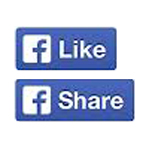
It's almost hard to remember a time when Facebook wasn't all about "liking" or "sharing" something. On November 7, 2013, Facebook's iconic "Like" button is changing, and the thumbs-up symbol people have long associated with it is no more. The company's Share button is also changing.
"We're introducing a new design for both Like and Share to help people share more great content across the web," said Ray He, a software engineer at Facebook. The Like button no longer shows the famous cartoon thumbs-up, but instead brandishes the Facebook lowercase "f".
Facebook has also made the logo a darker shade of blue, as well as giving it a new font. In addition, it's giving websites the option of lumping the Like and share buttons together. "We're already seeing a favorable increase in Likes and Shares with the new design," said He.
Finding an old version of the Like button is starting to feel like a needle in a haystack. Many websites have already undergone the transformation. But for those that need a thumbs-up fix, people can still see it on Facebook's own pages.
In the year 2010, Facebook first introduced the the Like button. Together, the Like and Share buttons are viewed by billions of times a day from over than 8 million websites. The new buttons are an update that's almost unfathomable in its scope, as these buttons are viewed over 22 billion times daily across millions of websites. But for Facebook, it was time for a brand-leading makeover, according to the new button's designer, Hugo van Heuven.
"The Like button was this light blueish thing that usually fell away," said van Heuven. "We thought we could make it more prominent, look a little bit better, and be more consistent."
When van Hueven speaks about consistency, he's not only talking about being consistent across Facebook’s own brand, but ensuring that their Like button is embedded consistently across the internet on sites that use it. The old buttons ranged in size, from 18 to 22 pixels in height, and many careless developers would often not leave proper padding, clipping the embedded graphic and made Facebook look a little worse for it. Now, the new Facebook's standard 20x48 pixels can be count on by web designers without double checking their spacing.
For the color, the team tried designing by using several colors, and of course, also tried blue. And since blue is a favorite, in Facebook's testing, they actually found that the color drove more people to click the button (the power of color for a brand's design). However, the blue color couldn't get along with the thumb button that is also blue.
"The thumb is a little white thumb with a blue sleeve," van Heuven explained. "You can't see the blue sleeve on a blue button. So you use a white button. But if you have a white button, you won't see the thumb, just the sleeve. So you always have to use a half grey button, and it always falls away."
"Because the thumb has a light and dark element, it’s a really hard icon to use in a situation like this," he added.
In response, the team just opted to make the thumb 100 percent white on top of a blue button, but an all-white thumb didn’t work either. While Facebook successfully uses a monotone black thumb on their main page, the thumb, without its iconic two-tone approach, becomes generic when plugged into a random webpage.
The Facebook logo appears on the blue button is nearly identical to the way it appears on the top of Facebook's page, bringing a level of brand consistency to the social network that's been lacking across its digital tendrils, which van Heuven explains, "is really hard."
"Because the icon in the Like button is only 14x14 pixels, and that's a really small area to make the 'F' look nice," he said. "Zoom into that 'F'. There are literally two pixels to make the stem of the F. That's one reason it took a long time. I've been with a lot of people in an argument how the anti-aliasing of the F would work. A lot of people said it's more recognizable three pixels wide, and I said it was better at two. That couple of pixels takes so much attention."
Ultimately, van Heuven's two-pixel approach won out, meaning his vision for Facebook is now seen by a large amount of crowd daily, from typical daily users to business marketers that use Facebook.