What makes a responsive web design (RWD) good is that it responds to its environment. But if compared with adaptive web design (AWD), which is best? At first glance, both RWD and AWD aren't distinguishable. But when you're viewing a website on a mobile device and it's easy to view, it's probably built using one of these two designs.
RWD was coined by Ethan Marcotte. The design starts with incorporating CSS, media queries and rule, fluid grids and percentages for flexible foundations. The goal is to make a flexible layout with flexible images, flexible videos and fluid type of overall aspects that suit its viewers.
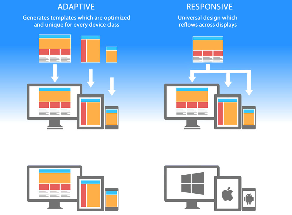
AWD on the other hand, coined by Aaron Gustafson, utilizes many of the components of progressive enhancement (PE) to define the set of design methods that focus on the user and not the browser. Using a predefined set of layout sizes (a minimum of three: desktop, tablet and smartphone), AWD utilizes CSS and JavaScript as its attempt to approach detected device.
The biggest similarity between the two is that they both allow websites to be viewed in mobile devices and various screen sizes, with the ultimate purpose of providing visitors with a better mobile user experience.
For their biggest difference is their delivery. AWD uses multiple fixed width predefined screen sizes while RWD uses multiple fluid grid layouts. RWD is coded using fluid grids, CSS, and flexible foundations, while AWD is more streamlined with layered approach and scripting to assist with adapting to various devices and screen sizes.
Responsive design is often seen as a design that has a slight different look from one device to another. Adaptive design is different as it's device-specific where features are detected before being rendered, and the user is served based on that information. The result is a custom-made look targeted just for the user's device.
The next is how the responsive/adaptive design is called to the browser. RWD is client-side, meaning that the whole page is delivered to the user's browser, and the browser then changes the page's appearance and dimension. Adaptive is server-side, meaning that before the page is delivered, the server where the website is hosted detects the attributes of the user's device, loads the appropriate and optimized version of the site, then deliver the data to the user.
So the differences is who does all the work. RWD depends heavily on the user's browser while adaptive uses its server.
How Do They Compare?
Responsive web design is more difficult to create because it requires extra attention to details, especially to the site's CSS and organizations to make sure everything function and appear as intended. It's relatively easier to make a few specific layouts for your website instead of making one layout that works in any screen size.
Because of its flexibility, RWD is more capable to suit more screen sizes. But that doesn't mean that adaptive web design can't compare. But no matter how good AWD websites are made, it still lack RWD's flexibility.
The lack of flexibility in AWD websites made it difficult to show perfectly for a wide variety of screen sizes. While RWD is guaranteed to work on all screen sizes, including new and custom ones, AWD only shows best on screen sizes that are already pre-defined.
While RWD excels in flexibility, AWD is more likely to be better is performance. This is because the amount of information downloaded for a user is different from the next. In order for a RWD website to work well, the user's browser needs to download everything the design has to give. This can be overwhelming for users using mobile devices on slow connection. AWD on the other and, uses its server to select which design to be shown so not necessarily everything the design has to give is given.
Which One To Choose?
When it comes to choice, responsive layouts layouts are generally better than adaptive layouts. But in some cases, like complex web applications for example, adaptive design could perform better.
To most websites, RWD is almost a safer and better choice because it functions better regardless who view them. Despite being relatively slower, most RWD websites somehow load faster in most cases because not many RWD websites are complex. But with websites with the same complexity, AWD should perform better.
When creating a website, there are many things to consider. Some of which are: your resources that include time and money, how your website render on old browsers, how is its performance, its contents, web application consideration, and its design and development process.
If you want a website that is easy to maintain, RWD is a good choice for you. But if you're in a strict budget, opting for AWD can be your way out. But once again, the type of design interface you choose really depends on the needs of the project and the users that you serve.