Yahoo! was one of the earliest internet pioneers. It was online and thriving, successfully, in the time when most people were still in the dark.
Established in 1994, Yahoo! was a web portal, which was literally a directory, a simplified search engine, to welcome anyone who had no idea to go or how to surf the web.
Yahoo! at that time was the valuable gem of the internet, a juggernaut that helped create the web as the world knows it.
After being acquired by Verizon, Yahoo! has undergone several changes. And this time, the company thinks that a little redesign could help the giant back on its feet, and able to embrace the modern web Yahoo! was struggling to do.
The strategy follows what most single internet companies have done: creating simplicity, and flexibility with engagement.
And Yahoo!'s redesigned logo, is trying to emphasize that.
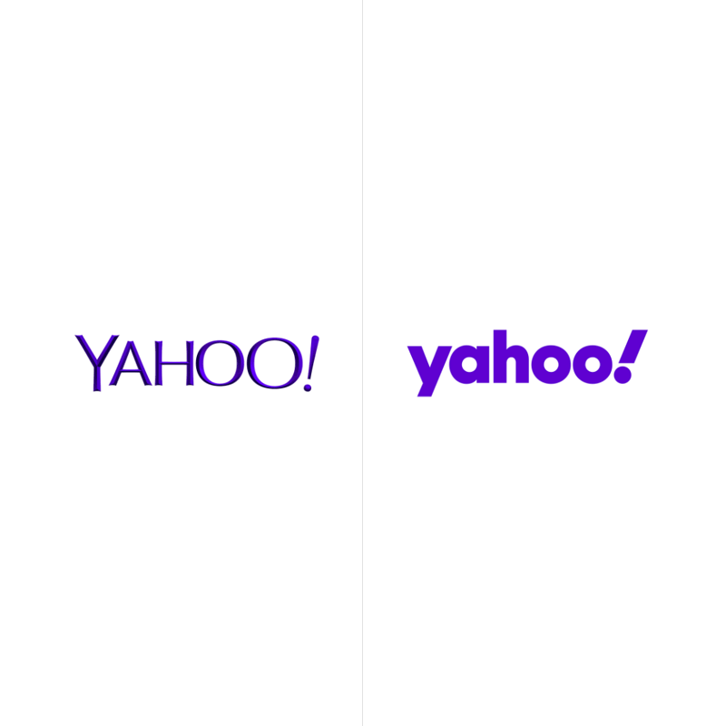
Yahoo!'s redesigned logo is simpler and more flexible that its predecessor, with the letters of the logotype being modified to be more geometric and compact.
The logo retains the famous exclamation mark, which is redesigned to be more italicized for greater emphasis.
Yahoo! with its array of products and services want to keep on empowering users of the web, by sifting out the irregularities of the normal web, and giving its users more control of what they see. The strategy positions Yahoo! as an “amplification brand,” which amplifies the things that matter, helping to “amplify you.”
And this idea is visualized in the Yahoo!’s exclamation point, a punctuation mark that literally stands for amplification.
What makes it also interesting here is that, the logo also retains the letter "y: and the "!" in a 22.5 angle, something that has been in every iteration of Yahoo!'s logo. The design suggests a sense of momentum and excitement.
With the redesign, Yahoo that knows that it isn’t exactly a popular company anymore, wants to stay and stand, reminding people of the web that it still exists.
This logo here, is designed by Pentagram, the company behind the bold, sans-serif designs for Citibank, New York City’s OMNY system, and the Cooper Hewitt museum. This logo marks the first redesign for the company since its big overhaul under the leadership of then-CEO Marissa Mayer in 2013.
The new logo makes Yahoo! absolutely indistinguishable from the hundreds or thousands of logos by other internet tech companies.
Retaining its purple color, the logo has also been optimized to work across various platforms and scales, from a small screen on mobile apps, to as large as a billboard on the side of a building.
And not to mention the simple "y!" monogram is certainly useful for favicons and icons.
Conclusion
When a change is necessary, a change should considered a must.
Yahoo! was the juggernaut of the web, at the time when many people still don't know what internet was.
But fast forward, when internet companies started to flourish, the giant fell under its own weight:
Yahoo! couldn't compete with Google in terms of search; Yahoo! Mail couldn't compete with Gmail; Yahoo! couldn't compete with specialized news outlets with their quality contents. And the list goes on.
The rebrand here, like previously said, is saying to people that Yahoo! still exists, and be the catalysts the company needs to be more relevant.
In other words, it's a way for Yahoo! to blend in to the already noisy internet.