2D was obsolete, and designs went 3D. But later, things shifted, and the trend was back to 2D, because 3D was outdated. Then, 2D is so yesteryear, so 3D is back.
A change is a must. Especially in the fast-faced digital world, where businesses are eyeing for the same audience, being different means a new effort to embrace a foreseeable better future. At least for Google, the company is expecting that from Android.
The popular operating system based on a modified version of the Linux kernel and other open-source software, is primarily designed for touchscreen mobile devices such as smartphones and tablets.
While Android is developed by a consortium of developers known as the Open Handset Alliance, its most-widely used version is primarily developed by Google.
The logo for the operating system has been redesigned for a number of times, experiencing quite a few different logotypes.
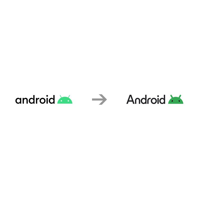
This time, Google is changing the two-dimensional 2019 Android logo, into a more refined three-dimensional Android.
**Cue the makeover montage music**
Take a peek at @Android’s updated look, from cute 3D bugdroids to a new logo ↓ https://t.co/qB5NTOoXN4— Google (@Google) September 6, 2023
In a blog post, Android consumer brand management director Jason Fournier wrote that the company wanted the bugdroid to "appear as dynamic as Android itself."
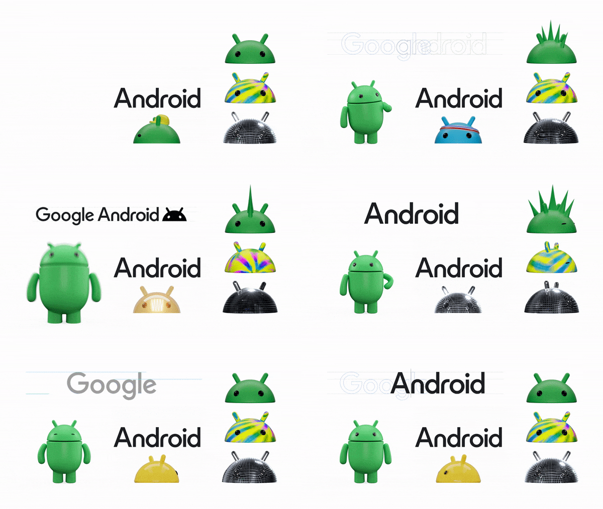
By shifting the design from 2D to 3D, Google said that it's giving the robot "more dimension, and a lot more character."
By overhauling the look of the notable green mascot, Google hopes this bugdroid to be more recognizable, and look consistent across both digital and real-world environments.
To showcase what it meant, Google has created numerous bugdroid variants, including one styled as a disco ball or jelly that slowly melts.
The company also redesigned the typeface to incorporate a new typeface, and an uppercase letter for the first alphabet.
This adds more weight to the logo.

And because the logo drew inspiration from the Material You design language, it should be able to complements Google's color palette, and can adapt to various materials, and textures, and even have accessories.
The broader goal is to make it look better next to the Google logo, in order to help it connect to the Google brand better.
Google introduces the redesign ahead of its 2023's Android 14 release.
Along with the rebrand, Google has also revealed that it's bringing its 'At a Glance' widget to all Android smartphones, which was previously a Pixel exclusive until.
The widget aims to provide more helpful information, such as weather alerts, event reminders and travel updates, right on users' home screen.
Then, there is the useful-sounding accessibility feature coming to Android imminently, called the 'Image Q&A on Lookout'.
With it, users can use voice commands, or type in questions, to find out details about AI-generated audio descriptions of visual content. Google designed the feature with blind and low-vision people in mind.
And among others, there is also an Android Auto update.
But what's worth noting, as people anticipate the arrival of Android 14, many of its new features have come in a series of updates, rather than in one big upgrade.
