Technology is becoming more sophisticated and powerful than ever. But the logos of the companies that made them, are becoming simpler than ever.
Intel is one of the tech companies that survived decades of competition by planting a firm foundation to the market and beyond.
To keep its identity relevant in the fast-paced digital world, the computer chip maker follows some other big tech companies by also redesigning its logo.
In the announcement, Intel's Chief Marketing Officer Karen Walker said that Intel's brand identity has remained "largely untouched" despite years of evolution for the company from developing processors to also develop software that powers artificial intelligence (AI) to the internet-of-things (IoT).
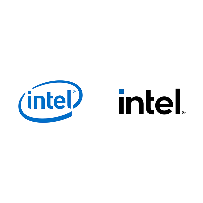
The redesigned logo is simpler and more generic.
Gone is the well-known circular logo. In its place, is a simpler typeface with brighter colors aimed at representing the company that has progressed beyond computer chips.
It marks the first logo change since 2006, and its third overall major identity refresh in the past 51 years.
Inspired by our past, our new look marks a transformative path ahead for Intel. Meet the new Intel.
— Intel (@intel) September 2, 2020
"This new brand is not only representative of the technology we create, but also an embodiment of the human spark of ingenuity and innovation that runs through the company," Walker said in a statement.
The redesigned logo isn't very different from its previous logo, in which the lowercase letter remains as well as the square-capped "i".
According to Walker, that is done on purpose.
Walker said that the redesigned logo is more modern and brings "dimension and breadth" to the brand.
The logo retains Intel's iconic blue as its prominent color, with the redesign adding "new variants with an extended color palette to add more depth and modernize our visual identity."
Beyond the logo, the "Intel Inside" stickers emblazoned on computers have also been redesigned.
Here, the logo embraces a wider pallet of the color blue, and for the most part, emphasizes its white typeface more than ever.
The little square dot above the letter "i" which represents the shape of processors, is also colorized in blue.
"We look different. And that’s on purpose. The new visual expression of our brand is a signal that Intel is entering a new era, where our rich legacy drives our future, where the pursuit of something wonderful fuels everything we do," wrote Intel on the announcement.
With the logo redesigned, Intel is introducing the typeface alongside its 11th Gen Tiger Lake Intel Core processors.
The company also announced a new chip brand called Evo, which is meant to integrate Intel's graphics processor and be featured in the highest-end laptops.
At this time, Intel faces increasingly stiff competition from AMD and ARM.
A growing number of PCs are already featuring AMD chips, which have proven capable of competing on both raw power and speed at affordable prices, if compared to Intel. What's more, Apple has also announced that it is phasing out Intel chips in its Macs products in favor of its own ARM-based chips.
This is putting Intel that was once a monopolistic company, in a moment to rethink its strategies.
So here, Intel's redesigned logo is its brand to showcase how the company has changed. It's the moment of truth for Intel to keep the competition at bay, as it hopes to be again remembered as the biggest chip maker in the world.
Alongside the logo and the new 11th Gen Intel Core processors, Intel has also modernized its "bong" jingle heard on its commercials.