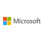
Microsoft, an American multinational corporation known for its Windows operating system is changing its corporate logo for the first time in 25 years. As the "Metro culture" of the company continues, Microsoft has revealed the new logo that reflects its new approach to visual design.
On August 23, 2012, Microsoft unveiled a new corporate logo at the opening of its 23rd Microsoft store in Boston indicating the company's shift of focus from the classic style to the tile-centric modern interface
For the first time in its history, Microsoft has a graphical symbol as part of its logo: a simple square with four colored squares sit to the left of the company name written in its chosen font family for Metro applications, the Segoe typeface.
Following the release of Windows Phone 7, Microsoft started to rebrand its entire product range between 2011 and 2012. Logos, products, services and websites were updated to use the aesthetic features of the Metro design language.
History
The new Microsoft logo is its fifth corporate logo. Its earliest logo was used between 1975 and 1979. At that moment, the company called itself "Micro-Soft," a feature reflected in the split name. The logo was a product of its time.
In 1980 the company sold consumer-oriented products with a short-lived logo. In 1982, Microsoft rolled out a new logo, all upper case with a patterned 'o'. The logo was replaced in 1987.
That same year, the company switched to its longest-lived logo. The logo was simpler with less ornaments than any of the predecessors and the first to use mixed case type.
Earlier in 2012, Microsoft revealed a new Windows logo. Office 2013 also has a new logo which share some design cues, in particular, the use of a perspective effect on their symbols.
The Symbol of Digital Motion
The new Microsoft logo is intended to embrace more of its Metro design. For those who are familiar with the company's old branding, the new logo looks mismatched: the symbol says "Windows" but the logotype says "Microsoft." The colors and their positioning are more than a little reminiscent of the old Windows symbol.
"It's one of many changes the company is making in anticipation of the Windows 8 launch," said Jeffrey Meisner, general manager of Microsoft brand strategy.
"The new logo is inspired by the company’s brand values, fonts and colors. The symbol is important in a world of digital motion. The symbol's squares of color are intended to express the company's diverse portfolio of products, he explained.
