Google is already one of the most popular companies in the tech world. Beyond its search engine, Google Photos could probably be one of its most successful services to date.
With millions of users on various platforms and operating system s relying on it to keep their photos safe and easy to access, Google Photos is already in many people's hearts, and phones, and computers. And here, it's experiencing a huge update.
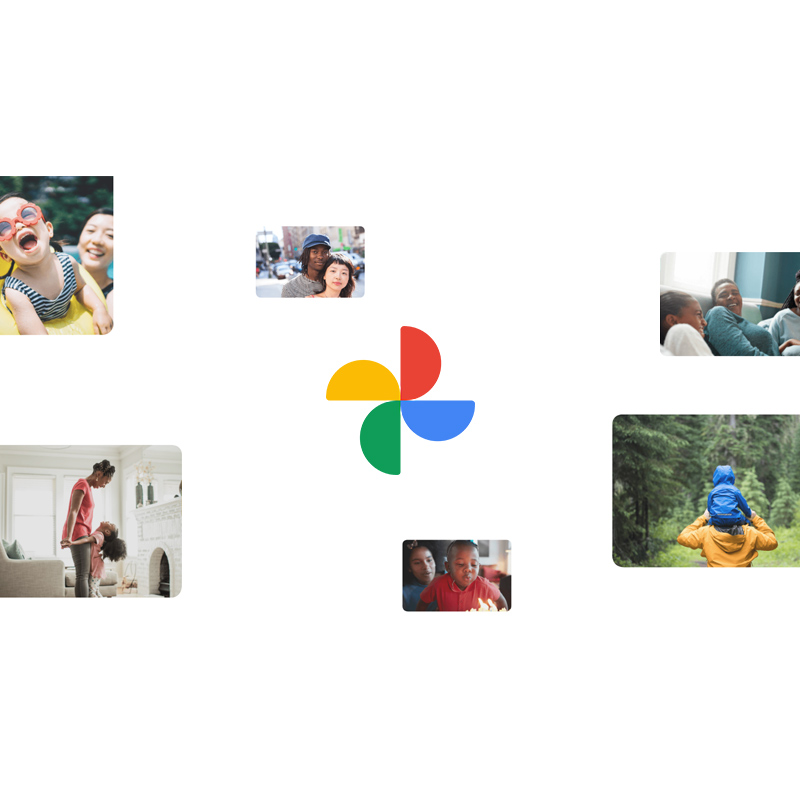
First of, the service is getting a redesigned logo to reflect the “simplified” experience the company wants to offer in 2020. Starting on iOS, the app has been updated with a logo that departs from the former pinwheel design, to a new rounded shapre for each of its four sections.
Retaining the color combination, which is Google's colors, Photos is made to more consistent with others of its products.
In overall, the design makes the app to look a little cleaner and more streamlined.
Second, the new logo is also meant to show how Google is trying to simplify the app's previous user-experience, by eliminating "clutter" while giving more focus to the “memories” row and the new messaging features.
On its blog post, Google said that:
"And that’s why today, we’re launching a redesigned Google Photos, focused on your memories, to help you find and relive your most treasured moments."
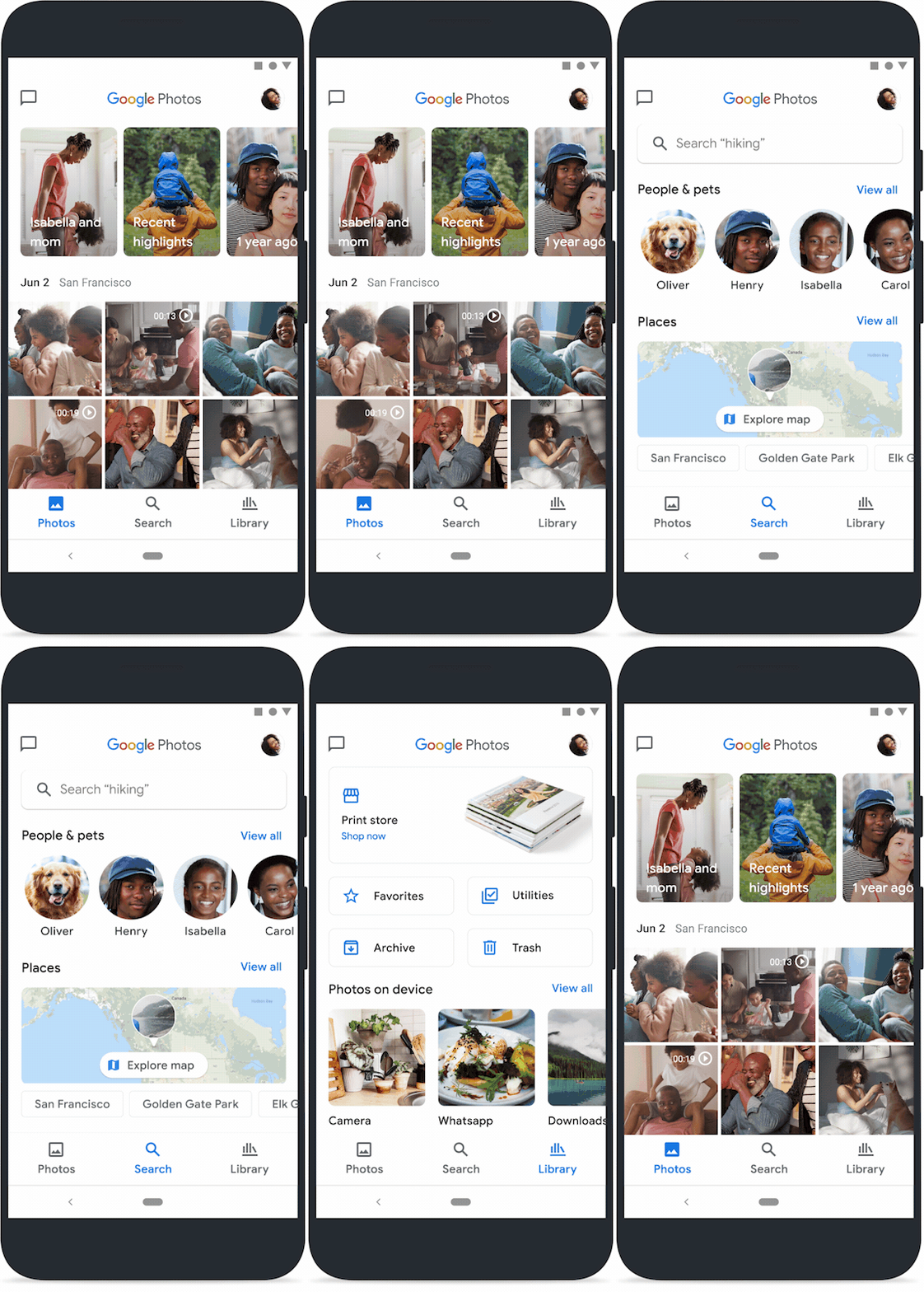
At the top of the app, Photos stripped the search bar and the shortcut to messaging, with the bottom to only feature three tabs: Photos, Search, and Library.
Because Google wants to put Memories a bit prominent, the previous ‘For You' tab that was meant to house all Google creations like movies, collages, and animations, has been merged with Memories.
The Photos tab has also been redesigned to feature larger thumbnails, less white space between photos, and a much larger “Memories” row. The Memories row was previously small circles, but with the update, it is redesigned to feature large rounded rectangles.

Then there is a way for users to hide specific time periods of individuals from Memories. So for instance if they have past memories that they may not want to see on an usual basis, the feature allows users to no longer need to worry about the app in surprising them with those bad memories.
After that, the Search tab which is self-explanatory, sits right in the middle. It offers a quick access to People, Places, and some of the things that were previously found in the Albums tab.
But there’s a feature here that has been highly requested: a Map View.
With the update, users can see an interactive map view of their uploaded photos and videos. Simply pinch and zoom around the map to explore the photos and videos from different locations. The map also has a “heat map” to show where most of the media is from.
For this feature to work, users must enable the location setting/permission on their device.
Then there is the Library tab where users can see Albums, Favorites, Trash, Archive, and more. This is also where users in the U.S., EU, and Canada can order prints directly from the app.
And lastly, Google Photos won’t automatically back up users' social media images in order to save bandwidth, at least initially.

Google is obviously trying to make Google Photos a product for more people to use.
While the simplified interface and experience should be considered a plus, the logo however, experiences a different thing.
This is because not everyone is liking it.
Some said that the logo makes Photos to appear "too simple, to the point where it loses identity." Another said that while other companies are trying to make their products simpler, Google literally simplifies the previous logo that was already simple, that it starts to make no sense anymore.
Google however, claims that it retains "that familiar pinwheel shape to remind you of past memories."
But the simplicity does appear too simple that the pinwheel itself may not be quickly recognizable in this over-simplified form. With the removal of both the two-tone shading and overlapping pointed shapes, Google has made Photos to lose some of its tactile quality, making the semicircles simply look like four separate shapes.
But still, although the updated logo may not scream that 'pinwheel' shape anymore, the logo design does shows how Google's flat design is getting even more flat, but with rounded corners that can make the product to appear more abstract.
Google has also made the design to be more consistent with other Google services, such as Chrome and Maps.
While users should adjust to the redesigned logo over time, the simplified interface of the app does make it a more intuitive service from Google.
