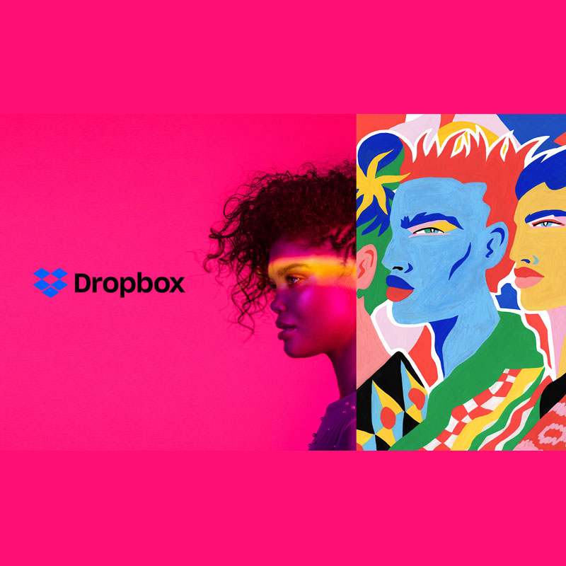
Looking sexy isn't easy, despite having more than 500 million users. That is what Dropbox is experiencing, and it's the reason why it's showing off a new look.
Dropbox is a file hosting service headquartered in San Francisco, California, that offers cloud storage. Offering file synchronization, personal cloud, and client software, Dropbox is one the big players in the industry.
But when it comes to its design, nothing has changed much since its first inception in 2007.
Early in October 2017, Dropbox finally moves away from its 10-year old design, which was identifiable as a box consisting of five isometric squares. The redesigned logo, as the company calls it, is "flatter, simpler" icon.
The logo is not limited to blue and white, the color combination it has been long known for, and also has been favored by the likes of Facebook and Twitter.
Instead, the logo redesign makes the logo "change based on the situation."
Dropbox hopes that the new colors will help it set apart from competitors, including Microsoft OneDrive and iCloud.

According to Dropbox's Aaron Robbs and Nicholas Jitkoff:
"Our users run the gamut from business professionals to scientists and creative types. Most of these folks tell us they feel overwhelmed and distracted during the workday, and that this is one of the biggest barriers to creating work they’re proud of."
"We want to change this, by building products and a brand that help people focus on meaningful work, instead of busywork. And we want to inspire creative energy, instead of taking it away."
The redesigned Dropbox also introduces a typeface called 'Sharp Grotesk'.
Coming with 250 different weights and sizes, the font can be have a squashed-up style and can also be made super thin.
The rebrand also includes a series of playful illustrations, which accompanies notifications on the website. For the campaign, these were used to create a 60-second film that asks: "What does creative energy mean?"
While Dropbox wants to move away from the label of simply being "a great place to store stuff," but the new visual identity has created confusion and outrage, and has attracted criticism for its use of clashing colors.
One Twitter user has described the experience as making him feel color blind. Another user even came up to say "Whoever came up with this horrid icon color update?" while others shared images of flashing colors to express their dislike.
Despite the revamp, many users might not even notice the changes. Dropbox’s UI in both its app and web versions remain mostly the same. The new colors and logo are more prominently displayed in the company’s marketing materials.
