
Engagement is key to free online services. The more the better, and that is exactly what YouTube wants.
The popular video-streaming platform introduces swiping as a method for mobile users to jump from one video to the next. This feature, known to employees by its internal name “swipey watch,” has been on the works since 2017.
The reason it took two years for the company to bring this gestural feature to fruition, is because it’s an alteration that shouldn't be treated lightly.
"This is a relatively fundamental change to the page,” explained Matthew Darby, product manager for YouTube Watch.
Previously, YouTube users had to tap to move between videos, both on the site and on the app. Because tapping is kind of outdated, and gesture has somehow become a runner-up contender on mobile, YouTube wants users to simply swipe left to see the video they were just watching, and swipe right to move to the next recommendation in the queue.
The main motivation? Ease of use. And of course, more engagement and more viewers' time occupied.
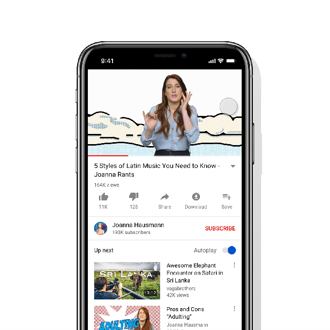
Swiping is now a "canonical pattern," said Darby, explaining that 70 percent of YouTube viewing time happens on mobile.
YouTube began its swipey experiment with sketches of an ideal project. This allowed the UX designers to consider every option, and dismiss the unworkable and unrelated ones. After getting the raw design of the feature, the team began building the prototypes, allowing them to play around with the interface, and see how thing goes.
The team wanted a "springiness" feeling to the feature. While the design looked good on paper, the prototype "performed terribly."
After some more redesigns and prototypes, YouTube finally arrived to a potential candidate which runs better than others. YouTube then launched the feature to selected beta testers, to gather some more feedback. This follows to a wide roll out to users, initially on iOS.
Gestures on mobile devices are nothing new. And swiping for that matter, has been around on several apps for years.
From Instagram to even Tinder, swiping is an easier way to move from one place to another, in a way that is faster and better than tapping.
For YouTube, this added feature may seem to be a small improvement. But its UX researchers suggested that in many instances, swiping energetically easier for the user than tapping. It also allows for better accuracy, as swiping typically engages a large part of the screen, opposed to tapping which only involves one small area.
What this means, swiping is easier to manipulate than a small button that requires a precisely-placed finger pad to function.
Websites may have unlimited scrolling, and social media networks have been fond of this particular feature because it keeps engagement high. And here, YouTube wants that same thing.
“Swipey watch” is only one of several developments YouTube made.
Back in July 2018, the company released “flexy watch”, which enables the video player to automatically adapt to a wider range of aspect ratios, instead of fitting every video into the 16:9 ratio. Before that, in 2017, the team launched "double tap to seek", which allows users to jump ahead 10 seconds with a quick tap-tap on the side of the screen.
YouTube's UX designers are tasked to keep users' eyeballs glued to the platform longer and longer. Any friction in the user experience, no matter how small, has the potential to drive customers away.
Each of these features is designed to help users sink deeper into the viewing experience. And with 'swipey watch", the team just made another improvement.
"We have a huge user base," said Robert Thompson, design lead for the YouTube Watch experience, "so we don’t want to mess around too much."