No matter how cheap or expensive a mobile phone is, screen aesthetic is extremely limited.
Developers of apps can only put a few call-to-action buttons here and there, and practically nothing else. Forcing themselves to put more will ruin experience, simply because screens on mobile phones can never be as usable as desktop computers'.
To address the issue, clever approach is needed.
YouTube is the media-streaming giant Google owns. For all this time, users on iOS and Android could only engage with a video as long as their screen is in the portrait position.
Users who were watching videos in full screen and wished to engage with a video, needed to turn their phones in the upright position first to exit the landscape mode, to be able to see the thumbs up and down buttons, the option to share the video and the option to add it to their playlist.
It was a choir, and pretty troublesome to have to minimize whatever they were watching to see those controls.
To improve user experience and to also increase engagements, YouTube has started rolling out a redesigned interface for mobile that includes quick access to the Like, Dislike and comment, as well as other controls.
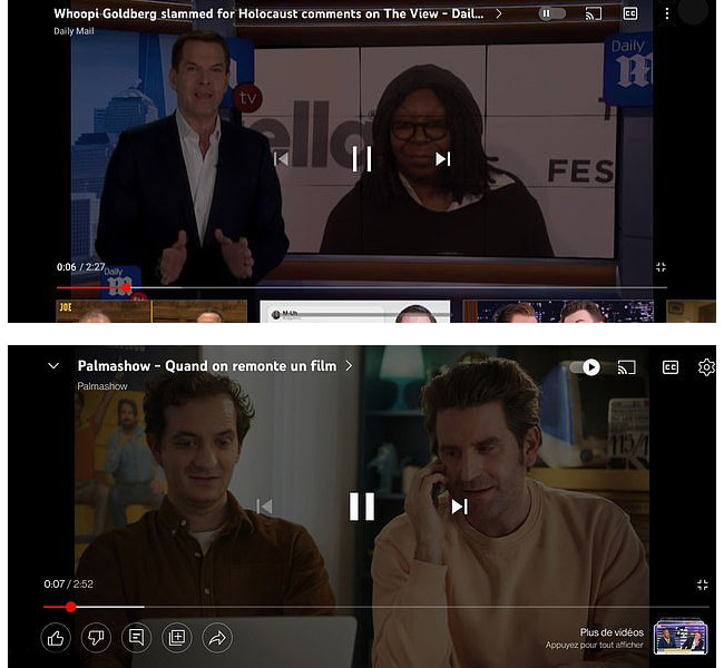
In the old player's full-screen mode, YouTube had the title across the top, alongside buttons to cast and add closed captions. At the bottom there was the slider to show the position in the video, as well as partial views of other clips that might be of interest of the users.
In the updated interface, YouTube replaced the partial views of other videos, and put the Like, Dislike comment, add to playlist and share buttons, as well as an option to view other videos.
By making the controls accessible even when in landscape mode, users are no longer required to switch to portrait to engage in a video.
Users can keep watching while scrolling viewers' comments, as well.
It should be noted that no number should appear below the Dislike button, as Google have hidden that from view in an attempt to keep small creators from being targeted by dislike attacks or harassment.
Read: YouTube Wants To Promote 'Respectful Interactions' By Hiding The Dislike Counter

The old version hid most of those features behind a swipe-up gesture on the 'more videos' section. The thing is, this was kind of a problem on some Android phones that utilize a swipe-up gesture for navigation,
This led to poor user experience,
The updated design interface puts the controls front and center. So obviously, this change is a welcome change.
Google spokesperson Allison Toh said that the updated interface started making its way to Android and iOS devices on January 31st, before being slowly rolled out to all users on both Android and iOS.
The feature was first spotted in testing in November 2021.
The redesign is a server-side change, meaning that users aren't required to update their YouTube apps to experience the redesigned video player.
It's worth noting that the changes are limited to the landscape full-screen player, and are not applicable when playing videos vertically, since all these buttons and controls have long been readily available.
