Internet users are usually in a hurry. If they see what they like, they'll stay, if they see that what see isn't interesting or relevant, they'll leave. You only a matter of seconds to make that moment counts, or you potential customer is just going to be another bounce rate you want to avoid.
After someone manages to come to your site, whether from social media networks, links on other websites, or search engines' result pages, you have to inspire them to read your post. You post is already taking time for you to write, there is no point of having one if no one reads it.
The most effective ways of inspiring your potential customers to invest their time reading your content, is to place the appropriate images.
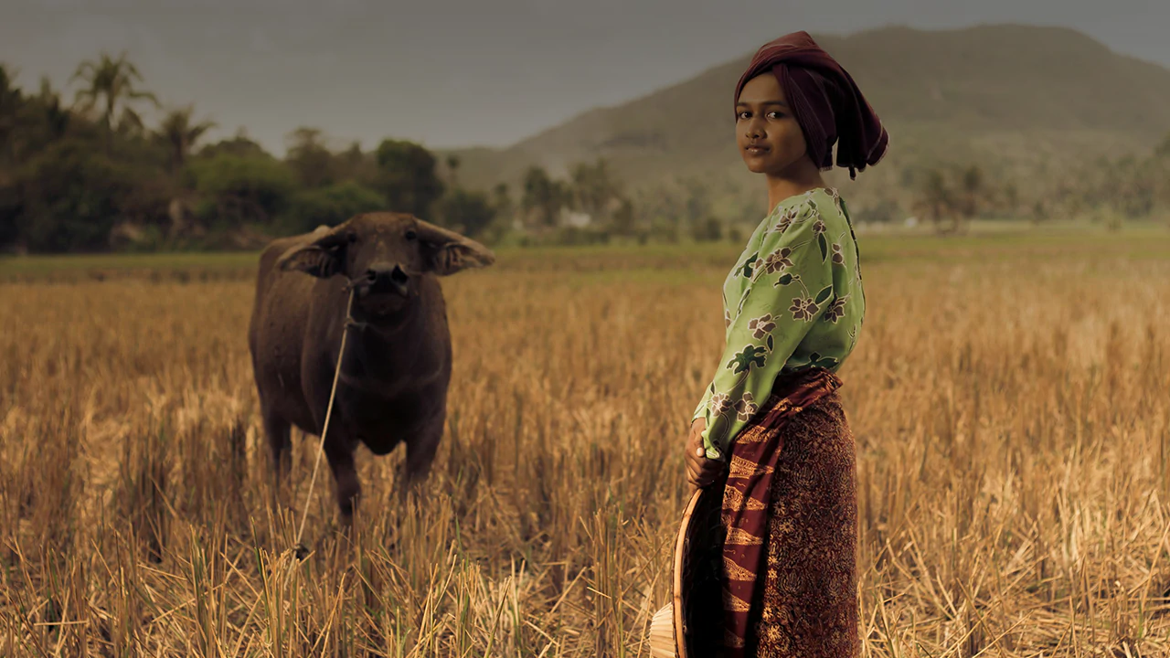
Images could be in any form, ranging from simple graphic design, charts to photos or others. Images don't need to interact with anything, they don't need to be clickable or do any animations. They are just cosmetics that aims to highlight your message so people can be attracted in that small time they have. In fact, selecting the right images for your content can increase readership by 90 percent.
Humans are visual creatures. They are attracted to how colors blend with shapes, how lines interconnect with others and how the perspective of objects represent a communicative elements. To capture the small amount of time your visitors are giving you, using images alongside your content is just as simple as it gets. As a visualization of your content, the impact can make a difference between a staying visitor and a leaving visitor.
Select Relevant Images

There are countless of images you can use alongside your contents. The problem is selecting the relevant ones. When selecting for an image, you should make sure that the image can describe at least the summary of your content.
Relevant image is not just something that can represent your content in the form of graphics, but also as something that people can relate to.
While you want your images to be relevant, you don't need to put all your creativity effort to have one. Your image is just a side product that is meant to pronounce your content better. If you want your website's visitors to read your content, don't distract them with image that beats the content. Although you don't need to create an outstanding graphic for your content, it doesn't mean that your image shouldn't be professionally made.
What you need to keep in mind is that:
- You can shoot your own images, and edit them with your favorite software.
- You can have others create one for you.
- If you can't have either, you can purchase photos that you like.
- If you want to post others' images, you must mention that the images aren't yours
High Quality Over Quantity

Screen displays on computers and mobile devices are getting better and better. Editing software has more tools to create all the necessities in creating and editing a compelling image. When selecting your image, you should make sure that the images are clear and crisp, and don't appear grainy or pixelated.
Since internet users are in a hurry, your website should load as fast as possible. Putting high quality graphics may impact on its performance. To keep your images' clarity, but keeping it small in size, you could try lossless compression for your images in order for them to keep their quality while reducing their size.
When selecting images for your blogs, you must ensure that you are not infringing upon any copyright laws or usage rights. On the internet, you can access unlimited number of images you can use. However, most of them are copyrighted and owned by their owners. If you want to use images that are owned by someone else, you shouldn't keep the credit for yourself, and contact the owner if you can. If you can't, you should mention somewhere on the page or on your website, that the images you put aren't yours.
Mobile First
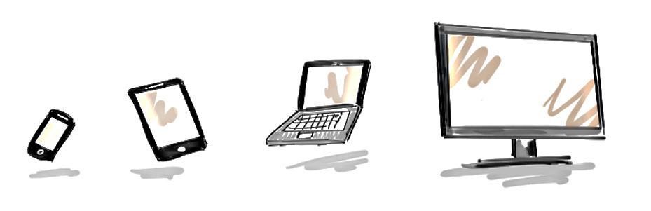
Mobile users are increasing, and websites that can be clearly viewed in those small screens are getting more noticed, especially by search engines. It's always important to know what device your visitors are using. If your visitors are mostly mobile users, you should at least make your website friendly to those small screens of theirs.
Mobile website and responsive web design are becoming a must rather than a necessity. Those wed designs are meant for mobile users, and for that aligns and width can adapt to any screen sizes.
Images have fixed width. Without using CSS codes to change its behavior, your images won't resize on smaller screens, interfering with your mobile first design. To make sure that your images can adapt to your visitors' various screen sizes, you can for example make the width to use percent (%) rather than pixels (px), and set their height to automatic (auto).