Google brings a redesigned looks to apps that incorporate Google Maps. They include: Assistant, Search, Earth, and Android Auto, and also apps and websites that use the Google Maps API.
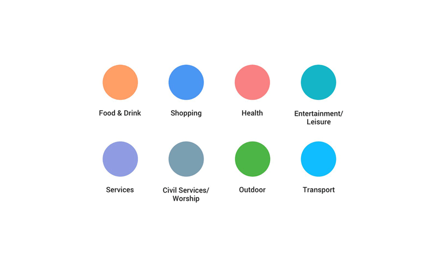
Rolling gradually to all users, the update introduces new set of color keys that are brighter and new icons depending on the category. This to overall improved user experience.
"For example, if you’re in a new neighborhood and searching for a coffee shop, you could open the map to find the nearest orange icon (which is the color for Food & Drink spots)," said Google.
This color and icon update should make things easier for users that tend to mix things up due to mobile devices having smaller screen sizes, making icons too small or too similar in colors.
The idea for the redesign, is to make users easily spot what they're looking for.
"So no matter how or where you’re using Google Maps, you’ll have the same consistent experience," said Google on its blog post.


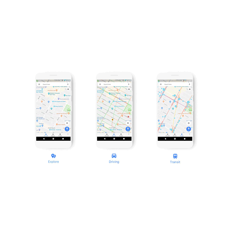
In addition, Google is also providing specific maps for different functions, depending if the user is driving, using public transport or exploring.
For example, if a user is driving, the map can show the nearest gas stations. And when using public transport, the map can show the nearest train station or bus stop.
The update is a minor one, but focuses on apps that incorporate Maps to be more useful for its users.