
In the world of tech, a change is a must. It's the most relevant thing to do to avoid being left behind others' business dust.
Meta, the owner of Facebook, is updating social media giant's "identity system." According to Meta, the update has "a focus on fostering effortless, self-initiated exploration and connection across every touchpoint."
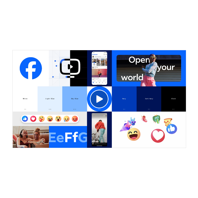
The first update, is the redesigned logo.
Meta described the change as being "bolder, electric and everlasting."
The logo is similar, but different due to the color it uses, which is dark blue that replaces the light, gradient blue. The redesigned logo also has tweaks to the lowercase "f", which is made a bit centered than before.
According to Meta in a blog post:
According to Facebook, the letter "f" uses Facebook Sans, which is Facebook's very own Facebook Sans.
The company redesigned the wordmark and logo to create "a consistent treatment and improve overall legibility across Facebook."
And in addition to the logo, Meta also developed a new color palette.
"We crafted a new set of hues, tones and contrast ratios that felt unique to the Facebook brand and are optimized for accessibility."
And here, the company concluded that blue is still unsurprisingly, "the foundational color, and pairs with our expanded spectrum to create stronger distinction for Facebook in marketing and when speaking to people in the app."
Here, it's revealed that the color palette includes a lot of blues in different hues.
The next update, is a tweak in its Reactions feature.
Reactions, which are a visual way for people to respond to a post, comment or story, can be the way for people to express themselves as they interact with what they discover on Facebook.
Thanks to the expanded color palette, Meta is able to "evoke more dimensionality and emotion in Reactions."
What the company did, was adjusting the colors to meet color accessibility guidance.
And more, because Meta also redesigned its entire iconography.
With the change, the iconography is legible at any size, flexible enough for different needs and easy for people to interact with.
This multidisciplinary effort was a culmination of teams working together to visualize Facebook. Through this design system, we are able to bring our brand to life through the app, enabling dynamic and effortless exploration.
When a change is a must, a change should be done.
But unlike Elon Musk's Twitter, which experienced a massive logo change and even a name change, Meta is only slightly tweaking Facebook's brand identity, refining it, instead of totally redesigning it.
As one of the most recognizable logos in technology, founder and CEO Mark Zuckerberg doesn't date to cross the boundaries and venture to the unknown.
After all, Zuckerberg isn't at all like Elon Musk.
Read: Elon Musk Versus Mark Zuckerberg: The Manly Fight That Entertains Social Media