
A font is a particular size, weight and style of a typeface. Essentially, each font is a matched set of a type of design, which makes it essentially an art.
Roboto is a Google typeface, first introduced back in 2011. Since then, it has become part of Google's visual identity, and has spawned a "superfamily" consisting of the initial sans, the condensed, the Roboto Slab, Roboto Mono, and Roboto Serif.
This time, there’s another member in the family.
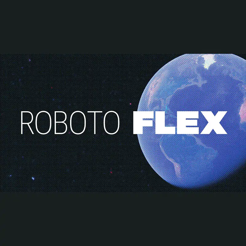
Google calls it the Roboto Flex, which is a major upgrade to Roboto and Google Fonts’ project.
What Google does, is introducing a way to customize the font using a huge range of weights and widths across optical sizes, plus additional capabilities for fine-tuning.
Designed by Font Bureau, Robot Flex is meant to be super scalable, adaptable, customizable, and optimizable.
Everything Roboto Flex has, can be changed, just as easy as changing the font size of most fonts.
In other words, Roboto Flex is how Google makes Roboto flex.
What happens here basically is that, Roboto Flex is essentially a "variable font." In Google's words:
What this means, users of the font are not required to manually load separate files to make changes to its weight, slant, or other variables.
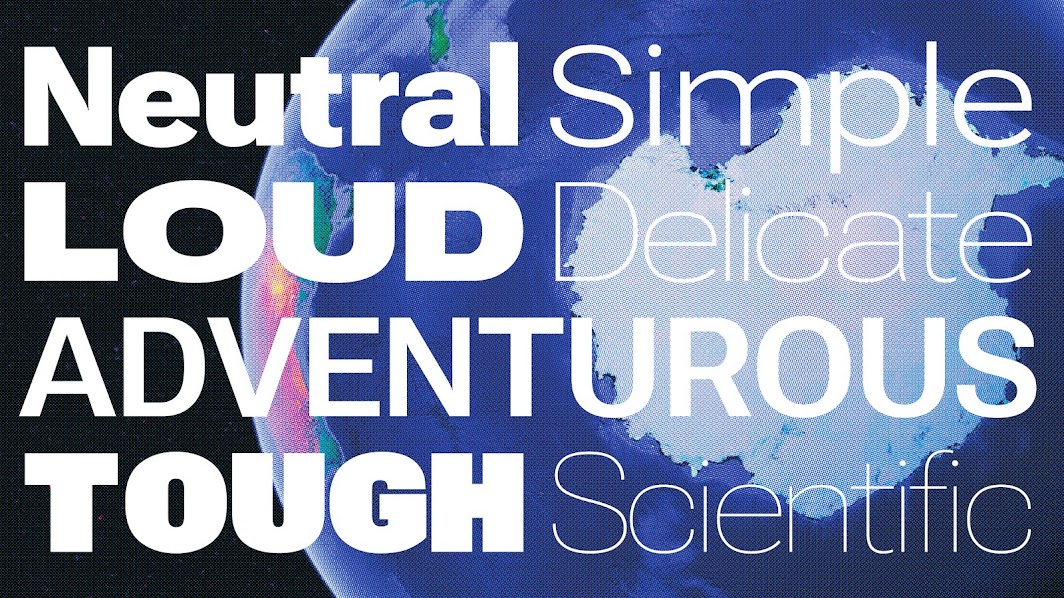
Google goes a step further with Roboto Flex, allowing users to do more than just basic changes. As Google explains it, there are 12 different ways users can tweak the font to their liking.
The customizing options include changing its width, stroke thickness, and even the heights of ascending and descending stems (like the ones found on the letters “d” and “p,” respectively).
Going through the details, Google explained in a blog post, that it has put balancing into the font to make sure that it looks right at specific sizes, so the text will look properly bold or thin, whether it’s taking up an entire page as a humongous headline or is just a tiny insignificant footnote.
Google’s announcement also gets into how the font’s designers made sure tiny details were right.
What this all means is that, users can have a much greater control over how their text ends up looking, without having to do a lot of work.
Roboto Flex should also be useful for web designers who wish to have a standard-looking Roboto font that they can tweak to make sure their headings and titles stand out, both from the rest of the text on the page and from other websites.
And lastly, because it's a font from Google and it's available on Google Font, users who wish to use it on the web can simply add the font to their domains using a simple line of code.
It's worth noting that these types of fonts have been around for a while.
Even Roboto Flex has been publicly in the works for more than a year, after Font Bureau underwent five years of "intensive development."
The thing here is that, Google is finally making the font available to anyone that wants to use it.
At this time, the font is open-sourced, and is available for download on Google Fonts in Latin, Greek, and Cyrillic.