Typography is more than just letters. It shapes how people perceive information, how brands express themselves, and even...
Typography is more than just letters. It shapes how people perceive information, how brands express themselves, and even...

A font is a set of characters that share a common design. These characters include letters, numbers, punctuation marks...
With VR and AR and their ability to create and superimpose new worlds, a unique look-and-feel is needed.
A font is...
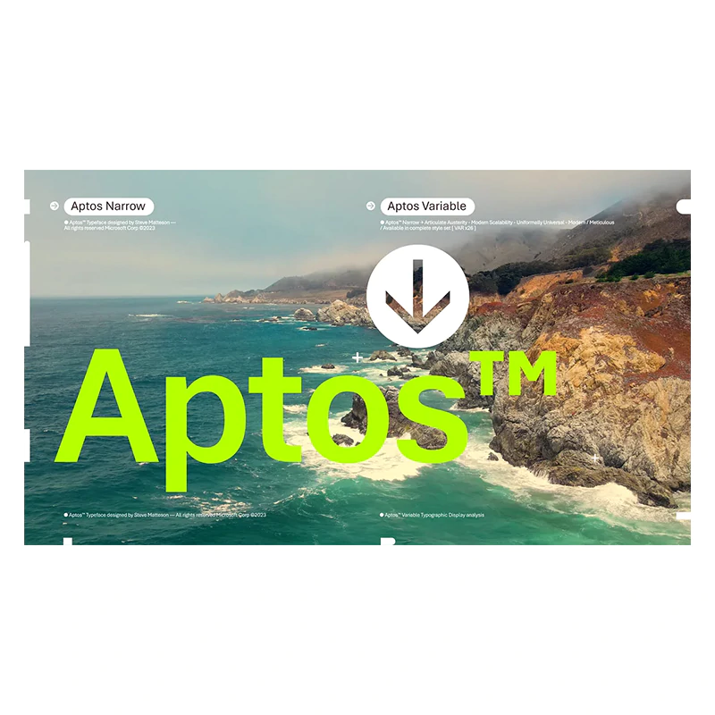
There are way too many fonts, but some fonts stand out than others.
Microsoft, the tech titan, has been using Calibri as the default font across all of its Office applications and services since 2007. This font was chosen to replace Times New Roman and Arial, both of which came before it. This time, there’s a new default font coming, and it's called 'Aptos', a sans serif typeface.
Having simple letterforms and strokes, Aptos is meant to be easily readable, thanks to its varying geometric shapes, is bold, well-defined, directive, and constrained.
And due to having no decorative lines or tapers, but with subtle circular squares within the letters’ contours, the typeface allows higher legibility, especially at small sizes.
The path towards choosing Aptos can be traced back to 2021.

At that time, Microsoft released five new fonts it commissioned as possible replacements for Calibri.
The new fonts - Tenorite, Bierstadt, Skeena, Seaford, and Grandview - were added to the drop-down font picker in Microsoft 365 applications and services since then.
Microsoft then listened to feedback, and chose the one that resonated most.
And based on Microsoft's data, Bierstadt was the most popular out of the five, and because of that, Microsoft wants it to become the default font to officially replace Calibri.
But before that, Microsoft renamed Bierstadt to Aptos.
As explained by Microsoft in a Medium blog post:
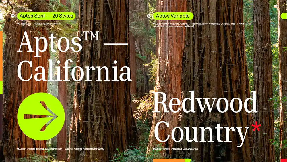
"His previous work includes the development of the original Windows TrueType core fonts and the creation of Segoe. Steve renamed the typeface he designed from Bierstadt to Aptos after his favorite unincorporated town in Santa Cruz, California, whose widely ranging landscape and climate epitomizes the font’s versatility."
"The fog, beaches, redwood trees, and mountains of Aptos summed up everything that he loved about California. Getting away from digital and evoking the outdoors was akin to getting back to pencil and paper. Drawing letters by hand would play a pivotal role in Steve’s creative process."
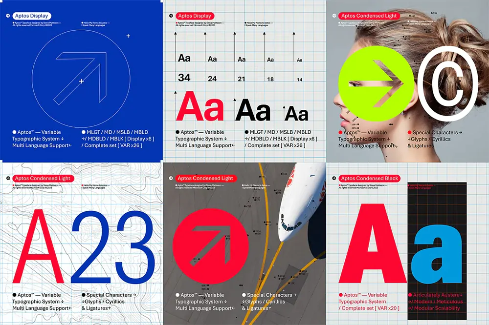
Following the introduction of the font, Microsoft is making it the default font for Word, PowerPoint, and Excel documents, and it will also be used in Outlook.
Since releasing the font means that it needs to appeal to different test, users can still change their default font in all Microsoft 365 applications, if you’re not a fan of the new look.
Microsoft also noted that Aptos shall not be automatically applied to any existing documents, so users don’t need to worry about sudden formatting changes or other potential issues.
And for fans of the other four contenders, Microsoft is keeping Grandview, Seaford, Skeena, and Tenorite in the font picker. And Calibri, the font it replaced, is pinned to the top near its predecessors, Times New Roman and Arial.
A font is a particular size, weight and style of a typeface. Essentially, each font is a matched set of a type of design...
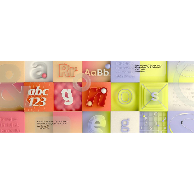
Most people overlook typography. Most people think that a font is a font, nothing more, nothing less.
This is...
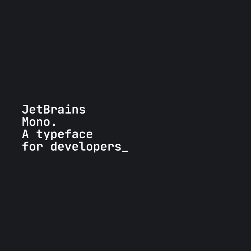
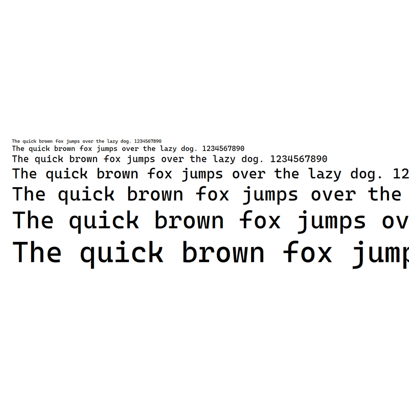
Developers spend most of their lives looking at codes. Here, the type of fonts they use can affect their productivity...
Developers that code, need to look a lot of text. To some, it's fun, and an extremely burden to others.
To at least...
Helvetica is probably one of the best-known and the most widely-used font in the world.
The 62-year-old font family...
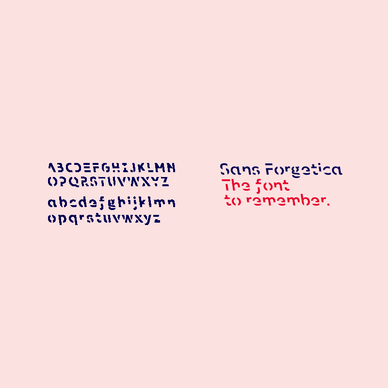
How often do we read to then realize that we forget most of the things we just read? More than often probably.
This is...
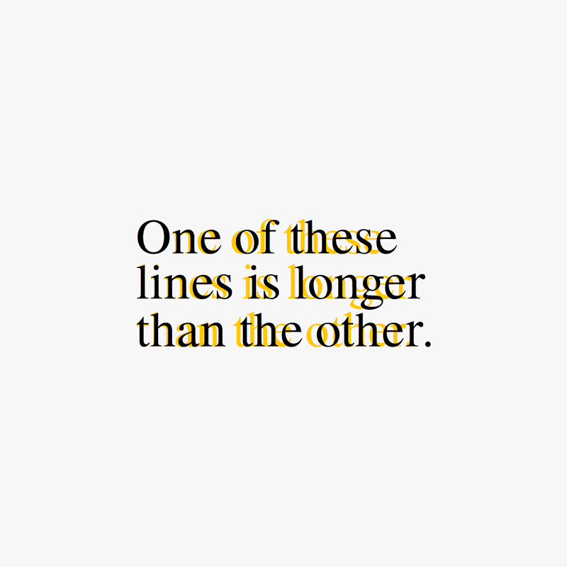
Times New Roman is a serif typeface designed for legibility in body text. With a history that can be dated back to 1931...
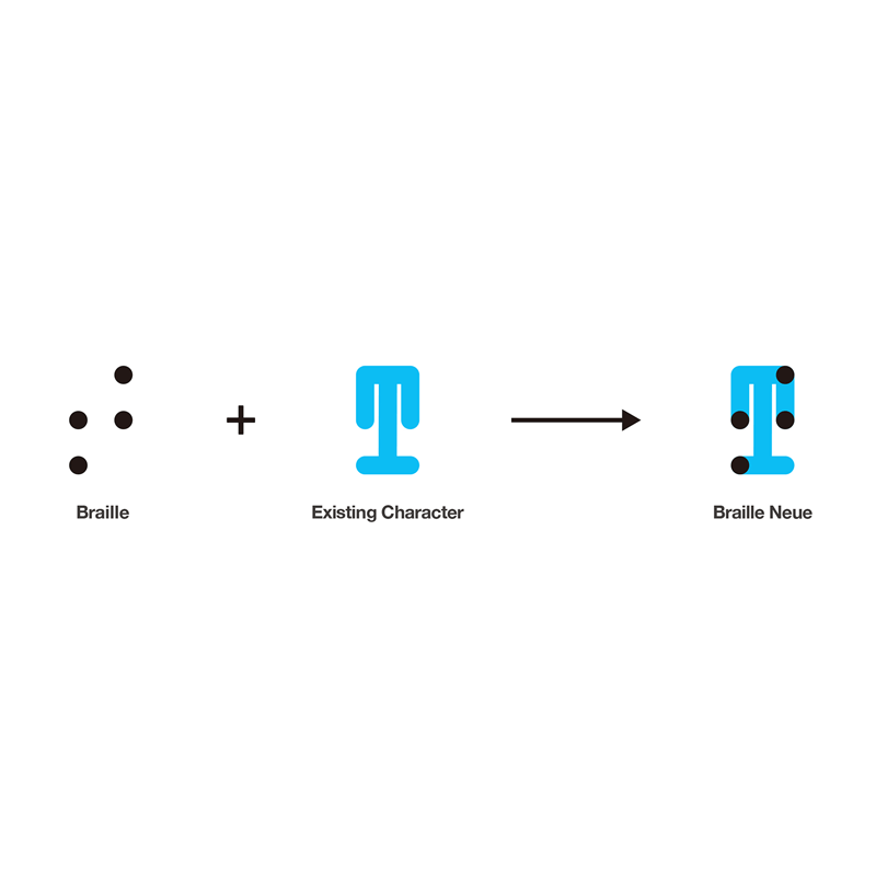
Anyone gifted with eyes to see, can read any typeface the world has to give. But for the visually impaired, braille is...