
Google Search is Google's flagship product. As a place where most of its money is coming from, it's obvious that the search engine should experience a special touch.
The algorithm for the search engine from Google is updated on a daily basis. But for the looks and feel of the interface, changes are subtle, unless stated otherwise. It takes Google quite a bit of time to develop and heavily test each change to make sure that it doesn't ruin user experience.
And this time, Google announced a significant redesign to how Search looks on mobile.
Focusing on simplicity, Google Search has been redesigned to have a search field that is visually more prominent, with the company logo, users' profile avatar, and some other elements.
The redesign also added more depth to how the faint gray outlines the bar used to have.
The search filters that appear underneath are made to no longer uppercased, and the active category in view is just marked by a narrower black underline, instead of wider blue.
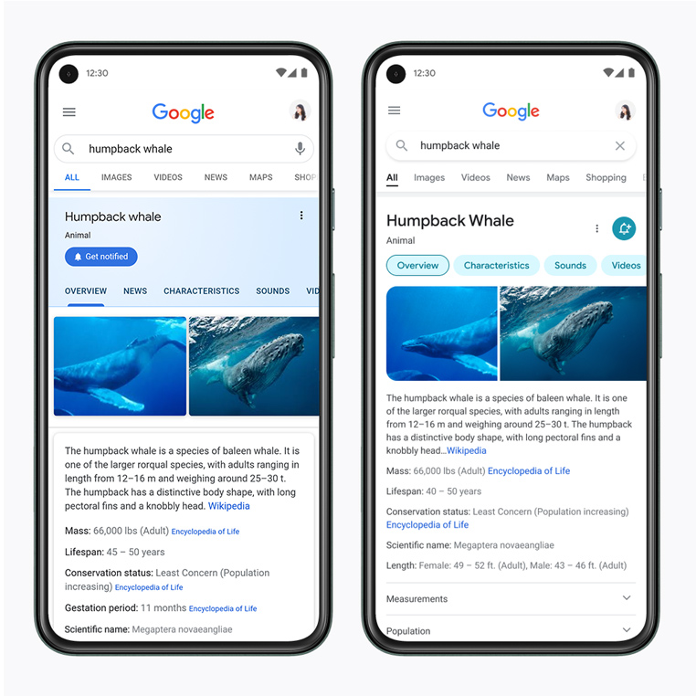
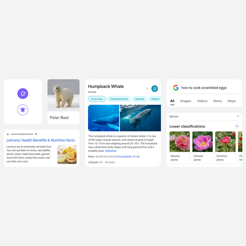
The redesign that is led by Google designer Aileen Cheng, also extends to the Knowledge Panels.
Google has made more distinguished by giving the panel a larger header that includes the name, category, and carousel.
The huge visible update is how the redesign eliminates the separation line and makes everything in the panel to appear as if they are one altogether. This can be seen with the information and the image gallery that are combined together, with rounded corners.
To focus on the content of the panels, Google has background of the panel lightly themed.
One of the main focus, is to use colors that are “more intentionally to guide the eye to important information without being overwhelming or distracting.”
Fpr example, the redesign uses colors to better emphasis the subtopics carousel, which has been redesigned to display each section in individual chips. The spectrum of hues have also been muted to bold, and are better emphasized in the redesign.
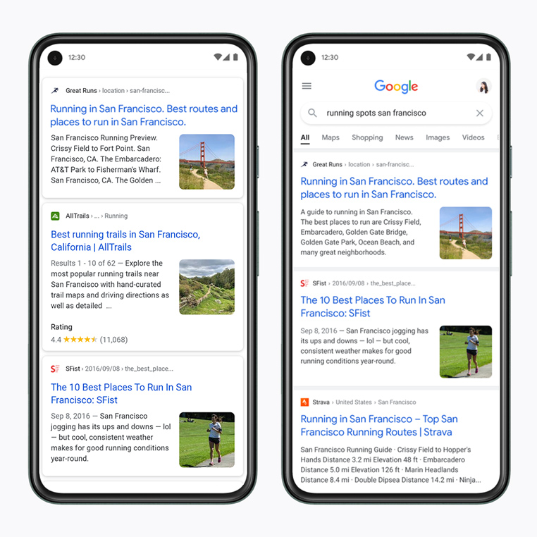
Further down the search result page, the redesign makes results span wider from the left-to-right edge. While still housed in cards, the effect is much less apparent with Google moving away from shadows. This helps provide more space for content and results in a cleaner look that’s less cluttered.
Another change is Google in using the Google Sans font in more places at a larger scale and bolder weight.
This should make text much easier to read on the white background.
According to Google on its blog post, the redesign focuses on five following things:
- Bringing information into focus. Google wants the search result to "shine," as explained by Aileen, “it’s about simplifying the experience and getting people to the information they’re looking for as clearly and quickly as possible.”
- Making text easier to read. “We’re making the result and section titles bigger, as well,” Aileen says. And this is by bringing consistency, and help users parse information more efficiently.
- Creating more breathing room. “The overall effect is that you have more visual space and breathing room for Search results and other content to take center stage,” explained Aileen.
- Using color to highlight what’s important. The redesign focuses on centering content and images against a clean background and using color more intentionally, for "an optimistic feel, too,” Aileen says.
- Leaning into that “Googley” feeling. More rounded corners to make the redesign a little more bubblier and bouncier. “That form is already so much a part of our DNA. Just look at the Search bar, or the magnifying glass,” says Aileen.
The main goal of this redesign on mobile is to make it easier for users to search. The redesign is rolling out to Google Search on the the mobile web, as well as Google's Android and iOS apps.
For Google Search on desktop, the redesign is more subtle, and more visible on queries that are related to the 'COVID-19' coronavirus.