
In web design, getting a website to appear and appeal as good as it can is a critical target. As the global internet speed increases, people are demanding better quality in design, as well as more visuals and media. Implementing high definition means to adopt high resolution media elements.
That is good because as more devices are capable of showing sharper display, the more consumers are there to be targeted. But that doesn't mean there's no drawbacks.
High definition design is moving along well with how hardware technology evolves. HD design was once a luxury, but it's now an increasing demand, and not anymore a surprise.
As HD is becoming a common expectation for your web visitors, adapting HD to your web design include some techniques. But if you're talking about its disadvantages, there are more things to do to tackle the problem.
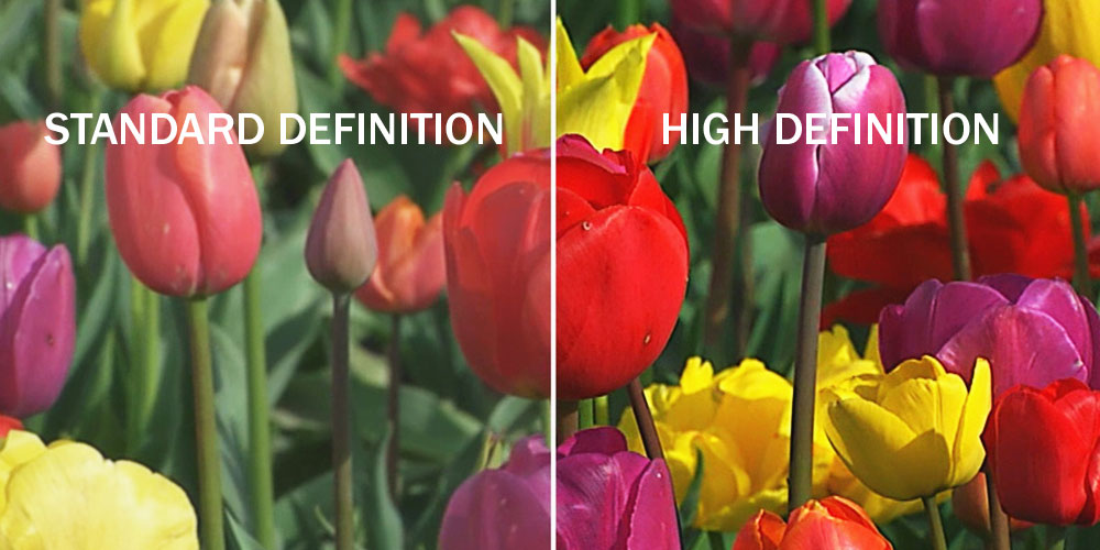
High definition in web design means your website can display images and media with higher density of pixels per inch (ppi or dpi). Anything greater than 200ppi is considered high definition, if compared to the standard definition which is built in 72ppi.
As display technology on both mobile and desktop computers improves, we're seeing a steady increase in resolution rates across all digital devices. As more designers are implementing HD in their design, more HD websites are created.
Better With Drawbacks
We are accustomed to seeing websites that load fast. For web designers, implementing HD on their designs mean more data to render, and that translates to longer loading for the website they're designing. If contents are the thing the website is selling, a slow loading page is a major problem that needs to be solved.
Web designers are often struggling to minimize the size of the media a website is showing, as well as cutting down the number of its HTTP requests. Creating HD web design won't necessary increase HTTP requests, but it will definitely increase the total size of a page.
To tackle this problem, web designers need to free up some space elsewhere.
Why should web designers implement HD design for websites is because standard 72ppi visuals don't look good on HD devices. They tend to show flat and rather "pixelated", making it looks dull. The problem only gets worse as more websites are created in HD making standard websites look "old".
Furthermore, websites created using HD do cost more. The reason for this is because contents are taking longer times to load. For that, the website needs more resources to keep it running well. And not to mention the tools and time to create HD visuals that are marginally more expensive than standard ones.
Then comes the question: should websites be designed in HD? Will all the efforts in creating one be rewarded? The answer is yes.
If you're still adopting standard 72ppi resolution for your website, as the popularity of HD continues, your website will look old and outdated in terms of design. As your competitors are using HD as their visuals and thrive, you have less to no option other than implementing HD sooner or later.
So the better you're prepared for the competition, the better for you to compete in your niche/industry.
Solving The Issue With Technology
As hardware technology advances, so is software technology. Web designers can use available tools at their disposal, as well as using new techniques to create HD visuals and minimizing the consequences.
Some of the methods web designers can opt into are:
- Scale Vector Graphics: Also called SVG., are vector graphics that use connected points and lines instead of pixels to create images (raster in JPGs, PNGs and GIFs). On HD devices, one raster pixel is rendered by four device pixels. This will make standard definition images look blurry on HD devices, expecially when the image is zoomed. The only problem is creating the already available images that are often photos in raster should be converted to vector. This can pose a huge problem for designers.
- HTML5, CSS3 and JavaScript: Using fixed attributes in HTML, CSS and JavaScript can minimize blurriness and unclear images. The drawback for this method is the lack of ability in making the design responsive to the size of the visitors' screen. Using media queries to change the dimensions of an image according to the device it is shown can be an advantage.
- Simplifying HD Medias: When user experience comes first for web designers, using HD medias can be a solution to the problem. However, HD medias can overkill a website because they have relatively much larger size than other design elements. To solve the issue, web designers can create media elements, as well as videos, that have little movements or have mostly static elements. They can also make media elements that have a fairly limited color palette. Because visitors expectation in a media presentation is animation, a slight motion still have positive effect on experience but won't overkill the website that much. This strategy is to simplify the content of the media instead of reducing its quality in overall.
- Playing with perspective: Beside than reducing the quality of an image, web designers can highlight certain elements of design while blurring others. For example, visitors tend to focus on things on the foreground than seeing things in the background. So if a website has high quality images, text and other medias in the foreground, web designers can feel at ease when using "unfocused imagery" as the background. Beside increasing the atmosphere of the design and its artistic presentation, the website can have both HD design without sacrificing much of its loading time.
- Use Less Visuals: Back to the very basic. Using fewer visuals is the ultimate way of reducing HTTP requests and page size. Avoid using unnecessary design elements to keep everything fast and tidy. This will simplify everything on a page without having any drawbacks. But if the web designers do need certain HD elements, they can use CSS instead of HD images, like for example for buttons and the navigation menu.

Conclusion
Better ability in rendering sharper and crisp visuals do affect how people literally see the internet. As more HD devices are available on the market, there is no reason why people will not use HD design themselves just to get the most out of their consumers' hardware.
Beside than just a cosmetic appeal, HD is a trend and obviously a must for web designers. The sooner a website is created in HD and able to be shown clearly on HD devices, and able to tackle its problem, the sooner they have the advantage to compete with others in the same industry/niche.
As internet's speed is going nowhere but up, HD is definitely a necessity since as time goes, slow loading problems will soon disappear and everyone can enjoy HD.