There are a lot of coronavirus-related information out there to show the spread of the coronavirus.
Those online services are indeed useful to track how each country respond to the novel coronavirus, and how effective their attempts are in curbing the pandemic spread within their borders. There are many companies that inform the data to users, and how to make them capable of protecting themselves and survive this pandemic,
For example, Bing has launched its own interactive map dashboard; Google has shared anonymized Maps' users location, and has launched a dedicated COVID-19 information website; and Apple with its own website and screening app.
This time, Facebook is delivering its own version of coronavirus-related information map.
As revealed by founder and CEO Mark Zuckerberg, the company has partnered with Carnegie Mellon University to help track the spread of potential COVID-19 cases around the world, even in situations where there hasn’t been any explicit diagnosis.
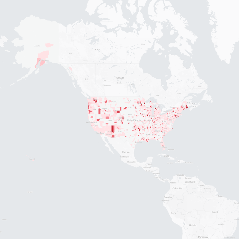
Initially, the interactive map tracks where people are experiencing symptoms from the novel coronavirus throughout the U.S., based on a 3-day rolling average by Hospital Referral Region data gathered from an ongoing survey by the social giant and the Carnegie Mellon University.
Explaining the granular map that shows an estimated percentage of people with COVID-19 symptoms down to the county level, Zuckerberg said that:
Understanding how Covid-19 is spreading is critical for local governments and public health officials as they allocate scarce resources like ventilators and PPE, and eventually to decide when it is safe to start re-opening different places. Researchers believe these symptom survey maps can be an important tool in making these decisions.
Facebook is uniquely suited to run these surveys because we serve a global community of billions of people and can do statistically accurate sampling. We do this in a privacy protective way where only the researchers at Carnegie Mellon see individual survey responses -- and Facebook only sees aggregated data.
The next step is to start running these surveys globally this week. This will allow us to expand the symptom maps to provide county-by-county data across almost every country in the world where Facebook operates.
We're also looking for more research partners around the world to help generate insights from this aggregate data to help with the Covid-19 response. We'll share more details on how to get involved soon.
It should be noted that the map which can be found on https://covid-survey.dataforgood.fb.com/, only shows an estimated percentage of people with COVID-19 symptoms, and not confirmed cases.
Facebook uses aggregated public data from a survey conducted by Carnegie Mellon University Delphi Research Center, saying that it doesn't receive, collect or store individual survey responses.
Facebook created the map not for purposes like diagnostic or treatment, nor for guidance.
But considering that there are likely more people have been infected than tested, and given that Facebook has more than 2.5 billion monthly users around the globe, the data could prove insightful.
Facebook hopes that the aggregate data could be useful for guidance regarding the virus.
Initially, the map includes samples from users who are 18 years of age and within the U.S.. But Facebook is planning to make this map to include more places around the globe, suggested Zuckerberg.