

When a change is a must, sometimes, there is nothing wrong for even the largest company to follow smaller ones.
In this case, Facebook, the social giant of the web, has redesigned its website to bring tabbed home screen and a cleaner profile, as well as the long-anticipated dark mode.
In was back in May 2019 that Facebook said it was going to redesign its website, with the initial test started in August.
And finally after the long wait, the company finally launches it to the "majority of people on Facebook".
Initially, the feature is opt-in; users can turn it on by going to Facebook Settings menu on the web, and tap the "see new Facebook.” Users can still revert to the old design of Facebook, by going back to Settings and hit the "Switch to Classic Facebook.”
What this means, the switch isn't permanent, at least just yet.
At first glance, the redesigned Facebook makes it look more like Twitter.
Cut down on screen glare with the new look of Dark Mode on https://t.co/Rw6MBNKIl3. pic.twitter.com/Rm4J5rCtbJ
— Facebook App (@facebookapp) March 19, 2020
But it also looks more similar to Facebook's mobile app and Messenger, which is a good thing considering that the design should unify the aesthetic.
Looking at the details, the redesigned Facebook for the web to have less visual clutter in overall, and has a bit streamlined its previously complex navigation menu. Here, Facebook centralizes the tabs for Facebook Watch, Marketplace, Groups and Gaming
Facebook also introduces larger fonts, and made the layouts easier on the eyes.
The redesign comes only just weeks after Facebook launched a simplified Messenger that removed the Discover tab, and demoted the visibility of businesses and chatbots. The company has spent the last two years promising to simplify its apps after a decade making them more visually complex.
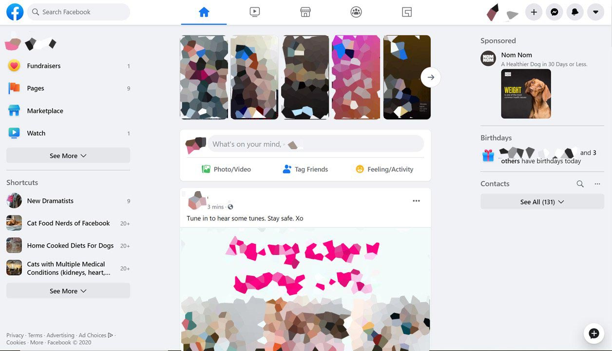
Facebook also seems to tweak some of the codes, to make the home page and page transitions flow more smoothly and load a bit quicker, too.
It’s Facebook‘s biggest redesign in years.
And for last, is the long-awaited dark mode:
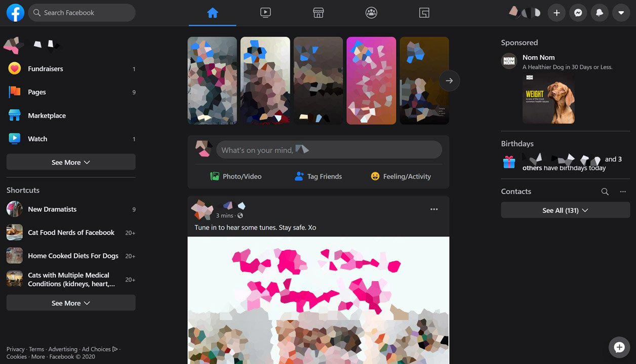
The feature can be toggled on or off through a switch in the Settings drop-down menu.
Just like others in the competition, dark mode is meant to minimize screen glare while maintaining contrast. This should make viewing experience better in poorly-lit environment.
Facebook was founded in 2004, meaning that in 2020, it's 16 years old.
Just as the company matures, the people behind the popular social media giant wants to keep it the popular destination of the web. And the redesign reflects that ambition.
Facebook's desktop website was built with tons of features and functionalities that Facebook needs, which are apparently more than what its users ever want. This is why with the redesign, Facebook wants to simplify the experience to mimic its mobile app, by borrowing some of its simplicity.
While most of Facebook happens on mobile, keeping hardcore desktop users happy should ensure the social network to thrive.
And even if users don't like all aspects of the redesigned interface, its dark mode would likely be popular. After all, the feature has already been made available on a number of Facebook-owned apps, including Messenger, Instagram and WhatsApp.
Read: Finally After A Long Wait, Dark Mode On WhatsApp Is Official