
![]()
Facebook has a new philosophy for its mobile app development. Instead of trying to make its feature app has everything for everyone that uses it, the company is a new way to satisfy different people in different demographic with its recently released Paper app.
The app comes as the social network celebrates its 10th birthday. With 1.2 billion users at hand, Facebook's Paper is another effort for the company in aiming at the practicality to monopoly the communications platform for the global internet.
Paper is primarily made for news, built in response that important stories users are looking for are buried and lost somewhere between comments, ads, quizzes, and so forth. The Paper solves that by giving the user the process to choose different categories for news to receive (including sports, tech, entertainment, photography, "Cute" and "Lol"), and a layer of editorial curation by actual humans ensures users to see what they want to see.
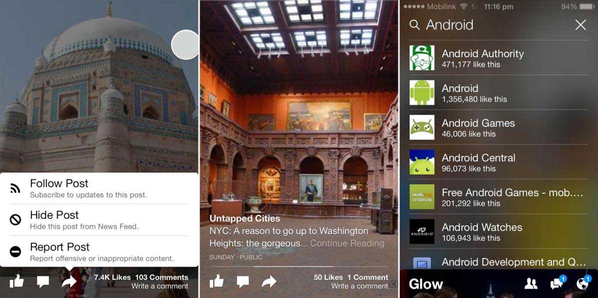
With the look and feel of a glossy magazine, the Paper-ized version Facebook's News Feed is rendered into a layout of tiles that scrolls horizontally, not vertically. Photos are extra large and can be panned by tilting the phone; comments are suppressed for tidiness. The app pays more respect to pictures, videos and other visuals. Users swipe the posts; they can skim them quickly or tap on a tile to go deeper and read stories shared by others or look at photo albums. Users can manipulate photos and other contents with gestures including pinching and swiping. By tilting the device, photos are shifted, twisted and turned around.
The app also acknowledges Facebook's massive influence over online media and takes a purposeful step into the business of news aggregation.
Paper isn't meant to replace Facebook's main app, or so the company says. But one can't help but think that it's the future. Facebook is so that just status updates: more than 600 million people check their account daily around the world and millions of pictures shared daily.much more than pokes and status updates. Not to mention posts from other social media sites that crowd the already less cluttered News Feed.
Paper uses the same basic tools of Facebook: to see posts from others and share their own. But it strips away the clunky tool bar and widgets in the familiar blue frame of the main app that users are familiar at. Pictures and graphics consume the screen, covering most of its white background of the app.
Facebook said that Paper is the first product from its Facebook Creative Labs, formed to create new apps for phones.
Using the Paper App

Although Paper uses the same basic tool of Facebook, learning to use the app requires some "unlearning" to do.
The first step to do is to customize your Paper. This takes a minimal setup, and whatever is made is reversible later on. There are 19 topics in all, ranging from the straightforward (Headlines, Sports, Tech) to the populist (Cute, LOL) to the more targeted (Equalize, Pride).
It uses the News Feed from Facebook in the favor of several and cover different kind of categories. Paper added your Facebook feed along with number of categories you choose. All of these sections bring a stream of stories that you can scroll with swipes.

Your own News Feed is your default home page. The app aggregates your friends' updates into a series of tiles from which Paper clearly drew a fair amount of inspiration. At top, you get one large image owning the upper half of the screen. Overlaid on the image is the associated text update and three familiar Facebook buttons: Friend Requests, Inbox and Notifications.
When you tap an image on a tile, it opens a balloon and expands it to full screen. For larger images, you get only part of the picture; tilting the phone the left or right lets you pan across it. Below that are more posts. You can scan through that carousel with a simple swipe to the right. From here, you can like, comment or share the post, and reshare (similar to Twitter's retweet). A swipe down and you will go back to the main page.
Conclusion
Paper is everything that Facebook advertised: beautiful, dynamic and user-friendly. It’s also a breath of fresh air after years of using Facebook’s resource hog and cluttered mobile app. Paper makes Facebook deserve a second look from what it has been doing in the last couple of years that are just plainly useless for some users.
The app creates a new enjoyment inside the social network by seeing activities from friends and digital news magazine in one place. The app works as it should and is well-designed Pros: You are enjoying many activities of your friends and digital news magazine in one place. It is well-designed and working fine. Paper does not feature the usual "pull-to-refresh", instead of it, you will find cards that creates a new experience.
Despite the many pros, the app does have some cons: it lacks ability to edit and manage friends list, groups and events. You can save articles with many reading apps but there is not sharing button for other social networks at this time. And there is no local news.
The reviews of Facebook users are more positive than negative, and gets better appreciation that Facebook Home that was released last year in 2013. For Facebook users that are active daily, the classic Facebook app is the choice for most of them. But by the moment they want to relax and see a more elegant presentation of Facebook, Paper is where it excels at.