Google has a colorful design, and it's tweaking that a bit to have more white space.
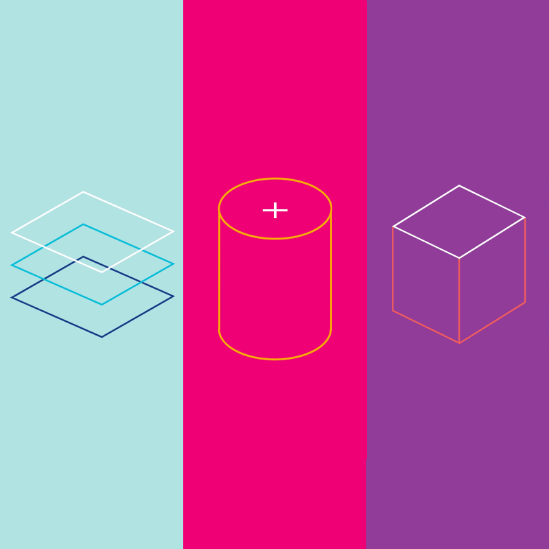
Material Design is Google's first official design language that was introduced back in 2014 at that year's I/O event. It introduces a colorful set of guidelines to highlight consistency across Android apps, and also beyond to whoever wants to implement the design on their own projects.
According to Google at that time, Material Design "is inspired by the physical world and its textures, including how they reflect light and cast shadows.” And this design language "surfaces reimagine the mediums of paper and ink.”
Google's Vice President of Design Matias Duarte revealed the first iteration of Google’s Material Design,, and it was a remarkable step forward for the company.
At that time, there was a scattered and chaotic approach to design across Google’s products. When compared to the design by Apple, for example, Android was considered ugly and outdated.
With Material Design, Google was refreshing its products' looks using a unified aesthetic beauty and philosophy.
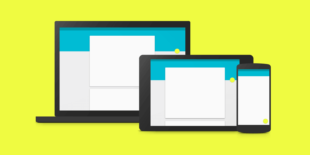
While many developers and designers started following these guidelines into their apps, others have ignored them altogether. After all, it's a matter of taste. Beginning in 2015, Google started utilizing the Material Design design language to its apps, to further highlight its brand recognition, differentiating itself from others, especially from Apple's design.
Google heavily embraced the use of Material Design's color, to give each of its apps a specific tone to identify with.
For example, Google Fit had a red and orange icon, and the app featured orange accents; Google Play Newsstand was filled with purple highlights.
As Material Design took off, others have somehow managed to create their own design languages that are similar to Google's. Most notably, Microsoft with its Fluent Design design language.
But gone are the colorful days of Material Design.
In what is so-called 'Material Design 2', Google updated the looks of its design language by introducing some lack of colors, among others. This makes Material Design to have more white space. Google’s designers said that using more white color can make products to shine better. While Material Design's color guidelines are still present, they are only being used to highlight meaningful actions.
"Color remains an important design tool and brand signifier within the Google Material Theme," said Matías Duarte.
For example, Google' brand color which include the color red, green, blue and yellow, are “intended to be used with purpose and intent, not for decoration,” explained Duarte.
"You will continue to see color being used meaningfully in the Google Material redesign of Google products — some specific examples include the red and blue selected states and icons within Gmail and Google Drive’s recent redesigns."
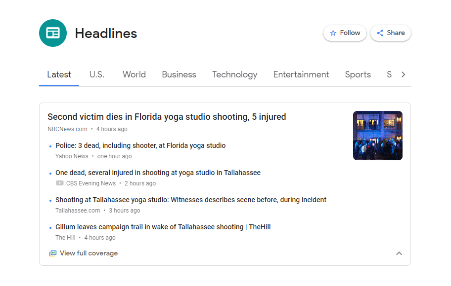
As a result, apps like Google News which replaced the Google Play Newsstand has no purple color anymore. The only color available in the interface can be found on the 'Full Coverage' icon. Google's apps are all predominantly feature in white, with color kept to a minimum.
Google said that in its tests, users were feeling more positive about its brand when it used Material Design with more white space and rounded corners in it.
By knowing its positive receptions, Google started implementing the 'Material Design 2' into its products.