Microsoft has officially unveiled its Fluent Design System at its 2017's Build developers conference. Previously known as Project Neon.
The software giant has been teasing changes to its Windows 10 design for months since May, and Microsoft is detailing how the design should improve experience.
Fluent is part of Windows 10 Fall Creators Update, with changes that include subtle additions. Fluent Design System is designed to be the true successor to Microsoft's Metro design.
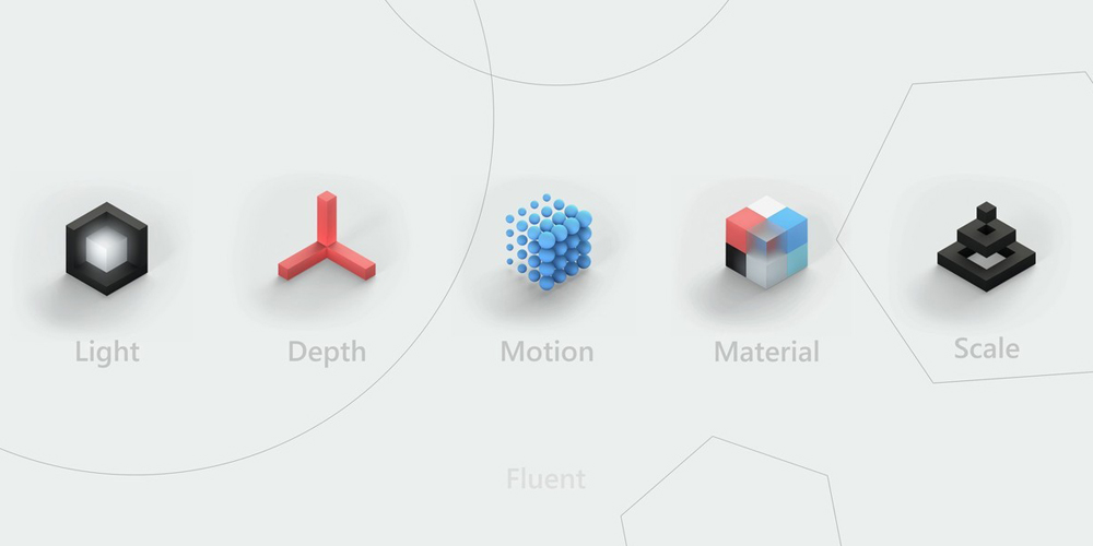
Microsoft is also bringing its Fluent design to the web. The company rolled out a major update to its Web Framework with all the Fluent Design components. With it, designers can create websites using Fluent's 5 different principles the company called "blocks":
- Light as a basis of illumination.
- Depth to add a sense of space by adding 3D (z-axis) information to create elements like parallax.
- Motion that connects or adds a sense of motion as users navigate through an interface.
- Material to control how user interfaces "bend, stretch, bounce, shatter and glad" during interactions.
- Scale in making different UI elements reshape or adapt to different environments.

The tools also include Acrylic Material, which offers apps an opaque layered effect to add depth, Connected animation for creating transitioning scenes, Parallax to create layered effect, and Reveal that offers a lighting effect that draws attention to interactive elements of an app.
The company's official website for the Web Framework includes some demos of how the Fluent Design should look like.
Microsoft bringing the Fluent Design to the web is definitely huge.
Microsoft's Fluent Design is somehow similar to Google's Material Design which also highlights flat design with interactive interface. Google has made Material Design guiding principles that can be applied to unify the experiences users have across various Google platforms.
This unification improves the overall experience a user has with technology by making the interaction easier, simpler and more intuitive.

Microsoft's Fluent Design, like Material Design, brings physical elements to the digital plane, but allows for a variety of materials (as opposed to Google's quantum paper).
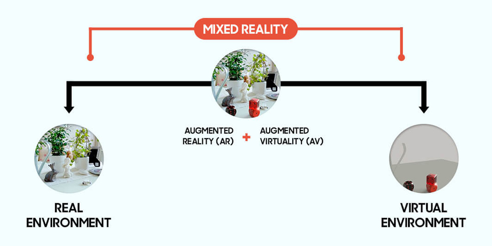
Microsoft is also focusing Fluent to go beyond common design, and into a range of screens including "mixed reality", from augmented to virtual.
So in many ways, the ideas behind Fluent Design resemble those of Google’s Material Design language.
But Google has had a head start with Material Design. Since its first introduction in 2014 alongside Android 5.0 Lollipop, Google has defined strict rules for the physics of that world and its digital material quantum paper.
Material Design also has a high level of consistency, and since its debut, millions of users have seen its elements on smartphones and the web.
