
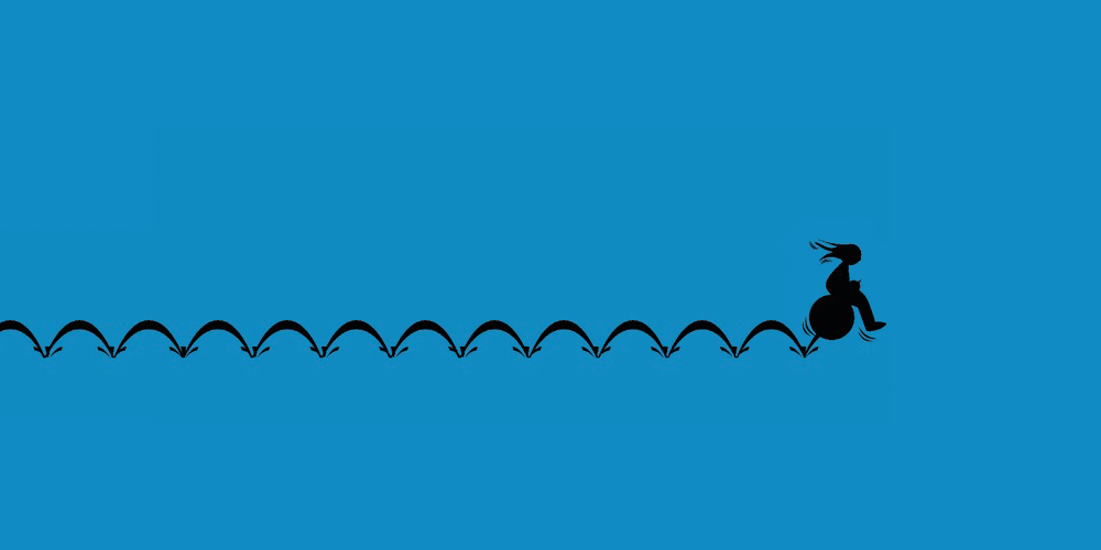
Bounce rate is one of the metrics that most marketers look. Unique as it is, bounce rate is opposed to most other metrics, because higher means worse.
A common reason why visitors tend to bounce from your website, especially when coming from an organic search, is that they do not feel like they belong there. Or, your website isn't having that value they were looking or hoping for.
To minimize bounce rate, you need to have a clear value proposition on your pages.
When visitors first land on your website, it is extremely important they can tell exactly what that page they've landed on do, and how its content can help. Not only this will ensure your bounce rate to be low, it will also give benefits to your brand.
The lesser people that bounce, usually translates to more happier people. And the more people that are happy after visiting your website, the more likely they will return or spread the words to more people.
Below is a list of some of the things you can do to reduce your bounce rate. They can be applied to almost every website, and results can be seen almost instantly if done properly. Successfully implementing these tips could improve your website's traffic and therefore increase the visibility of your associative activities.
Related: Web Analytics Data You Should Be Tracking To Increase Traffic And Sales
Faster Is Always Better
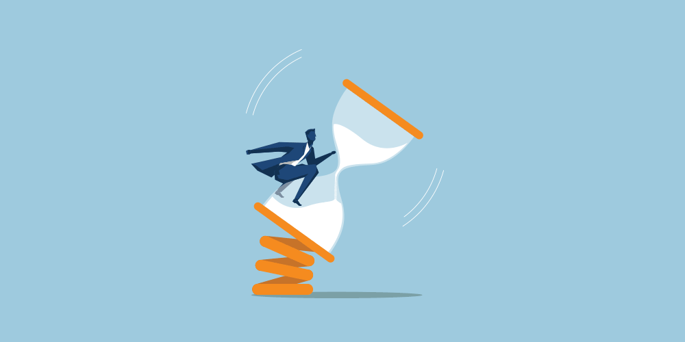
Your visitors may immediately bounce from your website when it takes longer than normal to load.
There are a lot of ways to speed up your website. From your server's configuration and capabilities, your website's design, the backend and the programming parts, and so forth. You may want to look at each of them to know the spots you can improve.
One of the ways to do this, is by understanding your website's waterfall diagram.
Encourage Exploration
A overcrowded and cluttered web page is an overwhelming source of information. Too much text, too many graphics and irritating colors. If you want to make your visitors stay longer, this is the first thing you need to avoid.
Your landing page is often the first impression visitors have on your website. For that reason, it should never be designed at random thoughts just to have an online presence. Your web page's design should have your visitors' thoughts as a priority.
When visitors landed on your website, they must've thought that you have something they need. Simplicity and clarity will ease visitors in getting to the exact information they're looking for on your website. Clutter will blind them from the real information they need, discouraging them from ever exploring your website.
So when designing your website, you need to make it uncluttered, but attractive and still captivating.
Have your website's navigation accessible, make sure that your web pages are linking together, and make sure that your pages are mobile-friendly.
A Recognizable Logo
A logo is that small image that represent your brand. On your website, it is usually located at the top left-hand side, or at the center and near the main navigation links.
Your logo should be appealing as it is recognizable. Your logo is what strengthen the structure of your brand: it's the thing that makes your website and your brand memorable. Your logo is like the visual identification that is part of the emotional experience that visitors will feel when visitomg your website.
Not only that a properly-made logo will make users' feel safe and happy, it'll make them trust you, too
The creation of a logo is an investment. Ideally, your logo should be immediately recognizable, transmit your vision and mission, effective with emotion and psychology, and powerful enough to bond with your overall brand.
Playing With Design And Colors
Visuals play an important role in maintaining engagement. Each of those cues transmit information that makes it possible for your website to communicate.
From the shapes and colors, your website design's elements should be able to bring all the communication media to strengthen the identity of your brand. Those visuals on your website, are the ones that help establish consistency and brand characteristics.
The visual theme should reflect the culture of your brand, and at the same time attracting people that you want to reach.
In order to please visitors and keep them longer, it is wise to keep colors to just a few, and only choose soft and light combination with some darker contrasts to emphasize certain elements. A good color combination can create an atmosphere that comforts people.
Contents That Are Easy To Digest
Visitors visit your website for at least one reason. Know this reason, and leverage it to the max.
When creating a content, you need to have your readers in mind. You need to know what problems they are facing; the information they are seeking and so forth. You need to provide answers to their problems; you need to make sure that your content will benefit them.
If they don't, your visitors won't have any good reason to stay.
Your contents should have clear titles - shown on their respective pages. With a headline to catch attention, make sure that you put your best effort on the first few paragraphs.
Your also need to make sure that your contents are easy to read. From the color of the fonts to their styles, you may want to do some research to get the best match to your overall website design's theme. Considering your text content, break those long paragraphs into smaller parts for better reading experience.
Using Images To Put Emotions Into Stories
Visuals are the important part of a design. They're also the crucial part in delivering emotions.
Static or animated, images can help visualize your text contents. If you have a web page that is full of text, reading each paragraph, sentences to sentences can be a bad experience to some. Since people can easily get lost between those sentences, images can be used to breath in some life (colors) to the dull monochrome boredom.
Images also allow visitors to focus on a specific moment in time, allowing contemplation and creating a lasting emotional bond.
Further reading: How To Use Visual Elements To Appeal Your Website Even More
Having Audio-Visual Presence
In the modern multimedia world, visuals play one role as it transmits information through shapes and colors to visitors' eyes. Others include sound that helps attract curiosity.
A compelling video, for example, can tell a story that will keep your visitors engaged. The more appealing your audio-visual contents are, the longer they will stay on your website.
However, many websites tend to neglect using videos on their pages because they think that they weren't necessary. But if your website can bring them as assets, you can make use of them to drive immediate attention.
With proper information and design, you can funnel those eyes to your call-to-action feature.
Creating a video can be difficult and costly, especially when done by professionals. But still, you can create a great one with a simple camera and a minimum editing. While This can be fractions of the cost, the videos will certainly look less polished.
A well-made video (professionally or not) can extend its usefulness beyond your website as a centerpiece of the communication efforts.
Attractive Call-To-Actions
As mentioned before, the ultimate goal for a website is to convert visitors into leads and sales.
To accomplish this, add alluring CTAs to your web pages, and make sure that they are aligned to the content. A proper call-to-action placement will not only keep visitors stay longer, but also convert them to leads.
Conclusion
Keeping visitors on your website is crucial. The longer they stay, the higher the chances you can make them do what you want them to do. From clicking on ads, exploring more of your pages, subscribing to your newsletter, signing up for membership, purchase something, etc..
There are many things you can do to maximize the chances that visitors will stay longer. You may want to experiment each and every of them, alter how they work or how they feel to see how they work.
To see maximum results for each changes that you've made, you may want fix the criteria one at a time to see how it goes instead of doing many things but only by bits. Not only that it will be easier to manage, it can also provide you more information about the changes, making things less stressful.