On the web, speed is everything. From SEO to user experience, faster web pages have a higher chance to appeal search engines as well as satisfy viewers. Users will visit more pages that are fast to load, making those pages have a higher chance to convert.
In short, squeezing out every drop of speed out of a website in order for it to load as fast as it can, is a strategy that is well worth an effort.
Out of the many tools web designers and developers can use to aid them in optimizing the performance of a website, there is one tool that can be used to show a graphic better known as the "waterfall diagram." This graphical view lists all the resources loaded by a web browser to present a page to users.
Showing both the order and the resources including the time they take to load, the diagram can give a great insight to any web designers and developers.
The concept of the diagram is indeed simple. But it packs powerful information about a website and how it's performing live to users. By analyzing the details, a website can be maxed to its fullest potential in terms of speed and resource management.
Reading The Waterfall Diagram
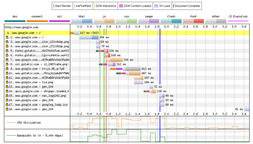
The image above is a sample waterfall chart of Google.com homepage made by Webpagetest.org. The diagram is simply a cascading charts that show how web browsers load an render the web page.
Each row in the diagram represents a separate request made by the browser. The taller the diagram, the more requests were made to load the page. The width of each row represents how long each resources took.
To improve the performance of a page, we need to understand what each phase means. In order to know how a website's resources are loaded, we need to first know the colors and what they mean.
- Dark Green = DNS Lookup: Before the browser can connect to a server, it must first do a DNS lookup to convert the hostname into an IP address.
- Orange = Connecting: After the browser is able to connect to the server, it has to send a request by first creating a TCP connection.
- Purple = SSL/TSL Negotiation: When a page is loading its resources using a secure SSL/TLS, this color represents how long the browser spends to set up the connection.
- Green = Time To First Byte (TTFB): This is the time taken for a request to travel from the browser to the server, and for the server to process it.
- Blue = Downloading: This the time it takes for the browser to download the resource.
As the colors above are used for the horizontal bars, there are also a few other lines on the waterfall diagram.
There is the green vertical line that shows when the "Start Render" happens. The left side portion of the line marks the time for a page to show a blank white screen. During this time, the page isn't yet showing, slow or unresponsive. There is also the blue vertical line which represents the moment when the documents of the page are fully completed. There could also be some resources that load after this time.
Optimizing Your Website Using The Waterfall Diagram
The waterfall diagram shows how long it takes for a web page to load, and how many resources are needed for page show completely to a web browser. By analyzing the diagram, there are information that could be taken.
The visual aids from the waterfall diagram can give some important insights in which can be taken to improve the loading speed of a page:
- Reducing the amount of time it takes a browser to download all the resources. This will reduce the width of the waterfall. The thinner the waterfall, the faster the web page.
- Reducing the number of requests the browser needs to load a page. This will reduce the height of the waterfall. The shorter the waterfall, the lesser the browser needs to contact the server, the better.
- Optimizing the ordering of resources to improve rendering time. If done properly, the "Start Render" line will move further left.
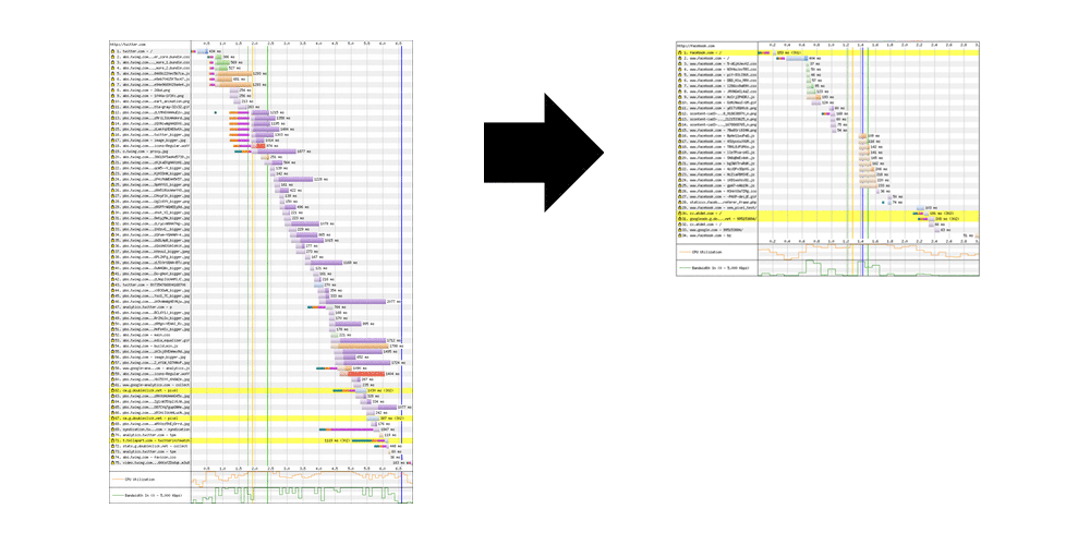
Reducing Waterfall Width
The wider the waterfall, the longer it takes for a web page to completely load. What this means, reducing the width of the waterfall will essentially reduce the time it takes to download the page.
After understanding the colors of the waterfall, we can understand which of resources are taking the most "unnecessary" time to load. Using its distinct colors, the waterfall reveals where we can optimize the resources in order to make the overall web page load faster.
If the resource has more orange color, this means the initial TCP connection took a long time to finish. Usually, only the first two to six requests should need to create a TCP connection, the rest of the resources will use that existing connection. If the orange bar is long, it means that the web page isn't using persistent connection. One of the solution is to use "Keep-Alive".
If the purple bar is long, this means the web page took a long time performing SSL/TLS negotiation. A web page that hasn't been optimized to use TLS, for example, will see some of its resources have a long purple bar. A bad TLS configuration on the server could also be the issue.
If a resource has a long green bar, the chances are the content takes a long time to get its TTFB. The cause could be from a low performing web server, a very busy server or others. The best way to reduce this green section is to move static contents such as images, CSS, JavaScripts and others to a CDN so they can be delivered closer to users. This will reduce latency, improving speed by margins.
A long blue bar means the resource took a long time to download. This could be a result of the resource having a large size. The best way to reduce the length of this blue bar is to simply reduce the amount of data that has to be sent to the client. Another way is to use HTTP compression, image optimization and minification.
Also consider to make the "Start Render” and "Document Complete" vertical lines to occur as early as possible, and be as close together as possible.
Reducing Waterfall Height
The taller the waterfall, the more a browser needs to make round trips to get all the needed requests. The best way to reduce the height of the chart is to reduce the number of requests. To do this, you need to review all the contents on that page to determine which can be eliminated.
For example: a lot of CSS and JavaScript files that should be loaded. Instead of having many of those files, is it possible to combine them into one but larger file? Another way is to make CSS and JavaScript codes inline if they're small (2KB or less).
As for images, you can use image sprites to combine multiple images into one file. This will also save users' browser to do multiple trips fetching them all.
Another thing to consider is to eliminate bad requests and redirects. Besides making the waterfall taller, bad requests and redirects are just a waste of server's resources and time. On the chart, bad requests are marked as red highlighting the whole row, and redirects appear as yellow.
Improving Rendering Time
Before the Start Render time, users will see nothing - only a blank white page that does nothing. To improve a web page's rendering time, you must know that on average, a web page should at least show something in less than 2 seconds.
To improve rendering time, you need to take a look at some of your first resources. Making them shorter will essentially improve rendering time. Some things you should consider while doing this are:
- Optimize CSS and JavaScript files. Make them to run in order without having them to render block other resources from running.
- Optimize things that are showing above-the-fold. From CSS, can they be inlined?
- Optimize fonts. If you use external fonts, make sure that you eliminate any redirects. If possible, avoid using externally loading fonts because a browser won't show any text until it downloads that font.
Conclusion
A website or web platform essentially consists of two major components:
- Backend which is the database and the business logic centered on I/O, file reads, lookups, information storage and update, analytics, processing, service calls, and others.
- Frontend which consists of technologies around rendering the web page. It includes network time to download resources such as CSS, images, and JavaScript files.
The waterfall may show only a simple chart, but it shows a lot more than it seems. And this article only scratches the surface of what you can do to make a web page perform at its maximum potential.
Insights form the waterfall chart should be more than enough for web designers and developers to understand how to improve performance by looking at how each resources are performing, and how they correspond others, from both the backend and the frontend.
Like for example, what makes a page slow to respond? Can the resources be made to load in parallel? Are there any of the resources blocking other resources from connecting/downloading?
The main goal for optimizing the waterfall chart is to make it thinner and shorter. In general, this will make a web page faster to load.