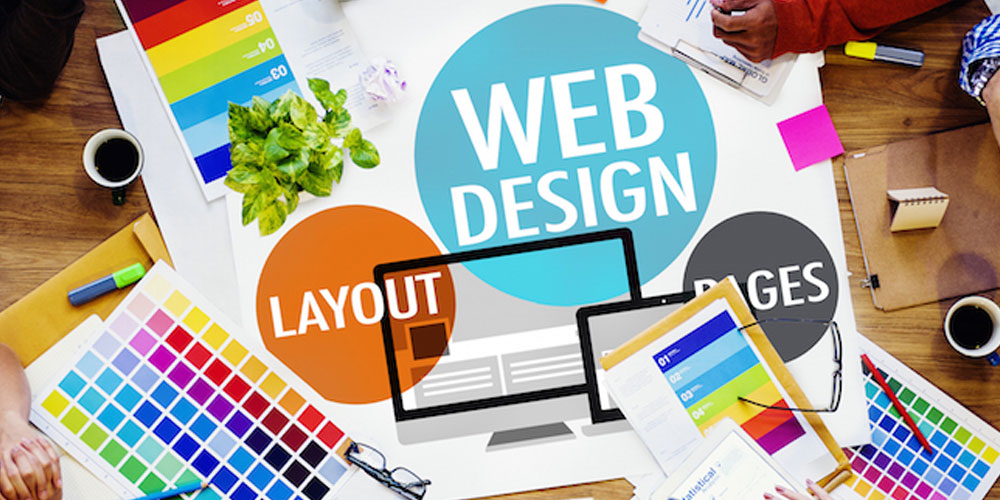
The internet is indeed getting larger. With more visuals accompanying text contents, we are seeing more clicks and engagements on contents that have included compelling images.
Images appeal and carry more influence than plain information, and that is the reason why the web is just so colorful.
So what are the factors that make people like a website? The answer varies from its design; the information it offers; its functionality; interactivity and so on. But if you were asked to point out the one that define design elements that make you fall in love with, there is a good chance that your answer will be its imagery and visual choices.
The value of a design is subjective; some people may have a different opinion regarding visuals. But what we can all agree is that visuals have always been the powerful means of communication.
In spite of the rise of minimalism in design, images still play an important role of successful websites. The reason for this is simple. We humans are visual creatures. We react to colors and shapes a lot faster than practically anything else.
So for example when we want to understand a context, we need time to decipher its message. Using visuals, the process will be a lot faster and much easier, putting down seconds to just fractions of them.
Related: Choosing The Best Images To Make Your Web Contents More Appealing
Visuals In Their Preferred State

Images don't talk for themselves, and for that reason, you need to convey your images to portray what you are about to say. And the best way to do it is by considering the following:
- Quality: No matter format you choose, quality is the key. High resolution images work best, but it's your design concept that determines its size. Make sure the quality is enough to make an impact.
- Relevance: Your images must be relevant to your brand's identity and/or the message you want to convey. Never leave your audience confused.
- Powerful: images your choose should encourage people to go through your stories. Images should be able to grab attention and make people engaged and eager for more.
- Unique: Differentiate yourself from your competitors using images can be the key to highlight your characteristics and further leverage your brand's awareness.
- Text replacement: Some well chosen images can replace some of your ongoing text. These images aren't the centerpiece of the page, but can make reading a lot more enjoyable.
- Photos of emotions: We humans have emotions, and images can describe them well. Putting images that include people expressing their feelings can tingle others to feel the same.
- Playing an importance: Don't use visuals just for decorations. Visuals should be the conceptualization stage itself so don't use them as an afterthought.
- Out of the box: Use images that are so attention grabbing that they make people want to know what your site is all about.
After having all the above in mind, you need to make your chosen images to be consistent and able to represent your brand. Never overdo things, and always try to strive for originality,
Choosing And Playing

Modern design tools and photo-editing software allow incredible opportunity to create complex visuals. Limited to only your imagination, your canvas is your area of thoughts.
Your goal for creating an image compelling enough for your content, is to make it visually more appealing to your audience, but at the same time able to visual your main purpose (keywords/summary).
The next thing that comes in mind is your website's characteristic. If you contents are about things that can be represented in a more comical and abstract way, using GIF and PNG can be a good option. But if your website is about photography, for example, you may want to use JPEGs as they can put richer colors. Either way, always remember to optimize them.
After knowing which kind of image files you should use, the next thing you have to do is choosing the colors. This depends heavily on the emotions you want to evoke to your audience.
Color psychology affects how your audience sees your contents. Despite being overlooked more than often, colors can associate itself deep inside the mind without people knowing them capable of. It affects your readers, and it can also help with your website's conversion.
There are also aspects to consider when choosing colors, and they are related to your audience and who are your potential ones.
For example:
- The country where your users are can affect how they see colors. In this case, their culture can affect their preferred choice. Some can see purple with rage and green with envy. To some, brown means to give that earthly peace feelings, but to others the color seems to be a color for dirt.
- Language also bounds itself with expressions and the connections between colors and emotions. This can make a them have different opinion on certain colors to be warm or cold.
- Gender plays a heavy role. When your audience is populated with men, having a rose-dominant colored images to represent your content may make them feel awkward.
Conclusion

When visiting a website, our eyes are automatically attracted towards colors and imagery. These elements, no matter how they look or feel, affects us more than any other design elements. After seeing those visuals, we then fall to different perspectives: some may see them appealing while some others may see them as annoying.
Because visuals are the main attractiveness on a website's page, you should always consider how people may receive them. Because images don't speak for themselves, the appropriate ratio of text will benefit one another to stand out better.
A harmonious blend of images, color, and placement of content can always make any website to be more appealing that it really is.
