
Helvetica is probably one of the best-known and the most widely-used font in the world.
The 62-year-old font family that has sans-serif shapes and clean corners, is already ubiquitous. It's already in use to represent many brand identities, from airlines to apparels, to even many kinds of ads, magazines and publications, as well as logos.
But here, it doesn't appeal Charles Nix, the director of Monotype, the world's largest type company, which owns the licensing rights to Helvetica.
He doesn’t like the letters that scrunch together when shown in small sizes, and that its kerning (spacing between characters) isn’t even across the board. For years, designers have altered the original Helvetica to make it more legible, like for example, changing the size of punctuation marks to balance the letters.
"We jokingly refer to it as Helvetica Stockholm Syndrome," said Nix.
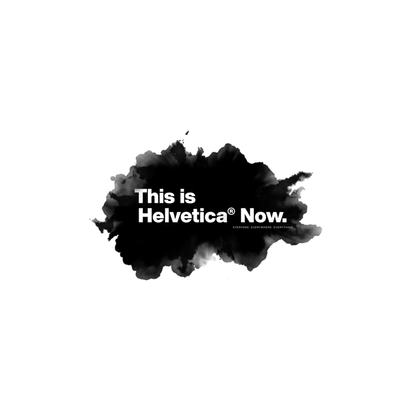
After spending two years trying to improve what could probably be the most iconic font, Monotype is giving Helvetica a refresh.
Monotype calls the font Helvetica Now, and this version updates each of Helvetica's existing 40,000 characters to reflect the demand of the more modern world.
The updated design is meant to improve how Helvetica is shown in smaller sizes, like on small screens of smartwatches, for example. While Helvetica is already great on large-scale applications, with Helvetica Now having better appearance on smaller screens, should make designers see the font in an entirely new way.
According to Nix, it's like looking at "someone you love, when the light hits them the perfect way on a Saturday morning, and you suddenly see them like you’ve never seen them before. It’s like falling in love all over again."
Helvetica Now is meant to bring back the glory of the font.
Nix and others at Monotype decided a change was due, especially when the adoption of the font family had sunk.
Major companies, which had used Helvetica for years in branding and other materials, had begun to ditch the typeface.
Google for example, stopped using it since 2011, to use a custom font that looks like Helvetica, but better. Apple followed the move in 2013 with its own font. So did IBM and Netflix, to name a few.
Helvetica was created to showcase "clarity, simplicity and neutrality". But it was designed in the pre-digital era where tablets or laptops or wearable devices, or high-resolution printers and ultra HD tiny screens have not existed yet.
Helvetica's main problem came from inconsistencies.
Before Helvetica Now or Helvetica, there was Neue Haas Grotesk.
Created in 1957, the typeface was created by Swiss typeface designer Max Miedinger with input from Eduard Hoffmann. It relied on a neo-grotesque or realist design, influenced by the 19th century typeface Akzidenz-Grotesk.
In 1961, typeface maker Haas rebranded it as Helvetica and introduced to the wider world.
Eventually, it became the hallmark of the International Typographic Style, and later became the most popular typefaces of the 20th century.
With mid-century modernism, Helvetica was meant to be simple and clean - with letters that make the words essentially speak for themselves. But when it became extremely popular, Haas in began issuing new structures, weights and sizes to the font, just to meet the growing demand.
While the differences are very subtle, these additions to the Helvetica family introduced inconsistencies.
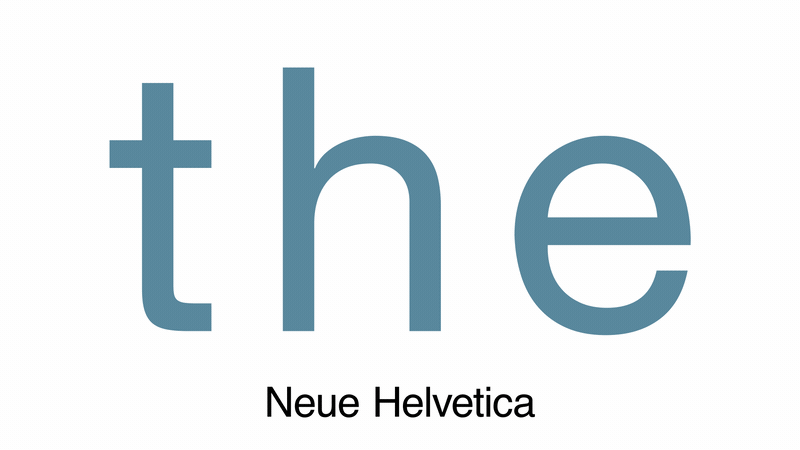
For example, the type company Linotype issued a new version of Helvetica, called Neue Helvetica, which was meant to make the font ready for the desktop computer market.
"Neue Helvetica was the first digitization of Helvetica," said Nix. "That was a long time ago, and so much has happened in our world since then."
But the thing is, Neue Helvetica wasn't created for the internet. It was created with a single master that included one drawing, and a cut at one size. This made optical sizing difficult. For example, Punctuation looked off-balance when displayed next to display-size text.
This is where Helvetica Now seeks to solve the issues.
"This is not a revival. This is not a restoration. This is a statement," said Monotype describing the updated looks. "It's more than a refresh or an update."
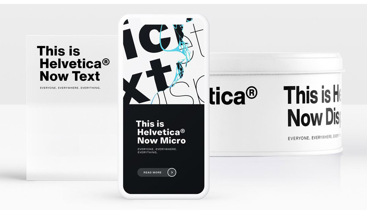
Helvetica Now has three versions:
- Helvetica Now Micro. Designed for use on small screens, recasts the font with more open forms, open spacing, and larger accents.
- Helvetica Now Display. Which evens out the kerning for larger type sizes.
- Helvetica Now Text. Intended to be the workhorse of the three, made for visually crowded environments with more white space for greater legibility.
Helvetica Now also re-introduced some of the original characteristics of the font that have been lost, including the single-story lowercase "a," a capital "R" with straight legs. These characteristics are considered to be Helvetica's original charm.
"It is kind of like visiting the Metropolitan Museum of Art with an easel and canvas and painting a Rembrandt,” he says.
“You’re following clearly what the master has done before you, and the big difference in our case is that we’re looking to make the type, the artwork, more suitable to the age in which we live.”
Helvetica Now is meant to make the font better meet the growing modern world and the internet. While it won’t replace the former version of Helvetica, Nix thinks that, like a software upgrade on a phone, eventually everyone will upgrade.
“You will see it everywhere, for everyone, for everything,” he adds. “It’s going to be everywhere.”