Typography is more than just letters. It shapes how people perceive information, how brands express themselves, and even how cities present their identities to the world.
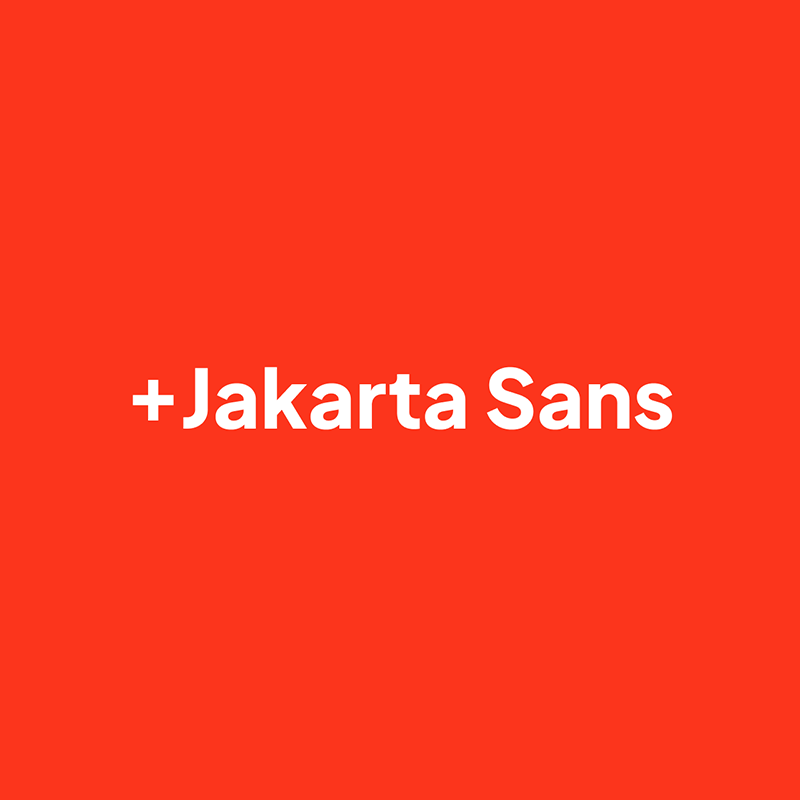
In recent years, there has been a growing trend of open-source fonts created not only by independent designers but also by governments and institutions that want a visual identity accessible to all. One of the standout examples of this movement is 'Plus Jakarta Sans', a typeface born from the city of Jakarta’s ambition to reintroduce itself as modern, inclusive, and globally connected.
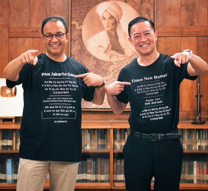
Plus Jakarta Sans is a modern typeface that was developed as a collaboration between the Jakarta Provincial Government and designer Gumpita Rahayu of Tokotype.
It first appeared in 2020 as part of a rebranding initiative for the city of Jakarta, Indonesia, which sought to present itself as a global metropolis that was both rooted in local culture and forward-looking in design.
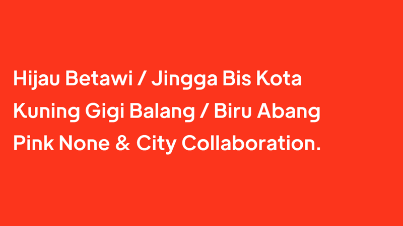
"Like the city itself, the beauty is in the details. The charms of +Jakarta Sans appear when one looks closer, manifesting in a beauty that emerges once seen as a whole. Each alternate on Display family contains several alternates characters, while the text version has a small adjustment to preserve the legibility of small sizes," the description of the typeface says.
The design of Plus Jakarta Sans was inspired by geometric sans-serifs, a style that has dominated much of modern graphic design for its clean, minimalist, and highly legible qualities.
While it draws influence from familiar typefaces such as Futura, Avenir, and Inter, Plus Jakarta Sans distinguishes itself by integrating subtle details that soften its rigid geometry. The letters are balanced with humanist touches, creating a typeface that is not only efficient for text but also inviting and warm in its appearance.
This makes it versatile enough for both display and body copy, working well in user interfaces, websites, editorial layouts, and branding.
Beyond aesthetics, the family was built to be highly functional.
It comes in seven weights, ranging from ExtraLight to ExtraBold, each with a matching italic, resulting in fourteen styles in total.
This range allows designers to create clear hierarchies and dynamic contrasts within a single project. Adding to that flexibility, Plus Jakarta Sans also offers stylistic alternates, divided into sets that subtly change the look and mood of specific characters.

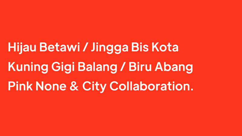
The alternates include variations like Lancip, which sharpens the ends of strokes for a more assertive tone; Lurus, which straightens and simplifies certain forms for a cleaner look; and Lingkar, which softens shapes with rounded details to convey friendliness.
These options allow the same typeface to shift personality depending on context, such as formal, neutral, or approachable, but without stepping outside the family.
The motivation behind creating Plus Jakarta Sans was more than just aesthetics.
For Jakarta, the font symbolized progress, accessibility, and inclusivity. A city that is home to millions and constantly reinventing itself needed a visual identity that could be flexible across different contexts, from government communication to public signage. The font was intended to unify the city’s image while at the same time showing openness by making it available to everyone.
By releasing it openly, the creators ensured that designers around the world could adopt it into their own projects, allowing Jakarta’s identity to reach far beyond its borders.
Since its release, Plus Jakarta Sans has gained traction internationally, becoming popular among designers who appreciate its balance of modern geometry and subtle personality.
It is available in multiple weights and alternate styles, making it a favorite not only for branding but also for digital environments like mobile apps and web design, where clarity and readability are crucial. By being open-source, it has been included in platforms like Google Fonts, which further amplified its reach and usage in global projects.
In many ways, Plus Jakarta Sans is an example of how type design can act as cultural representation.
It shows how a city can establish a visual language that is contemporary while still carrying symbolic weight. It is not just a set of letters but also an emblem of how design can bridge identity, functionality, and accessibility.
For Jakarta, it was a way to brand itself on the world stage, but for the broader design world, it became a practical and attractive typeface that continues to be adopted across disciplines.
The typeface was released as an open-source project under the SIL Open Font License, which allowed it to be freely used, modified, and shared by anyone. This decision not only gave Jakarta a contemporary typographic identity but also contributed something valuable to the broader design community worldwide.