Most people overlook typography. Most people think that a font is a font, nothing more, nothing less.
This is absolutely wrong. Newspaper agencies have used different types of fonts, like for their titles, articles and others, in order to keep people reading. Books for children not only use colorful fonts, but they also use easy-to-read sans serifs to children won't experience a hard time understanding the letters. Others use serifs to put a bit more character to their words.
The art of using typography to garner audience, has been going on long before digital media.
This time, during the modern days of technology and the internet, typography still plays a huge role in improving reading experience, increasing number of readership, and even make users happy.
And in the world that urges companies to continue innovating and experimenting on things, has made Microsoft to dump 'Calibri', a font the company has been using for at least 15 years.
Calibri has reigned on Microsoft products, as the default and the dominant font choice for many Microsoft systems.
It has appeared countless times in unformatted Word documents, PowerPoint presentations, and Excel spreadsheets.
But Microsoft is done with Calibri, and has officially announced in a blog post that it want to go "beyond Calibri."
We need to talk. What should our next default font be? pic.twitter.com/fV9thfdAr4
— Microsoft (@Microsoft) April 28, 2021
To replace Calibri as the default font for its Office 365 services, Microsoft is expecting to choose one out of the five sans serifs it deems fit.
And here, Microsoft is asking users to help it decide which one it should use.
"We need to talk. What should our next default font be?" asked Microsoft in a tweet.
"Dear Calibri, We've loved our time together, but we've outgrown this relationship."
The closing phrasing was stated as "Love your potential replacements," and the signature portion of the short letter included the list of the successor fonts.
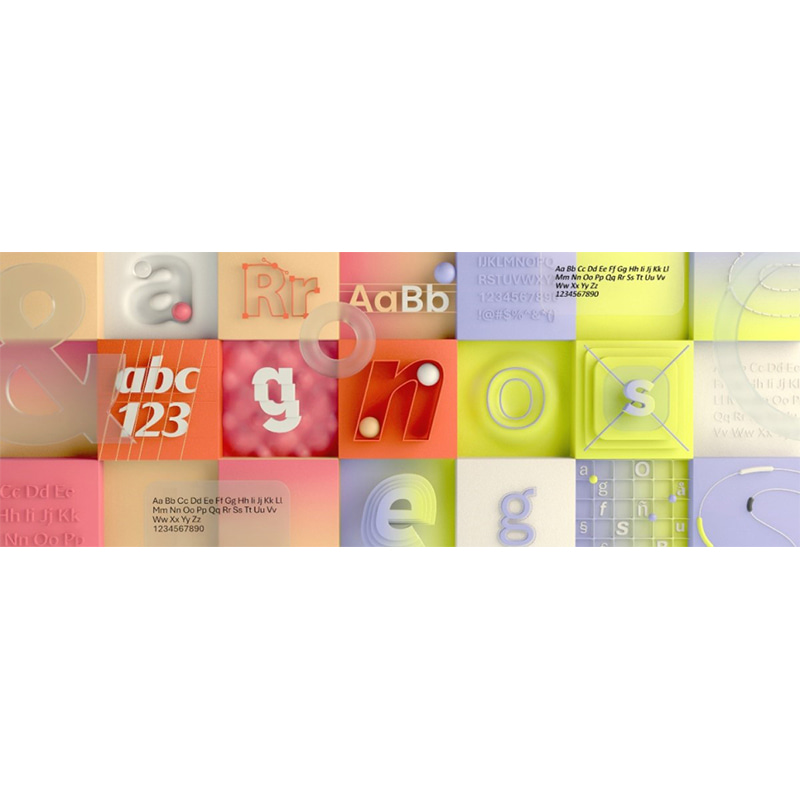
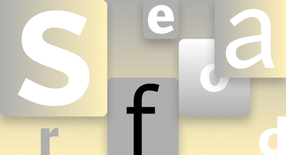
“To help us set a new direction, we’ve commissioned five original, custom fonts to eventually replace Calibri as the default. We’re excited to share these brand-new fonts with you today and would love your input. Head over to social and tell us your favorite,” the company said.
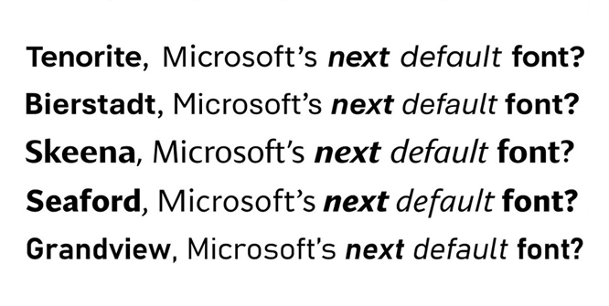
The fonts include Tenorite, Bierstadt, Skeena, Seaford and Grandview.
These fonts range from warm and friendly to blocky, precise and retro.


It should be noted that while Microsoft dumps Calibri, it does not mean that Calibri won't be a font users can choose when using Microsoft products.
Calibri shall continue to exist on Microsoft products, but as part of the company's massive font list.
Another way of saying it, users can still use Calibri in the same way they can use Times New Roman.
"Don't worry if the font you love best isn't chosen as the next default; all of them will be available in the font menu, alongside Calibri and your other favorite fonts in your Office apps in Microsoft 365 and beyond," the release said.
Microsoft here, only decommissions Calibri as its default font.
Before Calibri, Microsoft relied on Times New Roman as the default font for its Office apps until 2007. And when it announced Microsoft Office 2007, Microsoft replaced Times New Roman with Calibri font, and applied the font to all of its Office apps.
This time, it's Calibri's turn to be decommissioned.
Hearing this news, Calibri’s designer, Lucas de Groot, said that "it's a relief."
Calibri was created in early 2000s, and de Groot designed it to enhance screen reading.
“I designed it in quite a hurry,” he said. “I had some sketches already, so I adapted those and added these rounded corners to get some design feeling in it.”
During that time, displays used by computers lacked the pixel density to render fonts like they should be. For example, fonts with rounded corners were shown on screen as having stair-like design, not an arch.
In the year 2000, this changed with Microsoft’s new ClearType technology, which optimized the resolution on LCD screens, and made fonts like de Groot’s Calibri easier to read.
Microsoft loved Calibri so much that it opted to make it the default font starting Windows Vista in 2007.
Calibri never saw immense popularity, like Helvetica and some others. But it managed to live inside Microsoft without creating too many enemies.
“We’re not seeing customers turn against it, which does happen with fonts,” explained Simon Daniels, the principal program manager at Microsoft Office Design.
There's nothing wrong with Calibri.
"It (Calibri) has served us all well, but we believe it's time to evolve," Microsoft said.