
Developers spend most of their lives looking at codes. Here, the type of fonts they use can affect their productivity and the effectiveness of their coding skills.
Developer-centric fonts are usually easy on the eyes and simple. Their main purpose is to create an appealing way for coders to type and quickly read their creations with minimal mistakes.
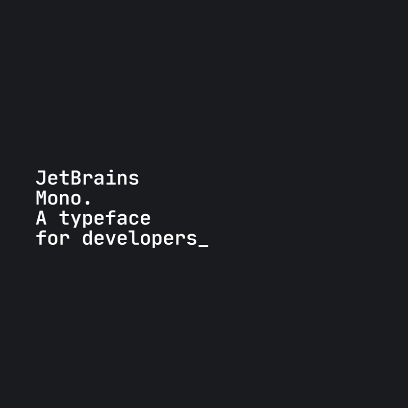
And here, the 'JetBrains Mono', is an open-source typeface specifically made for developers, made to prioritize readability and compactness.
Using this font, developers should be able to easily parse through their code, without the need to scale up the size of the font, and without having to make each line of code longer than necessary.
To make this happen, the makers of the font make the characters in JetBrains Mono slightly elongated.
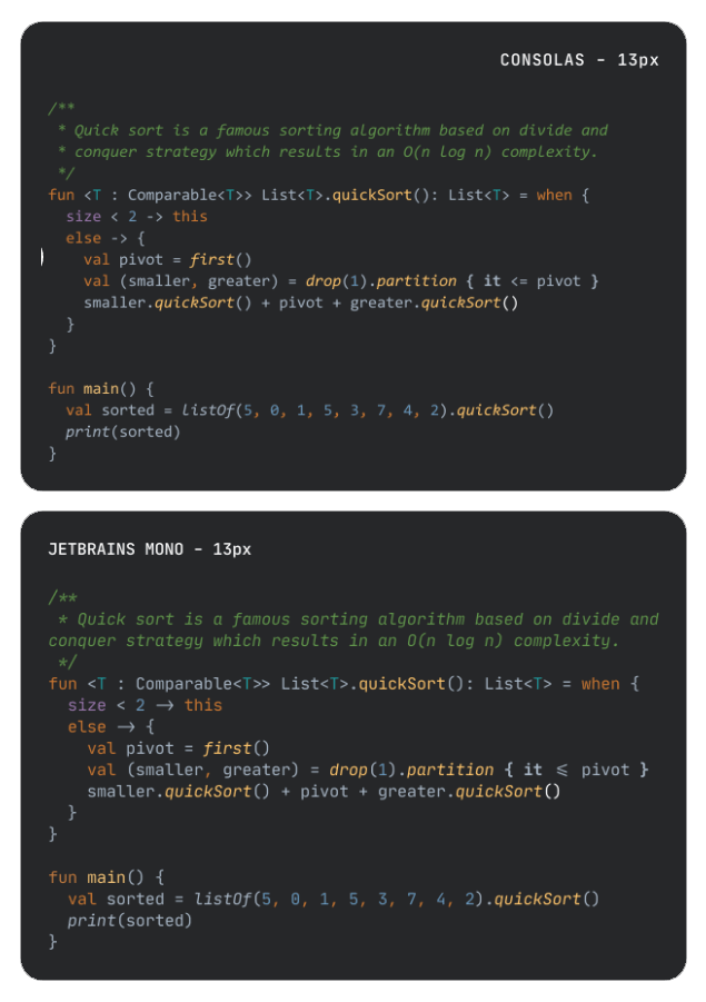
And to make sure the characters appear distinct, the font is designed to avoid mistaking “1” for an “l” or an “I,” or a “0” for an “o.” The comma’s shape also differs from that of the period, making them easier to tell apart at small sizes. The same holds true for derived symbols.
This should make reading experience a lot better. For developers where speed reading matter, the features should be useful.
According to JetBrains in a blog post:
"Our [developers'] eyes move along code in a very different way, often having to move vertically as often as they do horizontally, which is opposed to reading a book where they slide along the text always in the same direction."
Therefore, while working on JetBrains Mono we focused, among other things, on the issues that can cause eye fatigue during long sessions of working with code. We have considered things like the size and shape of letters; the amount of space between them, a balance naturally engineered in monospace fonts; unnecessary details and unclear distinctions between symbols, such as I’s and l’s for example; and programming ligatures when developing our font."
Other features of JetBrains Mono include:
- 4 weights with matching italics.
- Increased letter height for better reading.
- The shape of ovals approaches that of rectangular symbols to make text more clear-сut.
- A radical cut at the end of strokes fits the pixel grid better.
- Support for ligatures.
JetBrains Mono also supports cyrillic.
This means that the font supports various languages across Eurasia and various Slavic-, Turkic- and Persian-speaking countries in Eastern Europe, the Caucasus, Central Asia, and Northern Asia.
With the support, developers who work with foreign-speaking developers should have an easier time in putting their work together.
As a matter of fact, JetBrains Mono supports a total of 145 languages, including Spanish, German, Russian, and Finnish, at least at the moment of its release.
Related: The 'Cascadia Code' Font From Microsoft Is Designed To Appeal Developers