
When competing with a more popular product in the market, competitors need to adapt by introducing something more unique, or simply follow the cues.
This time at least, the latter is opted by Microsoft Advertising, as it is redesigning its interface to better align with the update Google Ads rolled out in 2018. The redesign should make Microsoft Advertising a lot familiar to users of Google Ads.
First of all, the most noticeable change is to the left-hand oriented navigation menus, that anchor the Google Ads-like interface and Overview pages with visual charts, for example.
According to Microsoft on its blog post:
"As a result, we’ve been working on a series of changes to modernize the look, feel, and functionality of our product."
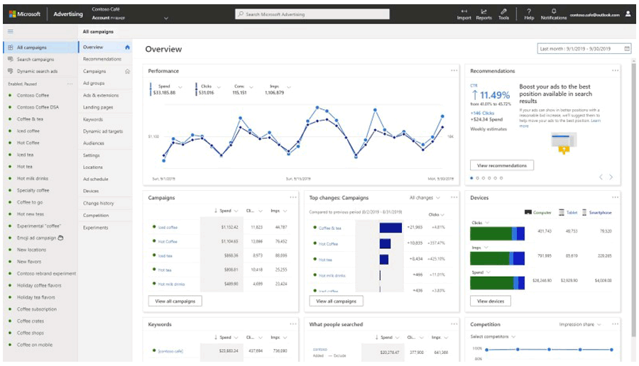
Going beyond the Google Ads'-like navigation menus, the redesigned Microsoft Advertising is also allowing users to "find that everything you need to reach your advertising goals will be right where you expect it to be."
For example, there is the global menu bar that appears on top, where users can switch accounts, access tools and settings, Google Import, and more.
"Overall, we've reorganized the navigation menus with a focus on your productivity. You will find that you will spend less time working through the clutter of tools and menus, allowing you to accomplish key tasks more quickly," said Microsoft.
Microsoft Advertising uses Microsoft Fluent design language, which boasts clean and light ecosystem. Microsoft is also including the product as part of this design language community.
This allows it to "continuously maintain the newest, most modern design principles for you."
The design also alters the spacing around page elements, tables, graphs, and forms in order to reduce clutters and distractions.

This design is familiar because it somehow resembles Google Ads. This in turn should bring relative parity between the interfaces of the two products.
While not everyone is happy with the design of Google Ads, a lot of people are already familiar with it. So here, Microsoft is not willing to bet big.
Microsoft is well aware that the closer the user experience is to Google Ads, the more it can reduce the friction for users. This in turn would translate to more advertisers in using the product.
So rather than redesigning Microsoft Advertising to be unlike Google Ads, Microsoft is redesigning it to be more similar.
This redesign is initially introduced as a test to limited amount of advertisers.
It should be noted that during this time, some features and pages may not yet be available for preview. For the time being, the redesign is available for the most used tasks, where Microsoft is expanding it with more features based on user feedback.
"During the preview period, you’ll have access to both the new and the previous Microsoft Advertising experiences, and you can easily switch between the two experiences at any time," said Microsoft.