People saw it coming, the inevitable of Google.
With the explosive rise of OpenAI's ChatGPT in late 2022, the world of artificial intelligence pivoted sharply towards powerful large language models. Google, long a pioneer in AI research turned a threatened search engine, responded in kind by evolving its previous chatbot experiments like Bard into a more robust platform—Gemini.
Launched in late 2023, Gemini wasn't just a rebranding; it was a full-scale effort to deliver state-of-the-art capabilities across reasoning, coding, and even multimedia generation.
It marked Google’s move to reassert its technical leadership in a space suddenly dominated by OpenAI’s conversational engines.
As Gemini matured, its reach expanded across Google's ecosystem—slipping into Google Assistant, Android Auto, Wear OS, Google TV, and more—signaling a company-wide shift to “AI-first.” The release of Android 16 and Material Design 3 further cemented this shift, embedding Gemini's conversational features and aesthetic into the fabric of the user experience.
Less about branding and more about unity, Gemini’s presence started to reflect a holistic, cohesive identity.
And there is nothing better to reflect this evolution than a logo redesign.
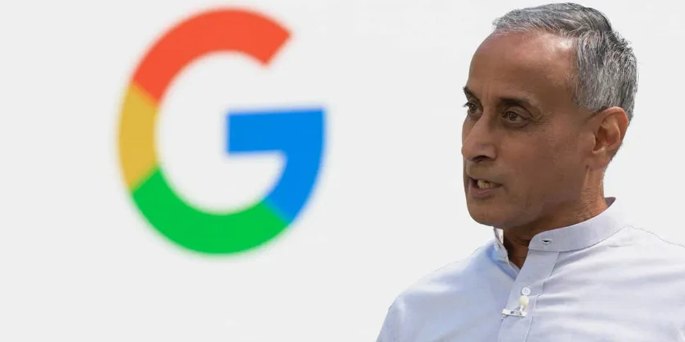
Whereas the original Gemini logo boasts a signature sparkle icon, Google has redesigned it to replace the old cool blue-purple gradient to the iconic four-color palette—blue, red, yellow, and green—synced with Google’s brand DNA.
Google also redesigned the logo with minor shape refinements earned it softer, friendlier curves.
Alongside the logo refresh, Google has also rolled out a notable update to the Gemini homescreen widget on Android—giving users both a visual and functional upgrade. While the new multi-color sparkle icon is the most obvious change, it’s what lies beneath that enhances the day-to-day experience.
The redesigned widget now includes direct shortcuts to Video and Screenshare, streamlining access to Gemini Live modes. It’s a thoughtful addition, especially for those using Gemini in hands-free or collaborative setups. Google has subtly emphasized these actions in smaller widget configurations, suggesting a stronger push toward real-time interaction.
Visually, the widget feels cleaner and less cluttered. Some sizes now display one fewer shortcut to avoid overwhelming the interface.
At 3×3 and larger, users still get the full arsenal: Open app (with keyboard ready), Voice input, Camera, Gallery, Files, Video, Screenshare, and Live—eight options packed into a neat layout.
Notably, the once-distinct “Ask Gemini” prompt has been replaced with a simpler “Gemini” bar, now styled without a separate Dynamic Color background, reinforcing a sleeker design.
To Google, this redesign is more than just a visual update—it’s a strategic declaration.
The new multi-color treatment, echoing the refreshed “G” icon unveiled in May 2025, seamlessly weaves Gemini into Google’s growing AI tapestry. It reinforces the message that Gemini isn’t a side project or a branding experiment—it’s the company’s definitive response to the age of large language models. The softened gradients and rounded contours align beautifully with Material Design 3’s visual philosophy: approachable, personal, and elegantly refined.
In essence, Gemini’s logo glow-up is more than cosmetic—it’s a quiet handshake between design and identity.
Every time users see that colorful sparkle, they’re not just interacting with a product.
They’re stepping into Google’s cohesive AI vision—where the form reflects the function, and every interface, from your phone to your car, whispers the same story: this is Google, reimagined through Gemini.
This update further aligns Gemini’s identity not just in appearance, but also in function—polished, intuitive, and undeniably Google.