Expect the Unexpected, always.
In a world driven by algorithms and aesthetics, the line between function and form blurs more each day. Technology no longer hides behind circuit boards—it dances in the glow of sleek interfaces and whispers through intuitive design. Just when people think you've seen it all, another new innovation emerges, challenging the norms and reshaping expectations.
In this ever-evolving landscape, one truth remains: the future belongs to those who dare to expect the unexpected.
A company changing its logo is equivalent to a new haircut. It’s more than just aesthetics. It’s a statement, a fresh first impression, and a subtle (or not-so-subtle) signal that something has evolved beneath the surface.
In the fast-moving world of technology and design, a logo change isn't just cosmetic; it's symbolic. It reflects progress, vision, and a readiness to embrace what's next. In an industry where standing still is falling behind, even the smallest design choice can carry powerful intent.
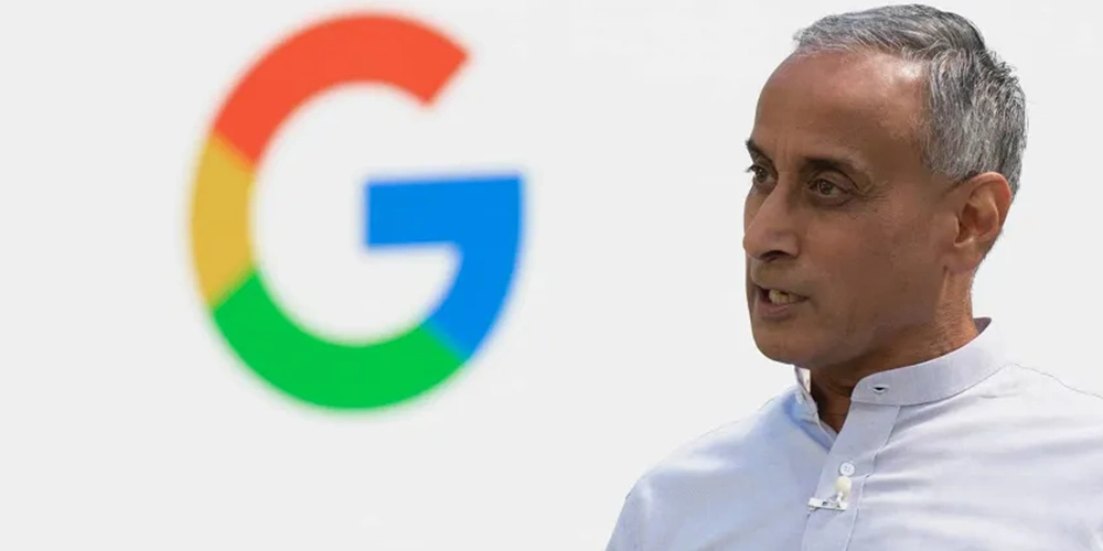
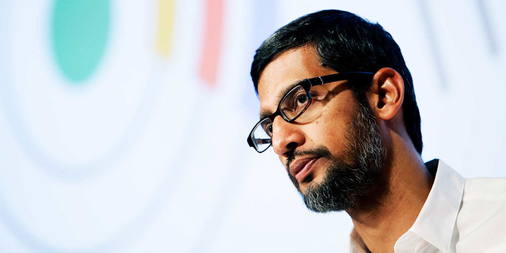
Google is a tech giant, thriving in its own level of sheer size. And this time, its logo suddenly looks different.
A gradient, an expected turn of an unexpected event.
It was back on September 1, 2015, when Google unveiled a major update to its logo—introducing the clean, geometric typeface known as Product Sans.
Alongside that shift, the iconic ‘G’ favicon also got a makeover, moving from a lowercase white ‘g’ on a blue background to a bold, circular capital 'G' dressed in Google’s signature color palette.
Now, in 2025—nearly a decade later—Google is refreshing the ‘G’ once again.
But this time, it's not about sharper edges or new shapes. Instead, it’s all about flow. The familiar four solid colors aren't distinct anymore because Google is giving them smooth gradients: red fades into yellow, yellow into green, and green into blue.
The result is a more fluid, vibrant, and modern look.
Initially, Google introduces the redesigned logo in an update to its Google Search app for iOS.
The logo came to Android with Google app 16.18 (beta).
It’s subtle, yet undeniably fresh—just enough to say that Google is evolving, even when people don't expect the change.
But given by Google's well-known drive for constant change, this logo redesign shouldn't be surprising.
In the world where Google is pushing hard towards developing AI, the logo is expected.
After all, the evolution feels perfectly aligned with Google's current design language, echoing the Gemini gradient and the dynamic visuals found in AI Mode on Search.