
YouTube is rolling out a new look across its platform, one that feels more modern, fluid, and less intrusive.
The update, which is rolling out globally across all platforms it's available at, marks one of the most notable interface refinements the company has made in years. While not a dramatic overhaul, the collection of smaller, thoughtful tweaks reflects YouTube’s ongoing effort to make watching and interacting with videos feel more natural, immersive, and delightful.
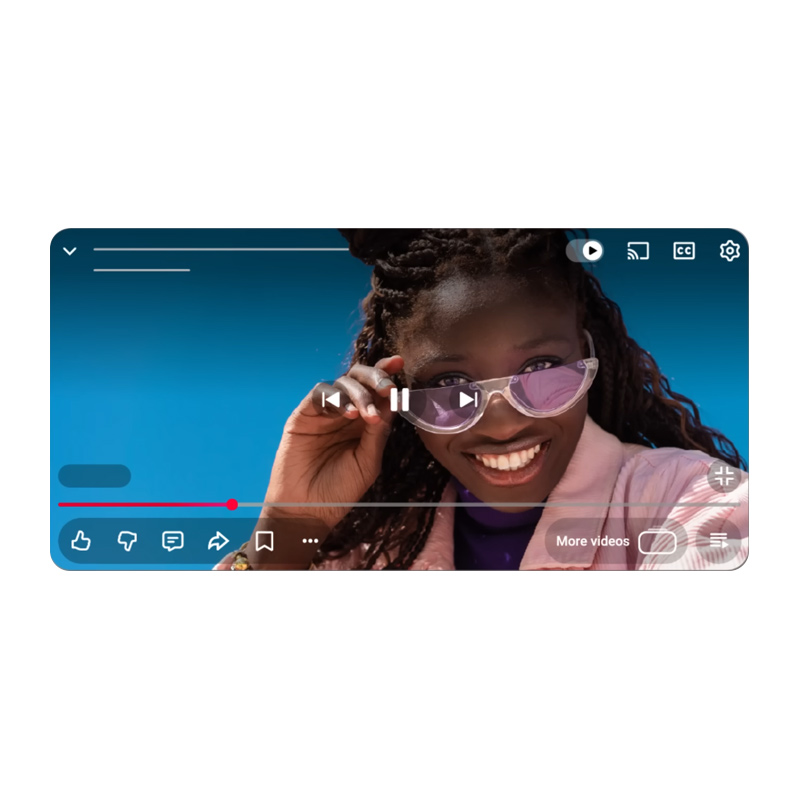
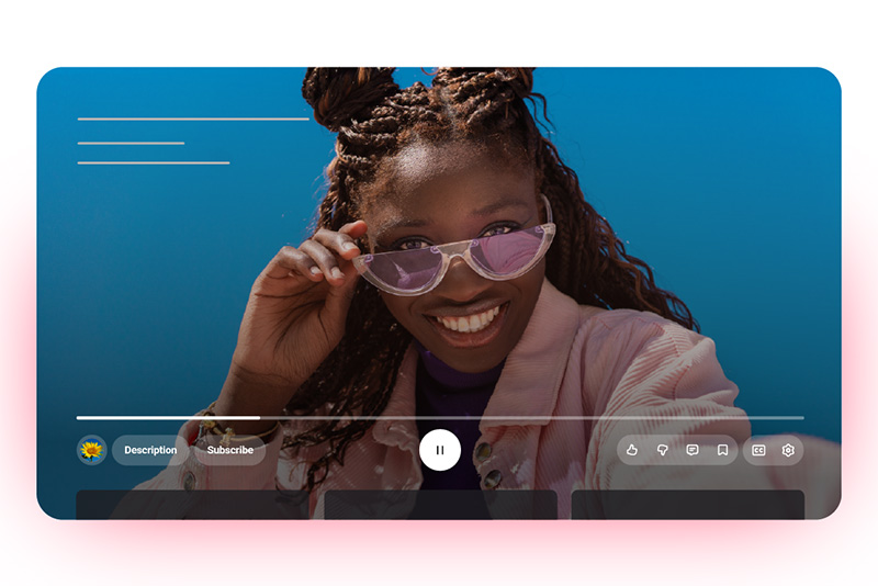
At the heart of the update is a redesigned video player that’s cleaner and more immersive.
The familiar solid buttons and progress bars have been replaced with translucent, rounded icons that let more of the video itself show through.
On televisions, the layout has been rearranged so that details like the title and channel now appear at the top-left corner, while controls such as Like, Dislike, Comments, and Save are grouped neatly below the progress bar.
On mobile and desktop, the new player aims to reduce clutter while keeping essential controls easily reachable.
Another noticeable improvement is the updated “double-tap to seek” gesture.
The feature, which allows viewers to skip forward or backward, now uses smoother animations and a less obtrusive text overlay to show how many seconds are being skipped. The timing aligns with the user’s chosen skip duration, whether it's five, ten, or fifteen seconds, making the feature feel more intuitive and polished. It’s a subtle refinement, but one that improves the overall flow of watching videos.
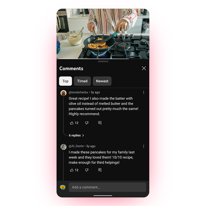
Commenting is also getting a major upgrade.
YouTube is introducing a structured, threaded system that supports up to three levels of replies, allowing users to follow conversations more easily without endless scrolling.
Once a thread reaches its third level, additional responses are neatly flattened for readability. This change brings much-needed organization to the chaotic comment sections, creating a more focused reading experience for users who enjoy engaging with creators and other viewers.
Beyond the interface, YouTube has also added small touches that make interactions feel more expressive.
Liking a video now triggers custom animations based on the content category, such as a musical note for songs, or a visual cue tied to the sport for game clips.
These playful elements don’t change how the platform functions, but they do make engagement feel a bit more alive. Similarly, saving videos to playlists or the "Watch Later" list now comes with smoother transitions and a cleaner design, simplifying the process while making it visually pleasing.
On mobile devices, switching between tabs such as Home, Shorts, and Subscriptions has become smoother thanks to refined motion design.
The new animations create a sense of continuity and speed, blending movement in a way that feels more cohesive. It’s part of YouTube’s broader effort to make the app more dynamic — less like a collection of menus, and more like a single flowing experience.
Not all reactions have been positive, of course.
Early user feedback has been mixed, with some viewers saying the new design feels less readable or too bright, while others appreciate its minimalism. Many of the complaints seem tied to muscle memory and contrast preferences rather than functionality.
Over time, as viewers adjust, the new interface may come to feel more natural, and perhaps even invisible, which is often the sign of good design.
This update represents YouTube’s recognition that its audience watches across more screens than ever before, from smartphones to large televisions. The company’s challenge is to create an experience that feels consistent across all of them, without overwhelming users. By focusing on translucency, spacing, and smoother transitions, YouTube is embracing a more polished aesthetic that matches the creativity of the content it hosts.
Ultimately, YouTube’s new look is less about change for its own sake and more about refinement.
This is that kind of update that is quiet, but suggests an evolution to make something familiar feel fresh again.