

A design language is a comprehensive set of rules, principles, and guidelines that dictate the visual and interactive elements of a company's products, services, and brand.
It's essentially the "grammar and vocabulary" of a brand's visual communication, ensuring consistency, coherence, and a recognizable identity across all touchpoints. In the early 2000s, Apple embraced skeuomorphic design, crafting interfaces with rich textures and realistic embellishments—think leather-bound calendars and wooden bookshelves in iCal and Bookshelf.
This approach aimed to make digital experiences feel familiar and intuitive.
By 2013, with the launch of iOS 7 when former Apple Chief Design Officer Jony Ive took over the design of software as well as hardware, Apple pivoted dramatically to a flat, minimalist aesthetic. Gone were the faux 3D effects; instead, crisp shapes, vibrant colors, and simple typography took center stage. This marked a defining visual shift toward clarity and modernism in their software.
In 2020, macOS Big Sur introduced what was sometimes known as “material design”, inspired by iOS. UI elements became more layered and cohesive, with rounded corners, translucent panels, and gentle shadows—creating a tactile yet digital feel.
Now, during its WWDC 2025, Apple is advancing again—this time toward dynamic translucency and optical depth.
Apple calls the design language the 'Liquid Glass.'
According to Alan Dye, VP of Human Interface at Apple:
"And for the first time, we're introducing a universal design across our platforms. This unified design language creates a more harmonious experience as you move between products, while maintaining the qualities that make each unique."
"Inspired by the physicality and richness of visionOS, we challenged ourselves to make something purely digital feel natural and alive, from how it looks to how it feels as it dynamically responds to touch."
"To achieve this, we began by rethinking the fundamental elements that make up our software, and it starts with an entirely new expressive material we call Liquid Glass."
The core principle of this design language is a translucent, refraction-rich material that adapts to content, context, and movement—creating a sense of depth and fluidity that was previously locked to hardware or futuristic AR/VR previews.
Drawing inspiration from the visual depth of visionOS, it creates a UI language that feels three-dimensional and interactive—a stepping stone toward more immersive, mixed-reality experiences.
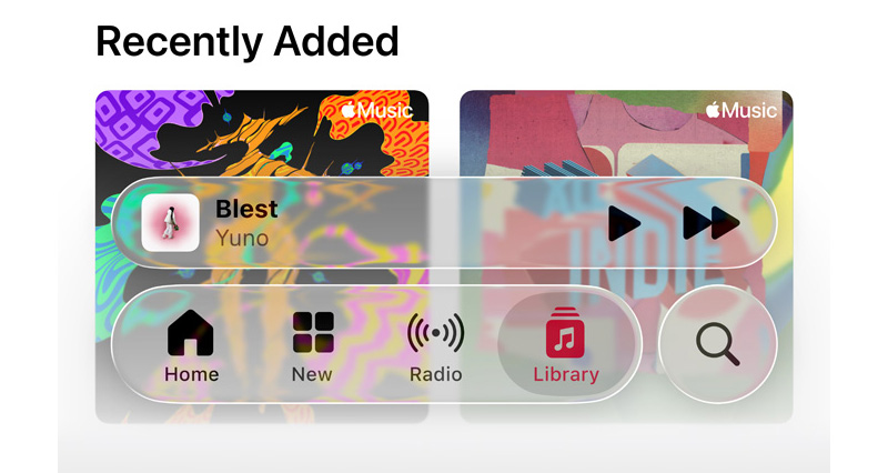
For example, the dynamic and translucent aesthetic can mimic how real glass interacts with light and surroundings. It's not just about appearance, because the design makes elements to be able to adapt fluidly, morphing and responding to content and user interaction.
The Liquid Glass design also enables a third way to view app icons on the iPhone home screen. Besides the existing Light and Dark modes, the design introduces an All Clear look, where every icon is clear glass with no color.
While transparency and translucency is the defining characteristic of Liquid Glass, the character is actually liquid-like.
The 'Glass' in the design introduces a glass-like effect in the real world in the way it deals with light and color of objects behind and near controls. The 'Liquid' part on the other hand refers to how elements can merge and adapt -- dynamically morphing.
In an example, Apple showed how the glassy time numerals on an iPhone lock screen can be stretched to accommodate the image of a dog and even shrunk as the image shifted to accommodate incoming notifications.

The idea is to bring this experience across iPhone, iPad, Mac, Watch, and Apple TV.
Across devices, UI elements—from sidebars and control centers to notifications and tab bars—now boast dynamic, glass-like transparency that can shimmer, refract, and respond to gestures.
These components subtly distort backgrounds and shift with gestures, lending a sense of realism and physicality that lies between digital and natural.
Liquid Glass represents more than a visual refresh—it’s a cornerstone of Apple’s push toward spatial computing.
From a branding standpoint, this is the most cohesive design shift since iOS 7, now spanning phones, laptops, watches, and TVs. Apple’s new year-based naming convention (iOS 26, tvOS 26) underscores their commitment to unified, annual design progress.
In all, Apple’s Liquid Glass is a shimmering leap forward in UI design—an elegant, intentional evolution of their digital ecosystem. As it rolls out in the iOS 26 public beta this July and more widely this fall, it promises to reshape how users experience everyday tasks—from checking messages to watching movies on Apple TV—all with a touch of luminous vibrancy.
With developer tools already live and testers buzzing, the real test lies in third-party adoption and everyday usability.
We’ve put together a design talk that does a deep dive into the thinking, philosophy, and principles behind Liquid Glass. If you’re interested in learning more about it and how to use it, check it out! https://t.co/hwMqdJjWEF
— Chan Karunamuni (@chan_k) June 9, 2025