

A font is a set of characters that share a common design. These characters include letters, numbers, punctuation marks, and symbols.
In the tech world, not only that fonts play a crucial role in readability and aesthetics, because when selecting a font, the font must match the content and the tone of the message, and compatible for intended usage. Fonts are important for both digital media and brand identity.
Spotify is a digital music, podcast, and video streaming service that gives users access to millions of songs and other content from artists all over the world.
Launched in 2008 by a Swedish company, it has since become "unique and personal" to listeners, as well as artists and creators.
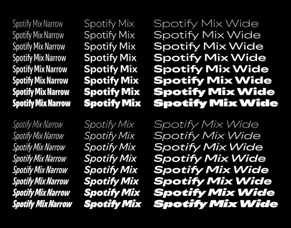
In order to evolve, and built an experience that reflects the vibrancy and creativity of its community, Spotify introduces a new font it calls 'Spotify Mix.'
Unlike traditional fonts out there, Spotify Mix is a genre-blending fusion of font styles, line weights, and unexpected details.

Before this, Spotify has been using a typeface called Circular, in its in-app and desktop experiences.
But this font is an existing font, and isn't unique to the brand
This time, Spotify wants to change that with Spotify Mix, which is a custom font, bespoke to Spotify's needs.
Spotify Mix that replaces Circular, was designed in partnership with Berlin-based foundry Dinamo Typefaces over the course of a year and a half.
And that it's much more than meets the eye.
According to Rasmus Wängelin, Spotify’s global head of brand design, Circular’s presets offered limited flexibility for conveying different moods and emotions.
"We built a lot of equity [with Circular], and it works really well inside of the app," Wängelin said.
"But at the same time, it has been limiting for us when it comes to expression. We work with so many different audiences—creators on our platform, our users, our advertisers—so it’s important that we show up in authentic ways in different spaces."
To design this Spotify Mix, the team took a deep dive into the history of typefaces across the audio space, sifting through various music posters, album art, and other marketing assets from jazz musicians and hip-hop groups to rock ’n’ roll stars.
The body of fonts they found was so vast that they decided one style couldn’t encompass the full history they wanted to evoke.
So instead of designing one typeface, the team decided to mix the elements from various typography, into one product.
For example, the upper and lowercase 'S' has a design inspired from traditional humanist letterforms, whereas the letter 'J' and 'K' fit more within the angular grotesque font family.
The letter 'T' is connected from right to left by a swooping line, and that the letter 'A', 'D' and 'E' have negative space that would typically be a circle.
Together, these touches are meant to give the words flow and rhythm, just like the songs they describe.
What's more, the typeface can condensed, bold-faced, italicized, and stretched to span across genres and aesthetics.
As a result of this, the font can be used from anything between ultra-sleek to maximalist.
According to Wängelin, the idea is to create a typeface with longevity, by "avoiding trends at all costs."
"[A successful font] needs to have two things: functionality and emotion," he explained.
"You can create a typeface that is super functional and extremely readable, but it’s just not that nice to look at. Or you can go very wild and create a typeface that is really out there, but then when you start putting it inside of the app, it just doesn’t work—it’s hard to read. When you manage to find that intersection of emotion and function, that’s when you’re successful with this type of work."
Spotify plans to roll out the change gradually, which include updating the company’s wordmark, swapping in the font on both its app and web player, and launching marketing materials for the new font.