Apple has long been known as the pioneer of technology design, the company that doesn’t just follow trends but creates them.
From the glossy hardware curves of the iMac G3 to the clean minimalism of the iPhone, Apple’s design philosophy has always shaped the visual language of modern technology. Its latest evolution, called 'Liquid Glass,' aims to do the same once more.
Apple wants it to be the design language that blends light, depth, and motion to create an interface that feels alive. It’s Apple’s next big statement, and perhaps its most ambitious one since the leap to flat design more than a decade ago.
Liquid Glass is defined by its dynamic translucency, optical layering, and a sense of material realism that doesn’t try to mimic the physical world but instead refines how digital surfaces behave.
Panels, buttons, and menus appear to float over one another like layers of polished glass, catching light as users scroll or move through apps. It’s visually rich, elegant, and unmistakably Apple.
But as with any bold design shift, not everyone is enchanted by the look. Some users find the new translucency harder on the eyes, claiming that the blurred backgrounds make text and icons less readable, especially in bright or complex wallpapers. For all its beauty, Liquid Glass can sometimes feel more ornamental than practical.
Instead of doubling down, Apple listened.
With iOS 26.1, the company has done something uncharacteristically flexible: it’s giving users the power to choose how much of the new design they actually see.
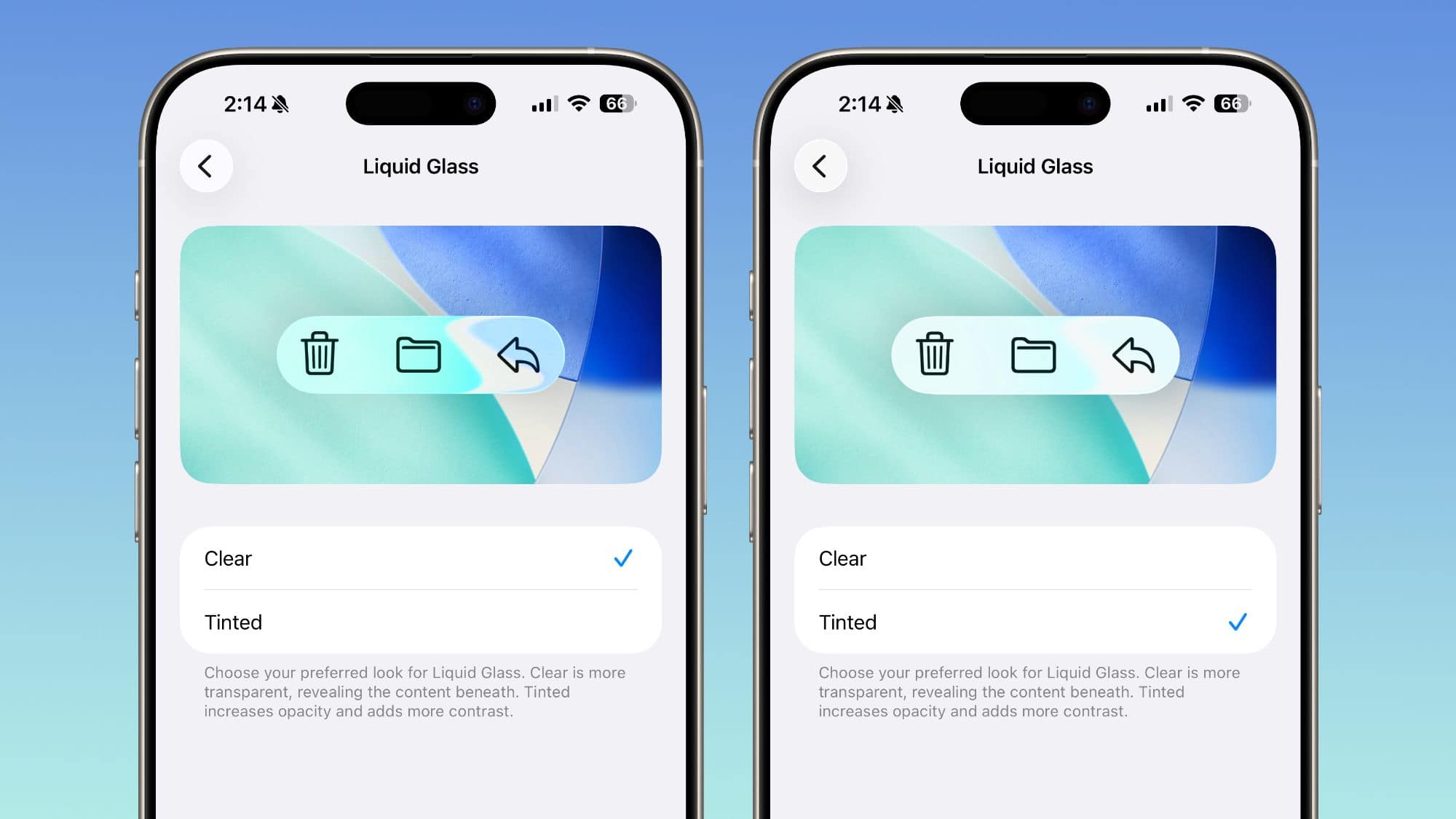
In the settings menu under Display & Brightness > Liquid Glass, users can now toggle between two main options: 'Clear' and 'Tinted.'
The Clear setting preserves the full visual effect, letting underlying content shine through the glassy layers. Tinted, meanwhile, adds a frosted filter that increases opacity and contrast, making elements easier to distinguish while still keeping the new aesthetic intact. This means users can tone down the skeuomorphic appeal of Liquid Glass, and return real close to the old experience of Apple design.
Apple even extends this customization to different parts of the system.
Users can adjust transparency for the Home Screen icons, Notification Center, and search bars, or fine-tune the look through accessibility settings under Reduce Transparency.
It’s a subtle but meaningful change: one that reflects a more human-centered design approach.
With the tweak, Apple is no longer dictating the experience. Instead, it's offering users the tools to shape it.

Liquid Glass design introduces a design philosophy that is a significant departure from the company’s earlier design eras.
In the early 2000s, Apple embraced skeuomorphism, but in a way that interfaces looked like real-world objects, complete with leather textures and wooden shelves. That era gave users familiarity and warmth but eventually began to feel dated. Then came the minimalist revolution of iOS 7 in 2013, when Jony Ive stripped everything back to its essence: flat icons, thin fonts, pure color.
By 2020, with macOS Big Sur, Apple merged the physical and digital once again with translucent materials, rounded corners, and gentle shadows. This introduced a soft realism that served as a bridge between flat design and what would become Liquid Glass.
Now, Liquid Glass pushes that lineage further.
It’s more fluid, more immersive, and distinctly modern.
However, soon after the design was rolled out, mixed reviews started pouring in. This was when Apple realized that beauty is subjective. Where once the company’s design philosophy was almost absolute, dictating a vision for users to adapt to, the tweak shows that Apple is embracing personalization, probably more than ever.
The ability to fine-tune Liquid Glass transparency may seem small, but it represents Apple acknowledging that a single aesthetic doesn’t fit every user, screen, or lighting condition.
Alongside the design tweaks, iOS 26.1 also introduces a range of quality-of-life improvements. They include a new security feature called 'Background Security Improvements,' which automatically installs small protective updates between major releases. Apple also added a toggle to disable the Lock Screen swipe gesture that opens the Camera app. The update further refines Apple Music with intuitive swipe gestures to skip tracks, and it introduces expanded language support for both Live Translation and Apple Intelligence, bringing real-time translation and AI assistance to more users around the world. Even smaller refinements, like improved FaceTime audio in low-bandwidth conditions, a redesigned video scrubbing bar in Photos, and new alarm controls that require a swipe to dismiss, add polish to the everyday experience.
Taken together, iOS 26.1 is less about introducing headline-grabbing features and more about refinement.
