
A logo is arguably the most important aspect of any brand. It's a short and often beautiful language, intended to show the personality of a brand and instantly convey what the company does at a glance. It gives identity - it's something that should be able to represent you professionally.
Every business, big or small, needs a logo to be recognized. It's one of the first items prospects will see before ever purchasing anything from you. So as a thing that comes forward for every business, a logo should be able to tell the story of a brand in such a way that it’s clear and straight to the point.
While its importance can never be overstated, not every business can get it right. There are mistakes that are common when designing a logo.
The reason is because designing a logo is tough, and even the largest organizations can get it wrong. Logo design is not an exact science, but involves a good level of creativity, knowledge on how to transmit a message using colors and imagery, and an amount of theoretical knowledge.
Logo mistakes can often result to failure of a business, embarrassment and more. These are the least a business wants in order to survive.
Below is a list of common mistakes when designing a logo.
Neglecting The Brand

Your brand should be first thing in mind when its logo is designed. A logo should be designed for customers and not yourself.
Before a logo is designed, you need to know what your customers need. The logo design should fit their requirement, clear and ideal in writing. A logo is more than just an image as it needs to tell a story and must be able to effectively communicate your brand to your customers.
Having the ability to represent your brand is the first thing a logo requires.
Following Gimmicks And Trends

In terms of design, there is always the time that some new trends and fads are taking place. But just like any trends that come, very few last. So from a logo design to web design or even fashion and others, design trend tends to change with time.
While logos that are created to suit well with an ongoing trend can be stunning and indeed attractive, the question that should be asked is: "will it last?"
Getting a new logo is like an investment. It should last you years and not just this season. You logo should be able to stand against time for decades or maybe for eternity. Logo is a brand's image, and should be well preserved as something that is recognizable. Frequently changing your logo will make your brand's image changes each time.
For that reason, you need to know how your brand is to be presented.
2. Too Simple Or Too Complex

Simple logos are more memorable and complex logos can leave people astonished. Logos can simple, but too simple won't make them stand out. On the other hand, logos can also be abstract, but too abstract will make them hard to leave its mark.
Complex logos for example, may not be able to be used in all scenarios. Such as print of web; when they're scaled down, they will lose their details. So not only that a logo should be easy to understand, it should also be able to be reproduced at any size or at any medium without losing any of its impact.
However, logos need to be unique and conceptual.
To have a simple logo, you don't need to be minimal. It's a good idea to ensure that all of its components work well together while not much colors or font clashes happen.
A logo should be well made and able to distinguish itself from others. But at the same time, it should be memorable and easy for viewers to recognize instantly.
Raster And Low-Quality Images
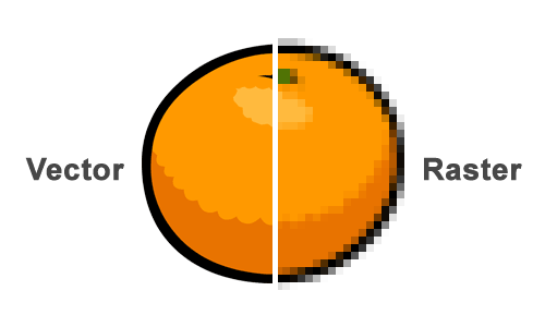
Logo should be able to be reproduced at its highest quality no matter where it is located. For example, since your logo can be used anywhere from the web to print media and business card to billboard, it should be clear and crisp in different sizes.
When designing a logo, you need to make sure that image quality is included as one of your priorities.
The best solution is to use vector graphics instead of raster. Editing tools such as Adobe's Illustrator and CorelDraw can create images that use mathematically precise points. Raster images like .jpeg images consist of pixels. While they can be great to reproduce images that are rich in colors such as photos, they aren't suited for logos.
Zooming on raster images will blur and pixelate them, and this will certainly make logos look imperfect and not professionally made. It can also make your brand looks cheap.
So when creating a logo, visual consistency is important. This is the reason why image quality is something that you need to pay great attention to.
However, bear in mind that because of the mathematical way that vectors handle data, they're not perfect for reproducing detailed colors like raster. So it's advised that you don't put much styling events, such as drop shadows, on your logo.
Copying Successful Brands

Imitating others may mean giving respect. But in design, copying others' design isn't at all professional and will certainly impact your brand's image.
As a start, design involves creativity at its highest level. If a design is copied or created based on others' work, people won't see the design as something unique. In many ways, people will see your brand identical to "lazy" and "not at all creative."
Furthermore, people will see your brand as something that attempts to ride on the back of another's success. This isn't how a brand should be presented. While it's okay to be inspired, but one of the reasons why logos fail is because they resemble someone else's logo. A logo that blatantly copy others wouldn't be able to connect with its audience.
So if you're designing a logo, you need to do thorough research and always be original. This way, your customers will thank you for it, and you won't end up in a case of infringing other's intellectual property.
Being unique here means to have your own voice and don't echo others. The more you mimic others' design, the further you are from your own identity.
Choosing Cheap And Easy Ways

There is always a cheap and easy way around a problem. This is true to many cases including designing a logo. However, cheap and easy don't translate to great, unique and professional.
First of all, cheap logos can end up being more expensive in a long run. Businesses that didn't want to invest in creating a logo, can eventually make them fail in achieving their goals. The reason for this is simple: a logo should be professionally made and uniquely able to distinguish itself from others by its ability to convey a brand's image. Cheap and easily created logo don't have these luxuries.
Creating a logo needs research and time. So having a shortcut to do the design won't make your logo something worth its name.
If you're not an expert in design, you may need to hire professionals for the job. But always remember that you need to get what you pay for. You should be willing to spend a good amount of money to get a great logo. But, how much you pay is never a guarantee of a good logo.
Relying On Effects

Colorful logos can certainly catch many eyes. But overdoing the colors can backfire. This is the reason why your logo should be designed with the least colors possible.
Some famous logo are created in black and white. However, others use colors to highlight important parts of the logo. Logos that hit success are the ones that appeal the eyes, but can blend them all in a neat manner.
A good logo doesn't use too many colors, too many font styles and use different filters. The reason is because too many of them will clutter the logo, and won't make it able to convey its message when reproduced in different size or when printed in black and white.
Some designers cannot wait to add colors to their designs, and some even rely on colors completely. Choosing colors should be your last decision. A good logo design usually starts in black and white. This way, the designer can see whether the logo can look as good in two-tones or in colors.
Poor Font Choice
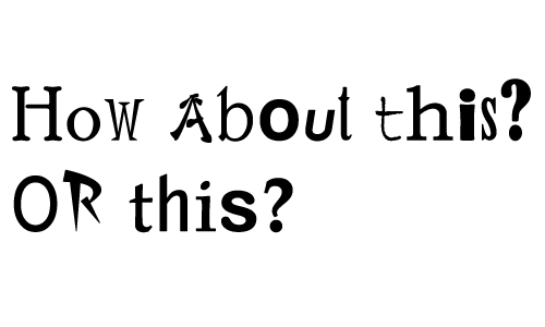
When in comes to designing a logo, choosing the right font is one of the most important decision a designer should make. More often than not, a logo can fail because of poor font choice.
Finding the perfect font to match a logo is all about matching the font with the icon. This attempt can be tricky and difficult to master. For example, if the match is too close, the icon and the font will compete each other for attention. This will make viewers unable to see your exact logo. On the other hand, the complete opposite will make the viewer unable to know where to focus.
The key in finding the perfect font is to find the right balance.
Every typeface has its own personality traits. So if you choose a font that doesn't reflect the icon's characteristics, the whole logo won't be able to convey its message.
Bad fonts are often chosen simply because the designer isn't taking fonts seriously enough. Some designers simply think of fonts as an afterthought.
Another thing that you should know is the number of fonts. Too many fonts will ruin your logo as viewers seeing too many at once will be confused. A great logo works best with a maximum of two fonts of different weights
.
Restricting the number of fonts to this number greatly improves the legibility of a logo design and improves brand recognition.