GO-JEK started as a solution for hailing two-wheel taxis. Fast forward, it has become a lot more than that.
In fact, it offers much more, with 22 different kinds of on-demand services across transport, payments, food, logistics, entertainment and lifestyle. GO-JEK claims to be Indonesia's and its surrounding region's app with the largest array of such offerings on a single platform.
In other words, GO-JEK is already a 'super app'.
For this reason, it needed a new representation of its brand, said Go-Jek founder and CEO Nadiem Makarim.
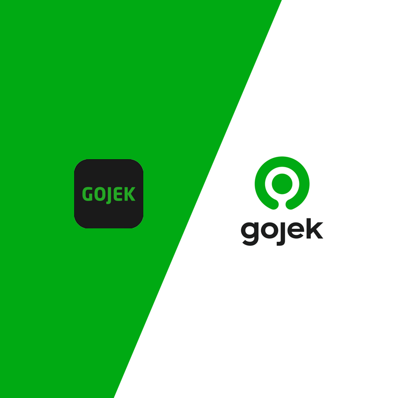
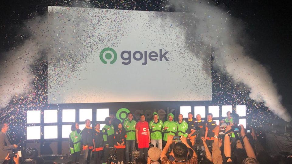
Originally, GO-JEK's logo illustrated a motorcycle. On July 22, 2019, the company unveiled a redesigned logo, which nicknamed as 'Solv'.
Taken from the English word 'solve', the redesigned logo symbolized the company's transformation from being just a ride-hailing service, to an app that literally provides tons of solutions for everyday hassles.
The redesigned logo looks like a bullseye, but has an incomplete outer circle. It showcases its famous green color, combined with an also redesigned typeface, without the dash (Gojek, not anymore GO-JEK).
The philosophy of the redesigned logo also makes it capable of being interpreted as a variety of things.
For example, it looks like a power button symbol. This is in line with the company's mission to empower its users. It also looks like a magnifying glass icon, which emphasizes Gojek's readiness to answer whatever its users need.
What appears to be an incomplete circle, is to make the logo look like a pin, which is used on many digital maps. This is to show how Gojek wants to be present wherever its users are.
It also appears like a motorcyclist. When seen from an aerial view, the dot looks like a driver's helmet, and the incomplete circle looks like the driver's two arms associated with a motorcyclist holding the handlebar.
"This reflects Gojek’s Super App proposition, with its multitude of offerings," said the company on its blog, showcasing how the redesigned logo is "easily recognizable and versatile".
"The new logo is inspired by the reason why Gojek exists, to solve problems through technology. It symbolizes one button for all," Nadiem said.
Gojek Group co-founder Kevin Aluwi, said that:
"We have been on an extraordinary journey over the past four years and the new brand is designed to embody everything that has been achieved throughout that period."
The redesign simply hallmarks Gojek's evolution from an Indonesian ride-hailing company to a Southeast Asian super app.
And not only that, as Gojek's rebrand not only covers a new logo, but also a redesigned user interface.
For example, the app has been updated with a fresh palette and more visually-striking colors and fonts, according to the company. The app for its driver-partners is also getting new looks, in addition to a number of new features such as a seven-day income summary that provides an overview of a driver’s completed trips in the past week.
Founded in Jakarta in 2010 with a fleet of 20 motorbike drivers, the business has grown rapidly since launching its app in 2015. And at this time, Gojek has more than 2 million driver-partners, 400,000 merchant partners and 60,000 service providers across Southeast Asia in its customer base.
And here, the rebrand sets the course for Gojek’s “next chapter of growth” across Southeast Asia, said Gojek Group president Andre Soelistyo.
Gojek which already operates in Indonesia, Singapore, Thailand and Vietnam. With the rebrand, it is simply ready for more.