Skip to main content
Eyerys
Main navigation
Latest News
AI
Business
Browser
Mobile
Articles
About
Search
Breadcrumb
Home
Articles
Playing with Colors
Graphic Design
Tips
TRENDING NOW
'Andini Permata': What Began As An Innocent Dance Spiraled into A Sinister Internet Notorious Obsession
The Leaked Sex Tapes Of Joal Ong And His Girlfriends, And How It Shocked Singapore
MDPOPE, The Start Of The 'Most Disturbed Person On Planet Earth' Saga
The Return Of Lil Tay, Not As A Child Influencer, But As An OnlyFans Creator, Soon After Turning 18
The Story Of The Nerdy Escorts Cashing In On Silicon Valley's AI Boom: What Happens During 'Single Until Series B'
Fresh Updates
340 Million OnlyFans 'Mega Leak' Was Actually a Mashup of Public Profiles and Older Data Breaches, Research Finds
18 minutes ago
OpenAI Launches ChatGPT 'Writing Tones' and Simplifies Its Social Media Handle to 'ChatGPT'
1 hour ago
Anthropic Introduces 'Claude Opus 5,' Bringing Near-Fable 5 Capability at Lower Cost as Mythos 5 Keeps Its Lead in Cybersecurity
1 hour ago
Jack Dorsey's Block Launches 'Buzz,' an Open-Source Workspace Where AI Agents Collaborate Alongside Humans
1 hour ago
Sony Is Killing Physical PlayStation Game Discs, Threatening a Thriving $7 Billion Resale Market
18 hours ago
Creating AI in Their Own Image, Hating Each Other, Pursuing the 'Imperial Agenda,' and Selling the Myth That Something Could Go Wrong
The Future of AI Is Not Competing Models, But One Connected Superintelligence: 'We by Definition Are Connecting Them'
AI Is Like A 'Five-Layer Cake,' And Anything That Produces Energy Will Get Funded
When 'AI Is Advancing At A Lightning Pace,' AI Is The Hobbit, Government Is The Treebeard
The Ship of Digital Freedom 'Has Already Hit the Iceberg.' We're Sinking 'Without Even Realizing It'
'Maybe You're A Dog. I Don't Care': How Introverts Are Quietly Running The Modern Internet
'God Complex' And AI Dystopia Claims By CEOs 'Are Not Helpful'
On Social Media, 'Some Gets Viral Some Does Not,' And 'People Just Pick Whatever They Want To Pick'
OpenClaw Is A 'Sandbox' Where People Can Play, And That It Moves AI Into 'Something That Is Fun, Useful, And Weird'
From 'Hierarchy To Intelligence,' A Company Should No Longer Be Viewed As A Human Hierarchy, But A 'Mini-AGI'
'I Think We've Achieved AGI,' And Why The Benchmark Keeps Shifting
When AI Is Taking Over Smartphones, 'I Think People Should Understand That Apps Are Going To Disappear'
Apple Is A 'Party Of One,' Thanks To The People And The Culture
With AI, Apps Will Have No Chance. 'I Think 80% Of Them Are Going Away'
AI Has Advanced So Far That 'We Don't Know If The Models Are Conscious'
AIs Learn From Mistakes, 'I Think The Concept Of Grace Is Maybe Important For Models'
When It Comes To AI, 'The Horse Is Bolting,' And When It Comes To The Web, It's Not Too Late To Fix The Internet
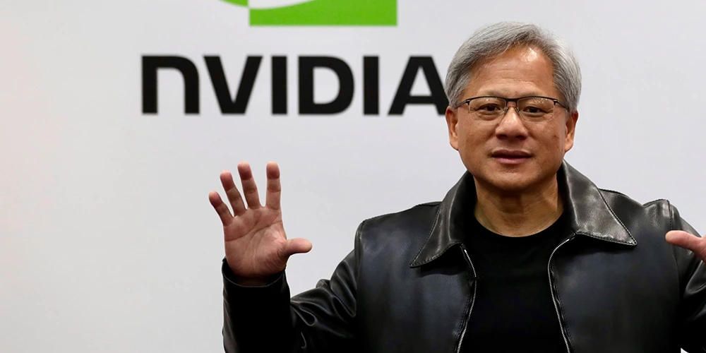
Selling Nvidia's H200 Chips To China Is Like 'Selling Nuclear Weapons To North Korea'
Beyond The LLM Wars, AI Should Be Considered The 'Bicycles For The Mind,' Not Slop
With AI And Robotics, 'Work Will Be Optional'
Using AI Can Be 'A Way To Spread Kindness And Love And To Detoxify Ourselves'
So Far, 'Nobody's Found Anything In The Universe That's Non-Computable'
In Pursuit Of Superintelligence In The 'Broligarchy' World Of AI, 'Getting The Balance Right Is Very Important'
The Future Of AI: Human Intelligence Isn't Going To Be The 'Upper Limit Of What's Possible'
'Hire Incredibly Senior Talent, Hire Incredibly Hungry Junior Talent,' And 'No Squidgy Layer In The Middle'
The Perfect Linux PC: 'A Big Percentage Of Windows BSOD Are Hardware Being Not Reliable'
Achieving Reasoning Model Was A 'Scientific Wonder,' And 'We'll Never Get That Lucky Again'
The AI Bubble, Losing $500 Billion In Weeks, And How Nvidia Is 'Basically Holding The Planet Together
AI Will Never Gain Consciousness. It's 'Absurd,' And 'I Don’t Think That Is Work That People Should Be Doing'
'We Must Build AI For People.' AI For Erotica May Sell, But 'Is Very Dangerous'
AI Can Save The 'Broken, Beaten, Battered' Gaming Industry. 'We Need To Bring It Back To What It Was'
Future AI Devices Should 'Make Us Happy, And Fulfilled, And More Peaceful'
'You Are Crazy Until You Are Successful, Then You Are A Genius.' That Is How The Society Works
When Speaking About OnlyFans, 'Everyone Just Immediately Assumes That We Do Porn'
'The Internet Is Forever,' Like 'A Tattoo.' Nothing Online Can Truly Disappear
First Is 3D In Games, Second Is The Internet, The Third Is AI. 'I Think That You’ll Take Advantage Of That'
AI Is Still Young, And Speaking About Its Welfare Is 'Both Premature, And Frankly Dangerous'
When 'One AI Is Playing In The Mind Of Another AI,' The Result Is Unlimited Training Data
On One Side, 'The World Is Going To Get A Lot Funnier, Weirder, And Quirkier' With AI
AI CreatesThe Highest Stakes Global Race: 'This Is Like Unprecedented At Any Point In Human History'
One Possible Future Dystopia is When 'Super Intelligence AI Is Reporting To Stupid Leaders'
AI Terms Like 'AGI' And 'Super Intelligence' Are 'Designed To Activate People's Dopamine'
Superintelligence Can Be 'A Tool For Personal Empowerment Or A Force Focused On Replacing Large Swaths Of Society'
AI 'Is The First Technology That Will Dramatically Accelerate Creation Itself'
'Sleeping With That Fear' And 'Waking Up Every Day Feeling Excited' Is The Recipe For Success
With AI Getting Smarter, 'No One Knows What Happens Next' Because Of 'This Weird Emergent Thing'
To Understand How Something Works And Where It Fails, 'Is To Go Straight To The People Using It'
For Companies In This AI-Driven World, 'IP Is Their Differentiation And Salvation'
Working 7 Days A Week: 'People Should Not Work This Hard,' And 'It Hurts'
AI Models Tend To Perform Better 'If You Threaten Them, Like With Physical Violence'
In A Possible Dystopian Future Dominated By AI, ‘You Have Human Meat Robots'
Anybody Who Is A Computer Scientist Should Not Retire, 'They Should Be Working On AI'
Large Language Models Ideally Should Be Something You Could 'Put Your Whole Life Into'
When Competing Against TikTok, 'You're Either growing, Or You’re Slowly Dying'
From Health And Education And Agriculture, 'AI Is Going To Help Us'
Without Google's Money, 'It's Very Frightening' For Mozilla
AI Companies That 'Crack Memory Properly' Can Create A 'Personalized And Hyper-Optimized' Experience
Saying 'Please' And 'Thank You' To OpenAI ChatGPT Is Worth 'Tens Of Millions Of Dollars Well Spent'
'AI Is Never The Answer. AI Is The Tool.' It Only Amplifies Existing Human Skills
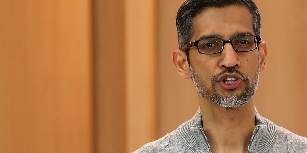
'The Final Race To Artificial General Intelligence Is Afoot,' And Google Must Work Harder
Steve Jobs Lacked Technical Expertise. But When It Comes To Marketing, 'I'm Not In His League'
When You Try To Be Open, 'Everything I Say Leaks. And It Sucks'
Humans And AI Must 'Evolve Together' To Achieve What They Thought Was Unimaginable
With AI, 'Figuring Out What Questions To Ask Will Be More Important Than Figuring Out The Answer'
Social Media, 'We Are All Attracted To It. And There Is Too Much Bullying'
Before Social Media, 'Life Was Great. Life Was Awesome Before This'
Social Media Is 'Giving People A Voice,' And 'Basically Giving People The Ability To Share What They Want'
The Dark Web Is The Internet's Hidden 'Evil Twin' Cloaked In Secrecy
In The Foreseeble Future, Smart Glasses 'Will Be The Next Major Computing Platform'
How To Invest Without Investing: 'Keep It Simple,' 'Forget The Stock Price,' And 'Luck'
Baby Boomers Must 'Buy Gold, Silver, And Bitcoin Now'
It's 'Easy To Be Behind The Computer Typing Words About A Person You Don’t Know'
Advancing AI Further Is Becoming Harder Because 'The Low-Hanging Fruit Is Gone'
AI Is Revolutionalizing Everything, But In Can Never Replace 'Human Touch' In Game Development
The Perfect 'AI Girlfriend' Can Make 'Normal People' Ditch Real Women For AI
AI At Its Best Is A 'Craftsman' That Imitates People's Techniques. 'It Cannot Write Shakespeare'
Pursuing AGI Is Exciting 'Because The World Is Still Sleeping On All This'
Smart People Are Natural Safeguards Of Humanity, But AI Is 'Breaking That Correlation'
'Timing Is Everything.' And Yahoo! Should Have Gone Mobile Earlier Than It Did
Being A Market Leader Is All About Being 'Profoundly Different' And 'The Best'
This 'Newbie CEO' Creates An Imperfect Technology That People Wish 'Didn’t Exist'
AI 'Really Does Enlighten,' And 'Can Introduce Serendipity'
'I Pled Guilty To Journalism': Freedom Over 'Unrealizable Justice'
AI Is 'The First Technology That Has No Limit'
One Relies On Feedback And The Other Polishes Products: Meta Is 'The Opposite Of Apple'
Once Misinformation Spreads, 'The Harm Is Done': Young People's Problem
Everywhere In Every Company, 'Everybody Will Have An AI Assistant'
Generative AI Is Not Doing Artists Any Good, Because 'Creativity Is Made, Not Generated'
To Compete Against Google Is To 'Do Something Google Don't Want To Do'
People Can Befriend AI, Or Even Marry It, If That Is 'The Flavor That They Like'
'Digital Gods' Are Not Going To Exist, Anytime, Anywhere Soon
'The Singularity' Is When Humans Merge With AI To Become Immortal Cyborgs
AI Is Creating 'A New Computing Paradigm' Where Computers Use Tokens Instead Of Bytes
Building The 'One True AI' Through Closed Source Is Like 'Creating God'
Hire 'The Best Of The Best Of The Best,' And Be Free From Taking Orders From Anyone
Since The 1990s, The 'Social Contract' For Content On The Open Web Is 'Freeware'
The 'Tell Me The Story Of Your Life' Question Can Help Spot A Liar
Instead Of Firing Employees, 'I Rather Torture Them Into Greatness'
AI Is Not Replacing All Jobs, And 'We Still Need Those Software Engineers'
NSA Official Joining OpenAI Is 'A Willful, Calculated Betrayal' Of All Human Rights
AI-Powered Devices Should 'Empower You To Be Able To Do Things You Couldn’t Do Otherwise
'The More You Buy, The More You Save.' That Is Part Of The 'CEO Math'
The 'Achilles Heel Of AI' Is Energy. Fusion Is Needed To Solve The 'Energy Puzzle'
A Scientist Is 'Not A Business Or Product Person'
'Anthropomorphizing AI' And Why AI Is 'One Of The Most Unfortunate Names'
'Try Not To Think About Competitors' No Matter How Fierce They Have Become
'I Want To Die Remembering My Pranks' Because 'Happiness Equals Smiles Minus Frowns'
'I Don't Care If We Burn $50 Billion A Year,' Because AGI Is Going To Be 'Totally Worth It'
In 20 Years, 'A Lot Has Changed' At Google, And That Includes 'My Hair'
'Feedback Loops' Is Valuable, And GPU Hoarding Was To 'Catch Up To TikTok'
'Didn't Expect ChatGPT To Get So Good,' As AI Is Expected To Take Away People's Jobs
Using YouTube Videos To Train AI Tools Without Permission Would Be A 'Clear Violation'
Microsoft Was 'Below Them, Above Them, Around Them,' In Reference To OpenAI
If Compared To Its Future Version, OpenAI's GPT-4 'Kind Of Sucks'
'Google Should Have Been The Default Winner' In The AI War Against Microsoft
The Transparency Question: OpenAI Sora 'Used Publicly Available And Licensed Data'
The Web Must Serve Humanity, But Monopolization Prevents It From Being 'Human-Centered'
Apple Vision's Weight And Motion Blur Is 'Not What We Aspire To'
OpenAI Becoming Closed Source And For Profit, Is The 'Opposite Of What I Gave The Money For'
Future AI Is 'Text-To-Action' And Will 'Double Everyone's Productivity'
Compared To Apple's Vision Pro, Meta Quest 3 Is 'The Better Value' And 'The Better Product'
Apple Vision Pro, The 'Second Most Impressive' Technology Since The IPhone
Every Photo Is A Fake, And That 'There Is No Such Thing As A Real Picture'
Apple Will Continue To Invest In AI Because It 'Will Shape The Future'
Children Are Harmed By Meta, And 'I'm Sorry For Everything You Have All Been Through'
Anything 'Subscale' May Not Worth Investing At. But Things Can Change
Microsoft Can Be A 'Good Publisher' To Competitors On All Platforms
Being Fired Can Be So Painful That 'I Wouldn't Wish It On An Enemy'
AI-Based Search Engine Can Make Google Look 'Legacy And Old'
People Are Responsible For Their Own Privacy Because 'Everything On The Internet Is Monitored'
Like Information System, Money Is 'A Database For Resource Allocation'
The Internet Is Full Of People With 'Crazy Ideas' Doing 'Crazy Things'
Artificial Intelligence Is 'Going To Lift The World Up'
AI Chess Bots Defeat Humans Because 'No Human Being Would Play Chess Like This'
'Speechless': Knowing That Advanced AI Can Follow Humans To Mars And Destroy Them There
Nobody Should Blackmail With Advertising And Money. 'Go Fuck Yourself, Is That Clear?'
AI Singularity Happens When 'Magic Intelligence' Is 'In The Sky'
'Software Is Still Pretty Dumb.' But With AI, 'This Will Change Completely'
Generative AI Is Turning 'Will Never Happen' Into 'Will Happen Faster Than You Think'
AGI Is When AI Requires Less Training Data, But More On 'Reasoning Capabilities'
When 'Done Correctly', Paying Money 'Can Make A Difference' In Business
To Build A Successful Company, 'Support Network' Is More Important Than Knowledge And Experience
AI Is 'Too Important Not To Get Right' Because Of Its Potential For 'Huge Breakthroughs'
AI Innovations 'Bring More People And Increase The Need For Professionals,' Not The Opposite
Technology Impacts Competitiveness: 'It's Either Utilizing AI Or Being Left Behind'
'Google Did A Good Job' With Chrome. It Is Something Microsoft Cannot Do
'AGI Is The Equivalent Of A Median Human', Just Like A Remote Co-Worker
Google Dominates The Market Because 'Switching Is Way Harder Than It Needs To Be'
'Numbers Are Just Numbers'. But Having Huge Instagram Following Is 'A Big Responsibility'
After Generative AI, Is 'Interactive AI' And Soon, People Will Have Their Own 'Chief Of Staff'
AI Is Going To Be 'The Biggest Technological Shift We See In Our Lifetimes'
Growth Of On-Device AI 'Could Create A New Upgrade Cycle For Phones'
AI Arms Race May Create A Dystopian World Occupied By 'Swarms Of Slaughterbots'
Generative AI-Powered Chatbots Are Just Like 'Glorified Tape Recorders'
Twitter's Rebrand To X 'Allowed Us To Evolve Past A Legacy Mindset And Thinking'
'AI Arms Race' Could Involve The Design Of 'Nuclear Weapons And Bioterror Attacks'
AI Weaponization Is Real Threat. 'I Warned You Guys In 1984 And You Didn't Listen'
AI-Powered Sex Robots Could Change Human Intimacy, And 'Redesign Love And Relationships'
AI Chatbots May Soon 'Run Out Of Text In The Universe' To Learn From
To Minimize Cyber Risks, 'Turn Your Phone Off Every Night For 5 Minutes Every 24 Hours'
Care About What Machines Can Say, But 'Also Care About What It Can Do'
AI 'Is Going To Be The Most Meritocratic Moment' In History, But Things 'Could Go Wrong'
Intelligence Is 'A Fundamental Property Of Matter,' And 'Humans Aren't Special
Generative AIs Show 'Great Promise' But Also 'Things Like Misinformation, Maybe Worse'
AI Poses 'Existential Risk' To Humanity, Which Is Defined As 'Many People Harmed Or Killed
If AI Goes Wrong, 'It Can Go Quite Wrong' And Cause 'Significant Harm To The World'
AI Can Make Scams Harder To Spot, It Can 'Kill You,' And 'We Can't Stop The Technology'
Not Tumblr, Because Hulu And Netflix 'Would Have Been A Better Acquisition' For Yahoo!
AI Is Soon Going To Be Smarter Than Humans. 'How Do We Survive That?'
If AI Gets To Human-Level Intellect, There Is A '50/50 Chance Of Catastrophe' To Humanity
After Elon Musk Acquired Twitter, 'It All Went South'
Innovate And Improve Upon What Already Exists. 'If We Do That Well, Success Typically Follows'
The Most Important Philosophy Is To 'Engage When There's Disagreement'
Everyone Is A 'Little Obsessed' With Their Smartphones That 'They Are Out Of Their Minds'
AI Can Reshape The Society, And That 'We Are A Little Bit Scared Of This'
Google Bard And OpenAI ChatGPT 'Are Large Language Models, Not Knowledge Models'
AI-Powered 'Sentient' Chatbots Are The 'Most Powerful Technology Since The Atomic Bomb'
Transitioning To AGI Is Perhaps The Most Important, And 'Scary' Project In Human History
ChatGPT Is As Important As PC And Internet, And It Will 'Change The World'
ChatGPT Is 'Cool' But 'There Is An Ethical Issue' Because 'It Doesn’t Always Work'
Google Tried Competing With ChatGPT With A Product That Wasn't 'Really Ready'
Beware Of 'Hallucinating' Chat Bots That Can Provide 'Convincing Made-Up Answer'
With AI Chatbots Like OpenAI's ChatGPT, Google May Soon Experience A 'Total Disruption'
Frequent ChatGPT Downtime Means People Are Using It, And That Is 'A Great Problem To Have'
Instagram 'Overfocused On Video In 2022' And That Was A Mistake
Instagram 'Makes People Depressed' While Twitter 'Makes People Angry'
'Do What You Love' And In The End, Don't Forget To 'Have Fun'
Inefficient Organization Is Not Ready For Competition, And That 'Hurts Your Soul'
This Twitter Owner Is Not A Serious Person' And That 'He Does Things For Sport'
'Google Is Just A Window Onto The Web' And The Web Is Getting Worse
Saving Is Not The Way To Prosperity. 'We Think You Invest Your Way To It'
Twitter Grew Up 'Too Quickly.' But It 'Will Never Die'
With High In-App Purchase Prices, 'Apple Destroys More Dreams And Crushes More Entrepreneurs'
The Best Way To Bridge A Paradox 'Is Not To Have More Dogma, But More Data'
An ‘Open, Interoperable’ Metaverse Is ‘Better For Everyone’
AR Will Be So 'Profound' That People Will Wonder How We Lived Without It
Companies Can Experience Ups And Downs, 'We Shouldn’t Always Equate Fun With Money'
Becoming A Whistleblower 'Is The Last Resort' A Cybersecurity Expert Has
Tech Monopoly Is 'Demoralizing', And How Small Developers Can Experience Difficulties Because Of This
In The Metaverse, Meta And Apple Are In A 'Very Deep, Philosophical Competition'
In Business, 'No One Can Be Successful On Their Own'
Cryptocurrencies And NFTs Are All Based On The 'Greater Fool Theory'
The 'Philosophy' Of Great Gameplay, And Welcoming 'The Challenge Of Changing'
'Use Bitcoin To Use It.' Do Not Invest In It Because It's Like 'Fire'
Interoperability, Speed, Scalability And Privacy On The Blockchain 'Just Doesn’t Work'
To Safeguard Unsafe Uses Of AI Requires 'Curbing The Power Of The Companies Who Develop It'
After The Arrival Of 6G And Metaverse, Smartphones 'Will Not Anymore Be The Most Common Interface'
With Blockchain-Enabled Technologies, 'Power Is Shifting' Away From Platforms
The Term Metaverse Is 'Ambiguous And Hypothetical' Because People 'Love The Real World'
The Rich And Famous Can Feel Lonely, And It 'Is A Natural Human Reaction'
Meta Is 'Not An Innovative Company' And Its Metaverse Is Not Going To Be Successful
When Someone Gets So Influential, They Work Hard To 'Stay On The Edge Of Sanity'
The Internet That Is Centralized Is Not Supposed To Happen, And 'I'm Partially To Blame'
When Working Remotely, Well-Being Is 'One Of The Most Important Pieces Of Productivity'
'Truth Is The Apex Of Everything That’s Good' But Some Can Just Say 'So Many Lies'
Global Reach Hacking Campaigns Is A ‘Wake-Up Call’ For Everyone
People Should Prioritize Relationships Rather Than Being ‘Objective Focused'
The Cryptocurrency Bitcoin Is 'Pure-Gold Mathematics'
To Have Employees Return To The Office, Companies Need To Be 'Purposeful About The Time'
How The Pandemic Is Giving Governments A 'New Power' For Surveillance
Cryptocurrencies Are Transparent Because 'We All See Exactly How They Operate'
Values Aren't What's Written, But What We Hold Accountable For Every Day
To Become The Largest Smartphone Brand, It's A 'War Of Life And Death'
Gamers Are Always Right. But When Considering NFT, 'They Don't Get It'
How Google Deploys 'Dark Patterns' To Trick Users Into Abandoning Rival Products
The Metaverse 'Is Not For Everybody, And Maybe It's Never For Everybody'
Metaverse Can Be A 'Multitrillion-Dollar' Business, Created By Millions Of Developers
Non-Fungible Tokens Can Be 'More Exploitive' Than They Are Creative
Search Engine Results Have Become An 'Absolute Garbage' And 'Google Is The Worst'
Google Is 'Crazy' And Apple 'Must Be Stopped'
Metaverse Can Create A 'False God' And It Is 'Not The Best Thing For Human Society'
People Who Want To Sideload Apps, 'Can Buy An Android Phone'
'It's Been Quite An 18 Months' Seeing Clubhouse Grew 'Way Too Fast'
'Sideloading Is A Cybercriminal's Best Friend' And Can Create A Malware 'Gold Rush'
'I Can’t Tell The Difference' Between Newer iPhones
'If You Weaken Encryption, People Will Die'
To Create The Future Of Work That Is Green, 'There Will Be Sacrifices'
In Business, There Is 'No One Day That Is The Same'
Bitcoin The Cryptocurrency, Is 'Worthless'
People Should Not Allow 'Computers Deciding What We Focus On'
Facebook Does Not 'Prioritize Profit Over Safety And Wellbeing'
'Multi-Skilled AI' Is The Best Term To Describe Artificial General Intelligence
In A Long Term, Work From Home Can Hamper 'Innovation And Collaboration'
AI Can Be 'The Single Largest Danger' When It Powers Autonomous Weapons
When Facebook Becomes A 'Metaverse Company', It Will Stop Being A Social Media Company
'Flexibility Is What People Desire' And 'Care Is The New Currency'
When Robots Make Physical Work A Choice, 'Universal Basic Income' Is Needed
People Who Aren't Criminals Have 'Nothing To Be Afraid Of' When Being Surveilled
Nobody Should Trust Wikipedia Because It Is Not ‘A Reliable Source Of Truth’
Apple And Google Intentionally 'Implement Backdoors' For Anybody To Exploit
It’s Time For People 'To Recognize The Right To Repair' Their Own Devices
Apple Focuses On The 'Best Interests' Of Users, And That Sideloading Apps Is Harmful
The Internet Is Giving The 'Flexibility' Of Work, And Also The Future Of Travel
Snapchat Exists Because Of The 'Amazing Platform' Apple Has Created
The Reason For IOS' Walled-Garden Is Because MacOS Malware Level Is ‘Unacceptable’
Apple Has A 'Totalitarian' Approach, And It Is Throwing People Back Into 'The Middle Ages'
Use Negative Comments On Social Media Networks As Motivation To Keep You Going
Give Employees The 'Flexibility And Choice' To Embrace Work Post COVID-19
'Give Users A Choice' Because People Need To Know 'The Right Thing'
Augmented Reality Is 'A Critically Important Part Of Apple’s Future'
Following Apple's Privacy Update, Facebook Can 'Manage Through That Situation'
To Say That 'My Team Is Great And Everyone Else Sucks,' Is Not Leadership
Android Is 'More Flexible' Than IOS 'In A Way That Makes It Easy'
AI And Automation Can Improve Productivity And Give Us 'Superpowers'
Companies Must Have The 'Willingness To Change' And A Focus On A 'Forever Problem'
'We Need To Inflict Pain' To Those Who Mistreated Facebook
By Changing The Way The Web Works, We Can 'Make It A Better Place'
Technology 'Does Not Need Vast Troves Of Personal Data' To Succeed
'There Is A Big Crisis Right Now’ In Cybersecurity
'Big Tech Is Not Monolithic', And Free Speech Doesn't Intersect With Violence
Drupal Has Evolved To Become 'Less About The Product But More About Open Source'
After Banning Donald Trump, Things Are 'Going To Be Much Bigger' Than Just That
Apple Is Still Living Off The Reputation Steve Jobs Built, 'Without Any Meaningful Innovation'
To Achieve Something Big, 'We Must Dare To Dream Big'
In The Future, Cybersecurity Will Soon Be 'A Thing Of The Past'
A Company's Success 'Would Lead To Government Attention' And Antitrust Scrutiny
Working From Home Can Feel Like 'You Are Sleeping At Work'
Companies Should 'Value Someone’s Propensity To Learn More Than Their Skills'
Blockchain And Bitcoin Can 'Point To A World Where Content Exists Forever'
To Create A 'Trustworthy AI, Creating Its Ethics Should Be A Continuous Process
The Internet Is Built By Everyone, And Bitcoin Shares That Principle, But Decentralized
COVID-19 Has Given A 'Once-In-A-Generation Opportunity' To Change The Internet
'I Was So Jealous', And Amazed Of The 'Genius' Steve Jobs
Take AI Out Of Facebook, And Facebook Will 'Basically Crumble'
Broadband Internet Access Is A 'Fundamental Right' For People Wherever They Are
Technological Singularity: How And When AI Can Be Considered 'Alive'
Contactless Deliveries And Mobile Payments Are The Legacy Of Coronavirus
How 'Digital Resistance Movement' Goes Global And Won't End
Inequality Cannot Be Solved By Technology. Companies 'Need Real Action To Change Things'
The ILOVEYOU Computer Worm Was 'Possibly' Released By Accident
Bitcoin Is 'One Of The Most Seminal Works' In Decades. 'It’s Poetry'
Tech Companies 'Shouldn't Get Carried Away' With Combating Pandemics
Successful Leaders Are Those Who Can 'React Appropriately' To Unplanned Events
How Bitcoin Price Relies On Optimisms Of Investors To Reverse The Market's Pessimism
All Organizations Developing Advanced AI Should Be Regulated
Artificial Intelligence Should Be Regulated, And Governments Need To Act
As A Talent-Based Platform, TikTok Can Be Larger And More Popular Than Instagram
Artificial Intelligence Is 'An Entity That Cannot Be Defeated'
The 'Contract For The Web' To Prevent The Deliberate Misuse Of The Web
Without Tracking Users, Search Engines Can Also Make 'A Ton Of Money'
Entrepreneurs Should Know That 'Nobody Knows Anything'
Businesses Offering 'Free' Services In Exchange For 'Surveillance' Is 'Negative' To Creativity
Just Say No To 'Killer Robots'
Data Privacy Has Become One Of The 'Fundamental Freedoms Of Our Time'
The 'Four R's', And How To Defend YouTube's Openness By Keeping Order
'Big Tech Has Gotten Too Big', And It Has 'Taken Our Choices Away'
When Privacy Matters, We Need To Ask Ourselves 'What Kind Of World We Want'
The Next AI Revolution 'Will Not Be Supervised' Because Not Everything Can Be Predicted
Losing Privacy, 'You Should Figure Out A Way To Get Off Of Facebook'
Steve Jobs Cast 'Spells' And Had Everyone Else 'Mesmerized'
USB's 'Biggest Annoyance Is Reversibility', And It's Meant To Be That Way
People Should Actually Opt Into Data Tracking, Not Out Of It
'Love What You Do, And You Will Never Work A Day In Your Life' Is A 'Total Crock'
Social Media Is 'A Disease' As It 'Encourages Bad Behavior'
The Four Ways To Regulate The Internet
AI is 'Both Promising And Dangerous', Similar To Nuclear Weapons And Nuclear Energy
The World Wide Web Is 'Not The Web We Wanted In Every Respect'
How To Decentralize Social Media Networks For The "Future Internet"
Social Media Must Disentangle Our Relationships With Friends And Our Relationships With The Media
To Evade Toxicity, Social Media Must Offer Value, Transparency And Respect
Blockchain Technology Needs API To Be Useful
Face Recognition Technology Should Be Regulated By The Law
Where Tech Companies Thrive, No Sincere Apology Because Users Are Addicts
Technology Is An Enabler, But It "Doesn’t Solve Humanity’s Problems"
"Hustle Porn" Is Toxic And Dangerous In The Tech Industry
Privacy Is Not Dead. And Protecting Privacy Doesn't Make You A Weirdo
Blockchain Is Meaningless Unless It Can Disrupt Manufacturing And Society
AI Bias Problem Must Be Fixed To Create Smarter AIs
When Creating AI, Don’t Get Stuck On Trying To Build The Perfect One
The Entire World Becoming One Big Giant Computer
Artificial Intelligence Is Going To Infuse All Of Software
Google Is Not A "Truth Engine," Yet People Think It Is
How Social Media Uses "Behavioral Cocaine" To Turn People Into Addicts
Less About Privacy And More About Consumers Having Control
Cryptocurrencies, A Tool Against Hyperinflation And Fuel For A New Internet
"Technology Renaissance" Contains Many Potential Threats
Artificial Intelligence "Doesn't Have To Be Evil To Destroy Humanity"
Between Fake News And Social Media, There Is You Actively Sharing Things
The Web Should Reflect Our Hopes, Rather Than Dividing Us
How Abusing Social Media Creates A Tool To Manipulate And Divide People
People Are Underestimating The Potential Of Bitcoin
Cryptocurrency Is Risky And Has A Deadly Side: It's Not A Good Thing
Facebook Was Created To Exploit A Vulnerability In Human Psychology
AI Is More 'Profound Than Electricity Or Fire': A 'Balance' Should Be Reached
Social Media Networks Are Ripping The Society Apart
The AI Revolution, And Where Humans Are Clueless
Crazy Founders Have Goals Much Bigger Than You Can Possibly Imagine
To Build A Great Team: "Have A Purpose And No Scumbags"
"Love Quotient" Gives Humans The Advantage Over Machines
"Ctrl + Alt + Delete" Was Created In A Rush, And It Was A Mistake
The Greatest Risk We Face As A Civilization, Is Artificial Intelligence
Instead Of Personal Branding, Earn The Reputation By Standing Up And Being Unique
There Are Loads Of Innovation, But Big Companies Don't Take Advantage Of It
Revolutions In Artificial Intelligence Has Made It Impossible To Forecast Accurately
The Three Challenges That Threat The Modern Web
Technology Changes Trends, And Trends Will Change Technology. It Is How Time Forces Us To Move Forward
Fake Information On The Internet. It All Goes Down To How We Perceive Them
General Artificial Intelligence Has A Long Way To Go
IT Sector Has Become Too Risky
Between Sympathy, Empathy, And The Internet
Decentralized, The Internet Should Not Be Controlled By Companies Or The Governments
People Share Everything On The Web. This Is Because We Love Free Things
Oversharing On The Internet. The Digital Love and Loss
Not Doing Something New Seems Like a Crime
Battles Generate Negative Energy for Innovations
Thoughts Of Success: Rethink Culture And Being Rich Shouldn't Change Who You Are
The Cursed Diamond Yahoo! Owns
90 Things Learned from Founding Tech Companies
Search Data, The Most Personal Data
Internet Accessibility is a Social Good Mission
Communication is Bigger than What People Think
Access to the Internet Should be Regarded as a Basic Human Right
The Web is Better If You Let Websites Personalize it for You
Government's Surveillance is Breaking the Internet
Advertising is the Original Sin of the Web
Social Media, a Place for Social Delusion
Apple Should Build an Android Phone
"The Web We Want" and Magna Carta for the Internet
Selling Online Requires Patience
Working in an Office is More Collaborative
Google Frightens Webmasters from Linking to Their Own Contents
Entrepreneurship: Between Employer and Employee
❮
❯