As an internet company, GoDaddy is considered one on the older side.
The web services company has been around since war-veteran Bob Parsons founded it. And since then, it has grown to become one of the largest internet domain registrar and web hosting company in the world.
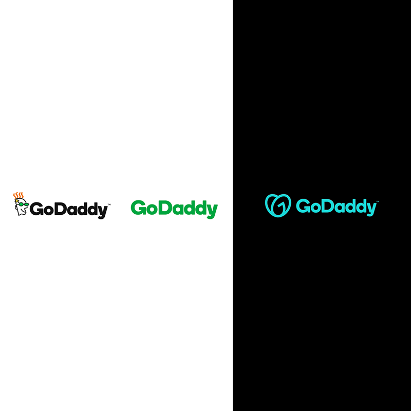
To ditch that old-school appeal the company has endured, GoDaddy unveiled a new logo.
Here, its redesigned logo takes form of a generic, sans-serif type accompanied by a heart shape that looks like an upside-down version of the Airbnb logo.
At first glance, it may look like just a heart.
But in fact, the logo was carefully designed by interlocking the letter "G" and the letter "O" together, to spell out "GO".
Aman Bhutani, the company’s CEO, said that he sees the logo as “a young girl who’s a little bit of a bandit—with a ponytail and a patch over her eye—who wants to grow up and be somebody.”
Our new logo, the GO, is all about empowering you — the everyday entrepreneur — to do what you love. Go after your dreams and make ‘em real, knowing we’re here to help every step of the way. #makeyourownway pic.twitter.com/8eVtTRrSID
— godaddy (@GoDaddy) January 14, 2020
With the redesign, GoDaddy is clear that it's ditching the ginger head mascot with green-tinted sunglasses.
For those who have been on the internet longer than most others, the unsettling cartoon-faced character was considered one of the last iconic vestiges of the early web.
It should be noted that the character has already been removed from the GoDaddy's website in 2018. Since then, GoDaddy has been operating without a logo, relying only on its wordmark.
What's also upsetting for some people is that, the change is just another example of the way tech companies are getting more homogenized in their design.
With GoDaddy having a new logo with a typeface that is more boxy, the company simply joins the sterile, generic logos that are used by the likes of Google, Spotify, and Pinterest.
But nevertheless, a change is a must when a company wants to reach a wider audience.

The new GoDaddy logo was created by GoDaddy's internal design team, in collaboration with external branding firms Codo and Lippincott.
Established in 1997, GoDaddy is a domain registrar and web hosting company.
Having registered a staggering 78 million domain names, GoDaddy is hosting over 19 million users.
With 14 offices across the world, GoDaddy has evolved from a place where people can buy domains and web hosting, to become a place where customers can also benefit from templates and web building tools.
GoDaddy may be one of the oldest domain registrar, but the internet world has evolved stupendously fast.
To keep up with the competition, GoDaddy needs something to represent its newer, younger self.
What's more, the dramatic redesign represents a new way for the company, which was previously operating behind a somewhat quirky brand image, full of personality but having projected a confused aesthetic.
Along with the logo change, GoDaddy is also redesigning its homepage to better appeal small businesses and entrepreneurs.
