Back in June 2016, Mozilla announced that it would redesign its logo through an open design process. On each and every step, it would ask the community for feedback, shaping the logo into what it believes will be a strong Mozilla rebrand.
In August, Mozilla unveiled the seven finalists for the selection. "Each of the seven concepts we're sharing today leads with and emphasizes a particular facet of the Mozilla story," wrote Mozilla’s Creative in a blog post.
"From paying homage to our paleotechnic origins to rendering us as part of an ever-expanding digital ecosystem, from highlighting our global community ethos to giving us a lift from the quotidian elevator open button, the concepts express ideas about Mozilla in clever and unexpected ways."
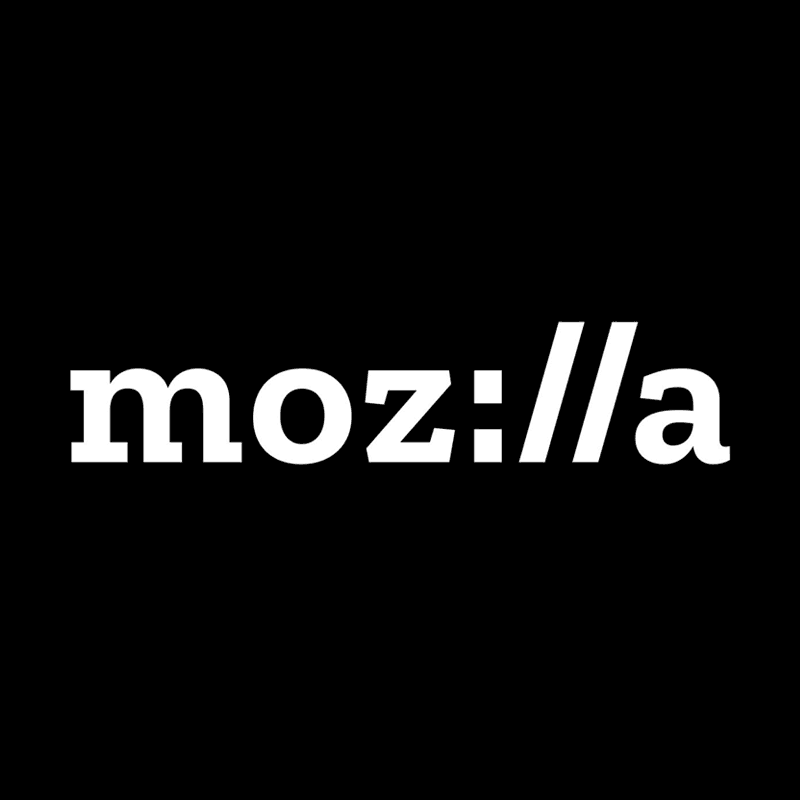
In January 18th, 2017, Mozilla settles to one of the most minimalist. Mozilla now calls itself "moz://a."
The core of the logo redesign was the need for Mozilla's purpose and brand to be better understood by more people. Mozilla wants to be "the champions for a healthy internet." The not-for-profit organization said that its brand identity that include its logo, voice and design, is an important signal of what it believes in what it does.
On the day of the announcement, Mozilla posted a page on its blog called "Arrival" where it shares its new logo and the proposed color palette, language architecture, and imagery approach.
The new logo nods to URL language that reinforces the web, and is at the heart of Mozilla. The company is committed to the original intent of the link as the beginning of an unfiltered, unmediated experience into the rich content of the internet.
The components of Mozilla's new brand identity was developed in collaboration with a London-based design partner Johnson Banks. At first, the logo received more than 3,000 comments during the project. While those comments didn't count as votes, but they influenced Mozilla to use the design.
Unique as it is, the design incorporates a fragment of a web address over other identities. It features the company's name spelled out in a Courier-like font, with the "I" and "L"s represented by a colon and two forward slashes.
"Because it has a portion of URL embedded in the middle of the logo, you know this must be some kind of internet company," said Tim Murray, Mozilla's Creative Director.
He wanted the new logo to improve public understanding of what Mozilla does, and the "://" is seen as something that can represent the company's expansive internet roots.
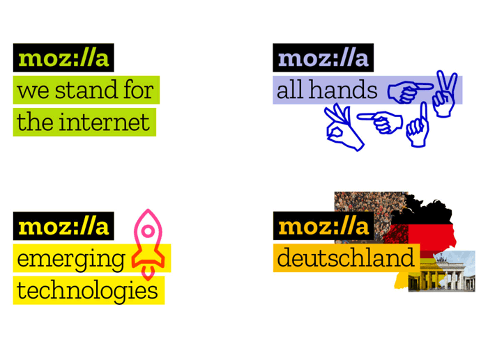
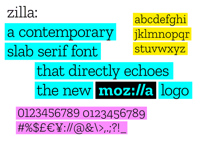
The logo uses font for the wordmark created by Typotheque from the Netherlands.
Typotheque has a historic partner to Mozilla. They were the first type-foundry to release web-based fonts, and Mozilla’s Firefox was one of its early adopters. Mozilla chose to partner with Peter Bilak from Typotheque because of their knowledge of localization of fonts, and also because it's inline with Mozilla's commitment to have a font that includes languages beyond English.
Because the logo evoke Courier font used in the original default in coding, Mozilla said that anyone can create the Mozilla logo by only typing and highlighting the Zilla font. This makes the logo more "open and democratic."
The flat design is bolder than Mozilla's previous plain wordmark.
Mozilla is rolling out the new brand identity in phases. As the company develops its design system, it's looking forward to hear people's feedback and suggestion.