
How often do we read to then realize that we forget most of the things we just read? More than often probably.
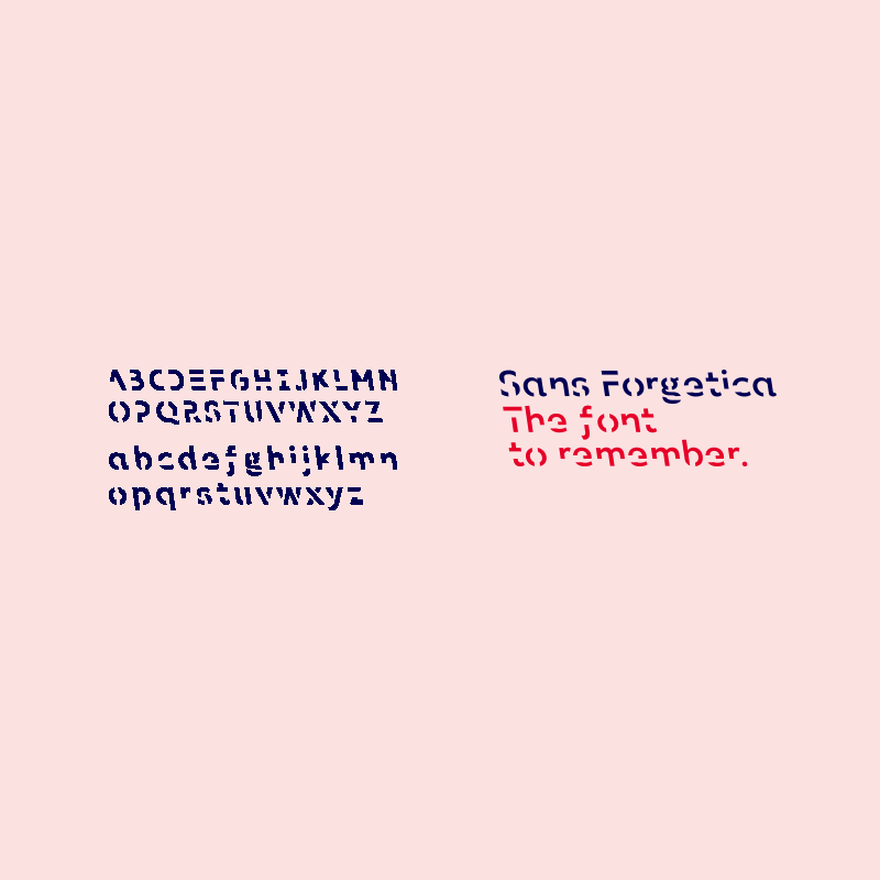
This is what researchers from Australia wanted to solve. Here, they have created a font which they say should help readers remember information better. Called the 'Sans Forgetica', it was created a multidisciplinary team of designers and behavioral scientists from RMIT University.
The researchers said that Sans Forgetica uses psychological and design theories to aid memory retention.
At first sight, Sans Forgetica is more difficult to read than most other typefaces. Text written using the font looks more like it have been printed using a ink-clogged printer or came out of a photocopy machine. But the researchers said that it's meant to be that way.
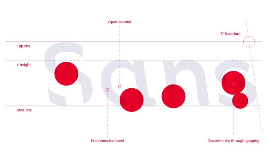
The unusual seven-degree back slant to the left and gaps in each letter makes the mind to naturally seek to complete those shapes, according to a typography lecturer and Sans Forgetica co-creator Stephen Banham. This way, according to the researchers, should slow the reading process and triggers memory.
"The 'desirable difficulty' you experience when reading information formatted in Sans Forgetica prompts your brain to engage in deeper processing," explained the researchers on the website.
The font adds a little obstruction to text to make slower learning process, because if something is too easy it doesn’t create a memory trace. In contrast, if it's too difficult, the text won't leave a memory trace either.
Here, Sans Forgetica is sitting at the sweet spot where text is difficult to read, but still readable without being annoying.
About 400 university students that have been involved, are said to have experienced a small increase in the amount of things remembered. The participants reading Sans Forgetica were found to remember 57 percent of the text, and only 50 percent when reading in Arial.
The font was originally designed for students cramming for exams, but could also be used to help people studying foreign languages and elderly people grappling with memory loss.
The font took about six months to develop. The team have tested three different versions, and released them as an OpenType font file.
Available with a PDF information booklet, Sans Forgetica also has a Chrome extension which allows users to convert any on-screen text to Sans Forgetica.
Although the font has promising statistics, it has limitations according to Stephen Banham. He said that: "God no, you wouldn’t want novels printed in it, it would probably induce a headache.”
It’s also unlikely for people to convert their text to Sans Forgetica as part of their every day reading, because it makes things difficult to read and just plain bad in appearance. But people can use it as part of their reading if they just want to remember certain things better.