
Design is something you see, and something that can be enjoyed. While it certainly looks like you don't need mathematics to understand it, the truth is that you do need it to make things more appealing.
Mathematics skills are one of the most absolute and essential in design. At the very least, math is where you measure your area and understand the size of your canvas. In a print design, or even online, math goes much deeper than that.
The thing here is that math uses numbers and measurements to turn a design into something more beautiful. Understanding the rule of thirds in design is one the many means. It's simple; but the concept is powerful enough to create a good design out of a bad picture.
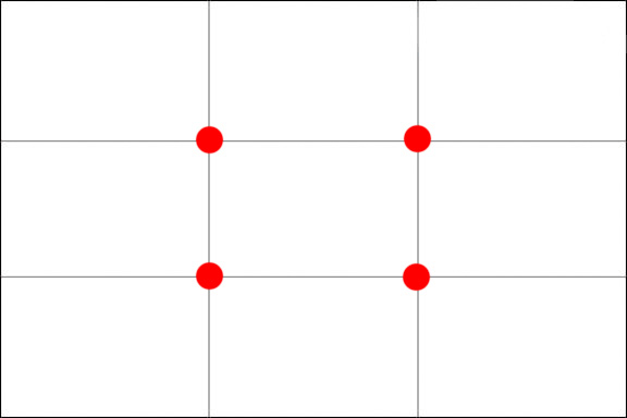
The rule of thirds is a "rule of thumb". In short, it's a guideline which applies to the process of composing visuals. What the guideline does, is creating an imaginary line that divides a canvas into 9 parts (3 horizontally and 3 vertically) by 2 equally spaced horizontal lines and 2 equally spaced vertical line.
What should be noted here is that important elements should be placed along these lines, or on their intersections. This is to create more tension, energy and interest in the composition.
Ruling The Rule
Your modern digital camera has it, and so as your smartphone's camera. Photoshop has it as well. The rule of thumb simply states that if you take a canvas and divide it into nine parts, the created grid provides a roadmap that helps you in placing your elements.
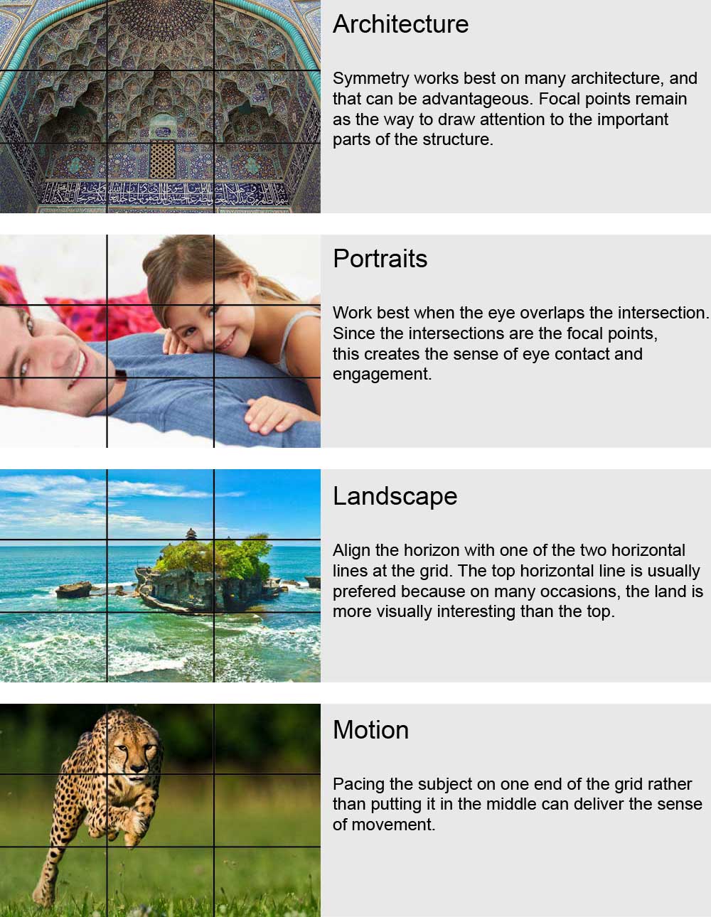
The rule of thirds grid can be applied to any size design and to whatever photos or images. The grid itself doesn't have to be any particular dimensions, or has to be made with 9 equal parts. It just has to be evenly divided into three vertical and three horizontal section (3×3 grid).
To put the rule into use, understand that the spots where the lines intersect indicate the main focal areas. Bringing your visuals close to these spots will allow them to stand out more. And if they're placed further from these spots, they'll receive less attention.
If you were wondering about symmetry or asymmetry, and whether they're good in design. Yes, they are. But they aren't always necessary for a good design. Instead, balance is an absolute requirement. The rule of thirds will help you in this because it allows you to put visual elements along the grid in order to create a better visual balance and interest.
For example: if you have something important on the bottom left intersection, you don't want something on the top left intersection to be dominant. But on the other hand, the bottom left and top right intersections are pretty much equally matched, so focusing elements in these areas creates that balance.
Rule Of Thirds To Create Visually-Balanced interest
The rule of thirds grid is how to balance the imbalanced, and can help you use asymmetrical balance to your advantage. If your design is imbalanced, it throws off the entire look. Using a rule of thirds grid helps you maintain good balance while still keeping things asymmetrical.
The 9 grids are there to help you. What they do, is to divide the canvas to smaller parts so you can see which parts of them have the most weight, in which you can then distribute when needed.
Photography is one of the areas of design where the rule of thirds really shine.
Having those grids available to guide you is a great way to start. Get into the habit of using this grid whenever you take pictures, even if you don't use original photography in your print designs. Soon enough, you'll start to get a feeling of where that rule of thirds grid exists, even when they're not there in front of you.