X has rolled out a notable update to how multiple images and videos appear in posts across the platform.
Previously users enjoyed a clean grid or collage layout where up to four attached photos or videos displayed simultaneously in the feed. This format allowed quick scanning at a glance making it especially popular for memes multi panel jokes and visual storytelling such as week in review summaries or before and after comparisons.
The old system felt native to X fast paced scrolling experience and gave creators an immediate way to showcase several visuals without requiring extra interaction.
Announced and showcased through a post by Jonah Katz, X iOS leader, the redesigned layout shifts to a horizontal swipeable carousel or slideshow format.
Now, when a post contains multiple media items it opens as a single prominent image or video with dot indicators at the bottom signaling additional content.
Users must swipe left or right to cycle through the rest of the attached files.
This change began appearing first on iOS with plans to extend it to Android and web versions soon.
According to announcements from the X team the update enables support for more than four images per post a long requested feature that the previous grid could not easily accommodate.
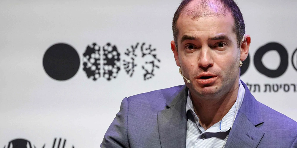
Head of Product Nikita Bier addressed early user feedback directly confirming the intentional shift.
In response to complaints about the change Bier noted that it had to be done to support more images and expressed confidence that the community would adapt popular meme formats such as the Pope Holding The Thing to the new carousel style.
Similarly iOS engineer Jonah Katz highlighted the collaboration behind the rollout and invited feedback as the feature expands beyond iOS.
Many users have expressed dissatisfaction with the transition.
The carousel makes it harder to see all images at once in the timeline which some say disrupts the quick consumption habits that defined the platform.
Others compare it unfavorably to similar layouts on Instagram and Threads noting that it feels less distinctive for X.
Despite the criticism the company appears committed to the change as part of broader efforts to improve media handling and support richer content creation on the platform.
This update reflects X ongoing evolution under new leadership with a focus on expanding creative possibilities even when it means altering familiar behaviors.