Google Chrome has been the king of all web browsers in terms of number of users. And the browser has been around for years with that ubiquitous logo.
The logo design incorporates Google's famed brand colors, taking the shape of a sphere with a circle right in the center. This design represents the browser, as well Google itself, to those people who wish to browse the wilderness of the web.
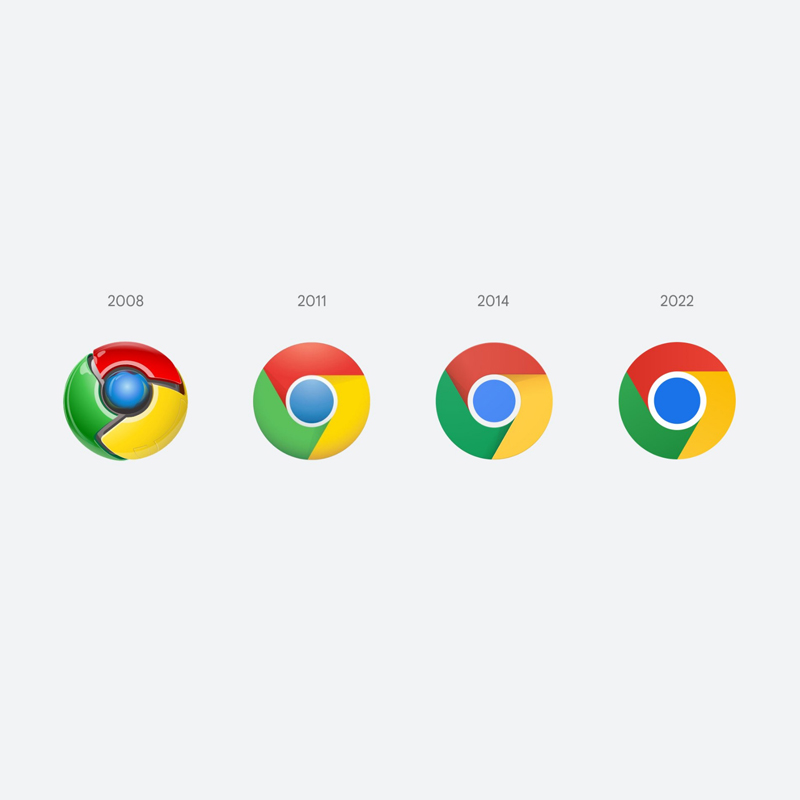
At first, when it was first launched, the era was 3D.
This is why at the time, Chrome logo took the approach and resembles a metallic ball. That design was then replaced, just when the tech trend shifted from 3D to a more flat 2D.
That was in 2011, when Google redesigned Chrome's logo to look like more like a circle rather than a sphere, but retained a bit of the gradients. In 2014, Google redesigned it again, removed most of the gradients to make way for a Material Design-inspired shadow, This logo was designed to appear even more flat.
In 2022, or 8 years later, Google introduced a redesigned logo that completes the transformation: an almost entirely flat design with almost no visible gradient.
The redesigned logo was announced by Chrome designer Elvin Hu.
In a more detailed explanation, this redesigned logo uses new shades of red, yellow, green, and blue, that supposed to make the logo a bit more vibrant and striking.
The design incorporates only a slight gradient to mitigate an "unpleasant color vibration" between some of the heavily contrasting shades.
Beyond adjusting the colors, the redesign also tweaked some things a little.
For example, the inner blue circle is made noticeably bigger, while the outer ring is made thinner.
This logo redesign may seem to be pretty subtle, and may not be visible at first sight.
But still, the goal is to keep the brand image relatable to the more modern trends, which tend to showcase images that are flat.
Some of you might have noticed a new icon in Chrome’s Canary update today. Yes! we’re refreshing Chrome’s brand icons for the first time in 8 years. The new icons will start to appear across your devices soon. pic.twitter.com/aaaRRzFLI1
— Elvin (@elvin_not_11) February 4, 2022
All of these changes are being done in order to "align with Google's more modern brand expression."
But the designer kept Chrome's orb-like appeal, just because people are already accustomed to the circle-like colorful looks.
What's more, the logo should fit well with other updated logos of Google apps.
Google also takes steps to blend in the redesigned logo across the many platforms and operating systems the browser is available.
On Windows 10 and 11, for example, Chrome's icon takes on a clearly gradated design to suit better with other icons in the taskbar. On macOS on the other hand, the updated Chrome logo is a bit more 3D, just like Apple system apps. On Chrome OS, the logo is brighter and has no extra gradients.
At the moment of introduction, the logo was introduced through Chrome Canary branch, with the beta app on iOS has that special blueprint-like icon, as a nod to other Apple beta/developer apps.
In other words, the design is to make the logo more flexible and adaptable across platforms and their respective design languages.
