Surfing the vast ocean of the internet just got a bit different, thanks to Reddit's logo redesign.
As the internet evolves, so does Reddit’s brand, and this time, it’s all about refreshing the iconic Reddit logo and introducing a more cohesive, accessible identity. Unveiled in November 2023, the redesigned logo marks a significant departure from the platform's previous iteration.
Snoo, the endearing robot mascot synonymous with Reddit since its inception, has received a makeover.
Here, Snoo is given a three-dimensional Pixar-esque makeover, adding depth and personality, as well as a touch of personality and modernity to the iconic character
Gone is the flat, two-dimensional alien.
As if Snoo has stepped out of the screen, the visual transformation is far from significant, but marks a major departure in logo design.

Speaking about the rebrand, Reddit said in a dedicated web page, that:
And the logo redesign is meant to "convey the conversational, community aspects of Reddit."
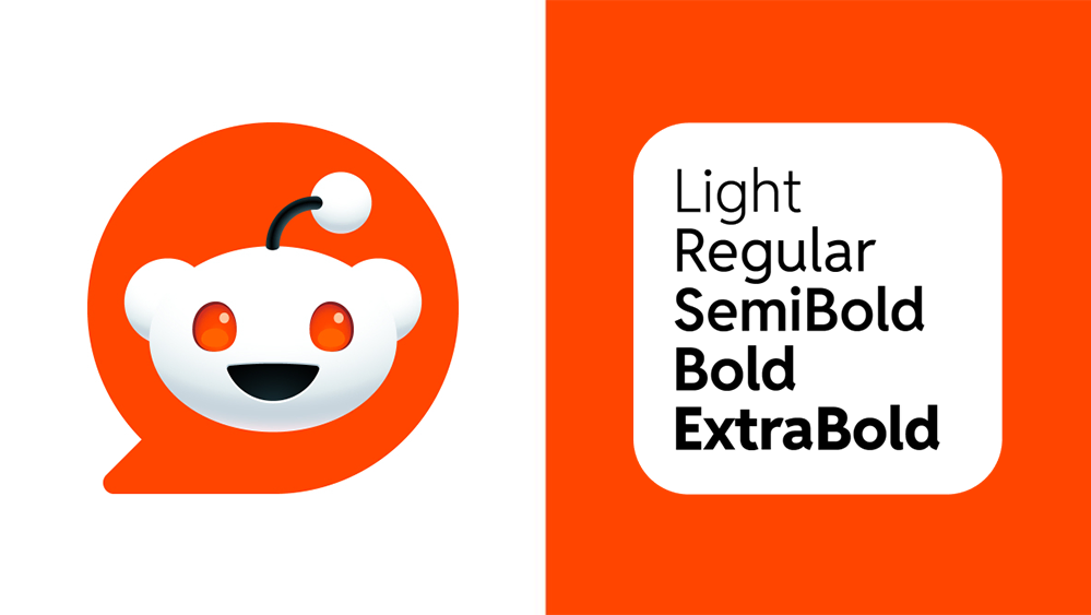
The redesigned logo is being nestled comfortably inside a speech bubble, a nod to Reddit's core function as a platform for conversation and discussion.
Besides a 3D Snoo, the logo redesign also introduces a redesigned Reddit wordmark.
Reddit calls it the 'Reddit Sans.'
"Reddit Sans is designed to be incredibly versatile with a large x-height for readability and disambiguated letterforms for rapid identification."

As with any significant change, the new Reddit logo has received mixed reactions.
Some users appreciate the modernized look and playful elements, while others find Snoo's 3D form and the new font too different from the familiar Reddit they know and love.
Whether users are longtime Redditors or recent converts, the redesign means a refresh, which should be in line with Reddit's dynamic identities.
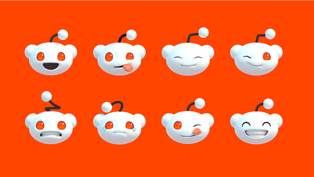
After all, giving Snoo a three-dimensional appearance means that Snoo can better express different emotions.
"Snoo’s expressive eyes are the origin of our brand color, a vivid OrangeRed. Snoo can have a variety of facial expressions, and the curve and bend of the antenna helps to show emotion. For certain expressions such as a grin, Snoo may gain teeth or a tongue. But when not expressing emotion, Snoo may have no mouth at all," Reddit said.

In turn, this should make it more visually appealing and memorable.
As Reddit continues to mature, its brand evolves to be more integrated, intuitive, and global.
In essence, Reddit's redesigned logo represents a bold and refreshing start.
The decision to go 3D isn't just about aesthetics; it's also about enhancing brand recognition and user engagement.
It's worth noting that the logo redesign means that Reddit also has a redesigned social share icons and an updated brand guidelines.
