
Google has long been the place for users of the web to begin their internet browsing session.
Is News section is known to be one of the fastest places to find up-to-date posts about the world. To make it even more appealing, Google said that it is redesigning this section for users on desktop.
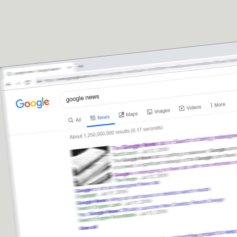
Here, the previous clutters that occupy its News results page has been slightly cleaned to bring it more in line with its mobile equivalent, and closer to that of the dedicated Google News site.
According to a tweet from Google News Initiative, each link on the News section has its own card rather than a list, This allows the results page to have more white space.
Searching the Google News section would surface stories from major news organization where links are put in their own respective boxes, while other links will have their individual cards.
What this means, no more crowded pack of links to be found.
And things don't really stop there.
Over the next couple weeks we’re rolling out a redesigned News tab in Search on desktop. The refreshed design makes publisher names more prominent and organizes articles more clearly to help you find the news you need. Check it out pic.twitter.com/xa2aZfO4Qd
— Google News Initiative (@GoogleNewsInit) July 11, 2019
Google News section has also been redesigned to emphasize better visibility of publishers' name. And within the stack of links, the headline is made blue, the publisher made green and the articles are labeled as 'In-depth' or 'Opinion', but only when relevant.
Publishers also get their logo next to the headline, making it easier for readers to identify their favorite news outlets. There are also small photo thumbnails on the lead story, with other publishers’ links underneath appearing as only text.
'And for last, the redesigned tab also includes a new carousel labeled 'People also searched for”, to point users to other relevant news posts that are based on their search query.
The redesign should make the experience of visiting Google News section on Google.com site more pleasing to the eyes. Users should be able to see several headlines around a single topic, with just a glance.
While it's considered a step back from the Material Design the company has long market, but the goal is for the better.
What's done here, is Google improve readability and experience by sacrificing information density for clarity.
The change is relatively minor, and doesn't change anything on the backend. But zooming out of the picture, this is part of Google's effort to improve user experience when using its news products.
Google News has been competing with a lot of aggregation apps out there. Despite using its very famous search engine, the fake news problem that plagues the web has created anxiety to those users that seek true information.
Here, publishers who depend on Google's search engine results page for visibility, are worried about their revenue, as they compete with the many low-quality sources on the internet.
Google has partnered with many news organizations to help publishers. The tech titan has also leveraged AI features to its dedicated News app, made it easier for readers to subscribe to news channels, and more.
Google is approaching the issue through all angles, hoping to please these publishers. And this redesign is just another step towards creating a more appealing and user-friendly Google News.