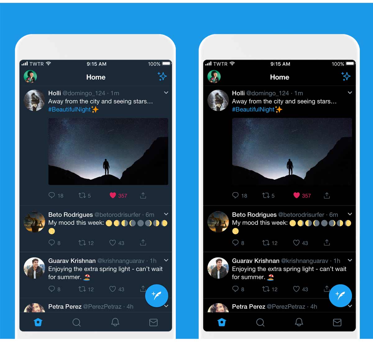
One of the design trends that caught the tech industry in 2018, was companies in creating products with dark mode.
For many reasons, with the internet-connected devices, users can use their services and apps no matter when and where. And this includes dimly lit environments to the darkest of nights.
Dark mode here essentially makes a services/apps themes to go dark.
This eases the eyes by giving them less strain, as well as improving the battery life of devices that use OLED as display.
Twitter has provided users to switch off the lights with a Night Mode feature since 2016. But this dark mode is never that dark.
As a matter of fact, Twitter's Night Mode has long been navy blue-tinged in color.
With an update, the microblogging platform is making its Night Mode even darker, with a darker theme that is actually black, and also allowing users to automatically enable this feature if they want.

Initially available for iOS users, Twitter's black theme is called "Lights Out."
Unlike the app's previous dark theme, Lights Out is "a pure black color palette that emits no light since the pixels are turned off," according to Twitter.
With the update, Twitter renames its old navy blue Night Mode to "Dim".
And for users who prefer to use Twitter as it is with the full glory of blue and whites, they can still do so with the usual theme Twitter calls "Lights Out".
"Dark Mode enables us to expand our accessibility offerings so everyone is able to use Twitter in a way that works best for them and their environmental conditions," said David Kaufman, Product Manager at Twitter.
It was dark. You asked for darker! Swipe right to check out our new dark mode. Rolling out today. pic.twitter.com/6MEACKRK9K
— Twitter (@Twitter) March 28, 2019
The definition of "dark" is having little to no light.
For services and apps to have a dark mode, they may need to consider the definition of "dark", to implement the theme without putting a lot of loss in brand colors. For reasons, this made apps to have different shades of "black".
As a result, some may opt to have pure black as their dark mode, while others use variations of "dark", which include achromatic colors with a little tint of other colors.
Users who just love a darker-shade of color themes, switching dark mode on an app-to-app basis may not the very best option. But until every mobile devices are shipped with system-wide dark mode option, the former is certainly the only way to go.
And as for Twitter, users who want to go vampire but still want to see daylight when the sun shines, can turn on the automatic dark mode, which switches the themes according to the users' timezone, similar to Apple's Night Shift feature.
This feature should take the burden off of people to make the adjustments.
"Giving more people options to personalize their experience on Twitter based on what makes them most comfortable is what the latest update to Dark Mode is all about," explained Bryan Haggerty, Senior Design Manager at Twitter.
