The microblogging platform Twitter is rolling out its completely redesigned Android app which now adopts Google's design language Material Design. What was once a test is now made official.
Material Design (codename: Quantum Paper) adheres a paper-like visual language developed by Google. Expanding upon the "cards" that debuted in Google Now, Material Design that was introduced alongside Android 5.0 Lollipop makes more liberal use of grid-based layouts, responsive animations and transitions, padding, and depth effects such as lighting and shadows.
With the new design, Twitter's app is split into four tabs which include Home. Moments, Notification and Messages. Users can move between them by tapping their respective icons at the top of the screen or by using horizontal swipe. Dragging the left-hand edge will now reveal a side menu that houses shortcuts. And to switch account, users just need to access the drop-down arrow at the top of the menu.
Given to the new looks, Twitter's move isn't at all a surprise.
First of all, Material Design is already a visual language that is marketed heavily by Google. The design has started to become a trend with its base flat and colorful design - something that most other brands tends to avoid. The search giant and the Android-owner has also been keen on its developers to embrace the design language and its principles throughout their projects.
But beyond that, Twitter did make one little unsuspected move, and that is by how it places Moments inside the app.
Twitter is on the move to increase user engagement. As an attempt, there is no doubt that the company wants to put its popular news-centric hub forward. Moment that was formerly known as "Project Lighting" wasn't affected by Twitter's stagnant number of users.
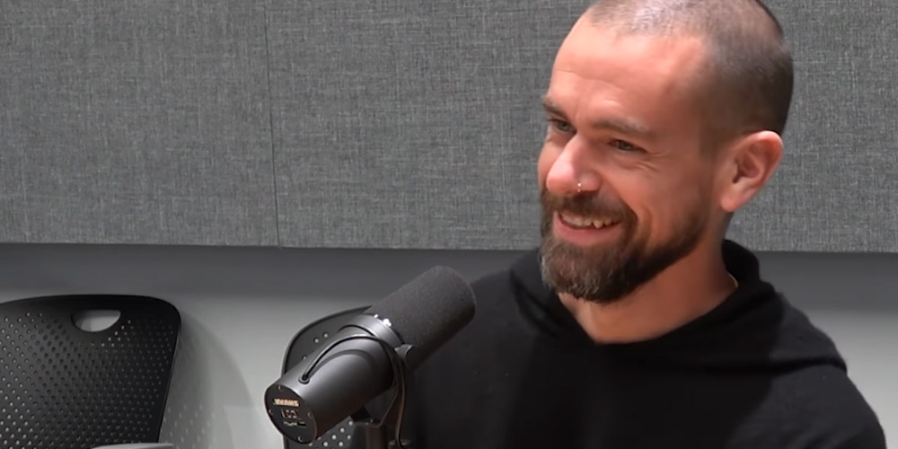
CEO and founder Jack Dorsey is hoping that the change will push Twitter to once again hold the prominent place in the eyes of Android users.
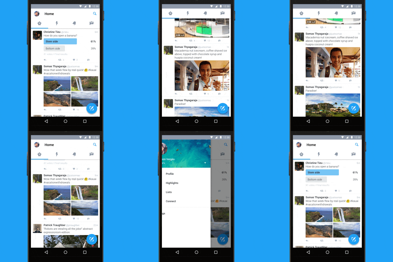
For Twitter's new look, it's all about aesthetic. Twitter design still maintains the white-and-blue theme that it is recognizable, but by adopting Material Design, Twitter wants its app to be native and more fluid with other apps that were marketed with the same principles.
What's more, the Google-approved design makes Twitter able to put a few functional differences.
Like for example, the tab bar at the top of the screen is now having swipe functionality so users can quickly more between Home, Timeline, Notifications, Direct Messages, and more. The side menu which is Twitter's navigation menu, is hidden and only can be revealed by sliding out. Not only that this saves space for a cleaner overall design, it also makes it accessible almost everywhere. The navigation menu is where users can access their profile, Highlights, lists, the Connect tab, and settings.
And because it uses Material Design as its design, Twitter is now having a new floating action button so users can easily send a tweet.
The new experience is rolling out to everyone globally as of June 7th, 2016.