
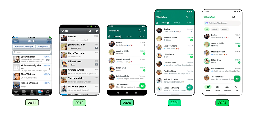
WhatsApp was originally designed to be simple, intuitive, and straightforward. Things have derailed a bit.
When Meta was still Facebook, the company acquired it from Jan Koum, and has since added a bunch of things and loads of gimmicks.
While the additions have made WhatsApp a much more complex app if compared to what it once was, Meta doesn't want to eliminate the simplicity.
This is apparent, in a major update it is introducing.
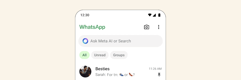
The update introduces a bunch of design chances, including revamped icons, a more minimal approach, and a white background for the conversation list, and more.
In a website post, Meta said that the idea is to keep the app "fresh, simple and approachable."
Overall, the interface looks cleaner and more fitting for a messaging app in 2024.
we’re rolling out design updates to give WhatsApp a fresh new look, while keeping it familiar + easy to use here are some ways it’s changing
• updated layout and icons that that help you find what you need faster
• new illustrations with added animation to… pic.twitter.com/pFu0cfxpWY— WhatsApp (@WhatsApp) May 9, 2024
"We take this role seriously, and we focus on the details to get it right for our users. We aim to create an app that not only works seamlessly, but also feels like a natural extension of your phone — allowing you to focus on the conversations that matter in your daily life. We believe success is achieved when our design enhances how people communicate on WhatsApp and empowers them to connect in new ways."
The redesign remains true to WhatsApp's core philosophy, in which Meta sticks to keeping it simple, reliable and private.
While the redesign introduces major changes, Meta only built the changes on top of the aforementioned philosophy.
"We pay close attention to how people use their devices and design our user interface to complement their existing experience, so WhatsApp feels familiar and easy to navigate. If you know how to use your device, using WhatsApp should be easy," said Idit Yaniv, VP, Head of WhatsApp Design at Meta.
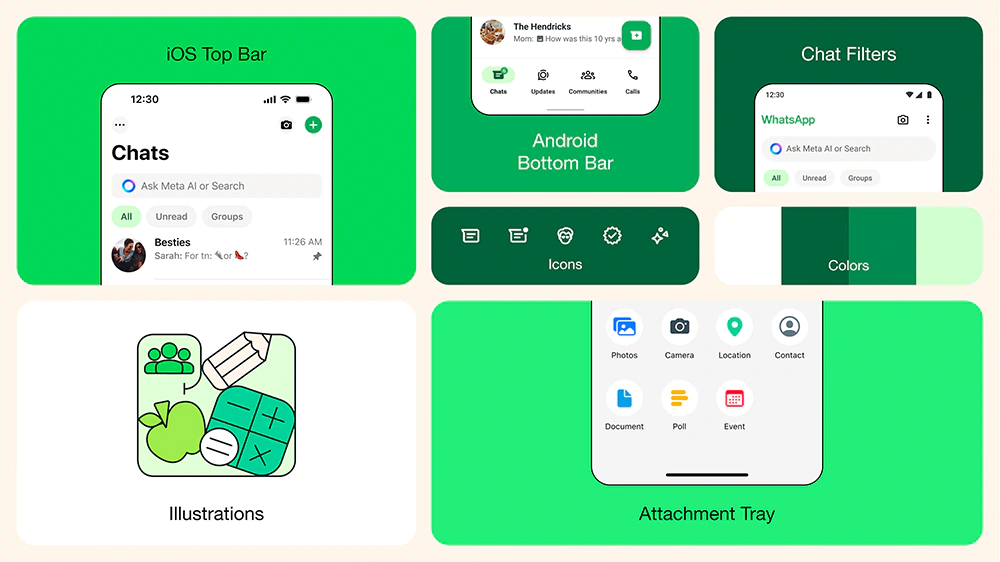
First up, is a new, consistent green palette within the app for a unified experience.
"We considered over 35 different color iterations, ultimately aligning with WhatsApp’s iconic green and opting for a palette that allows for harmonious color pairings throughout the app. We also increased the usage of neutral colors, enabling us to be more selective about where and how the green is used," said Yaniv.
And speaking of colors, Yaniv also said that the redesign introduces a darker dark mode.
"We focused on higher contrast and deeper tones to reduce eye strain in low-light environments. We’re making it one shade darker for improved visual appeal and legibility," explained Yaniv.
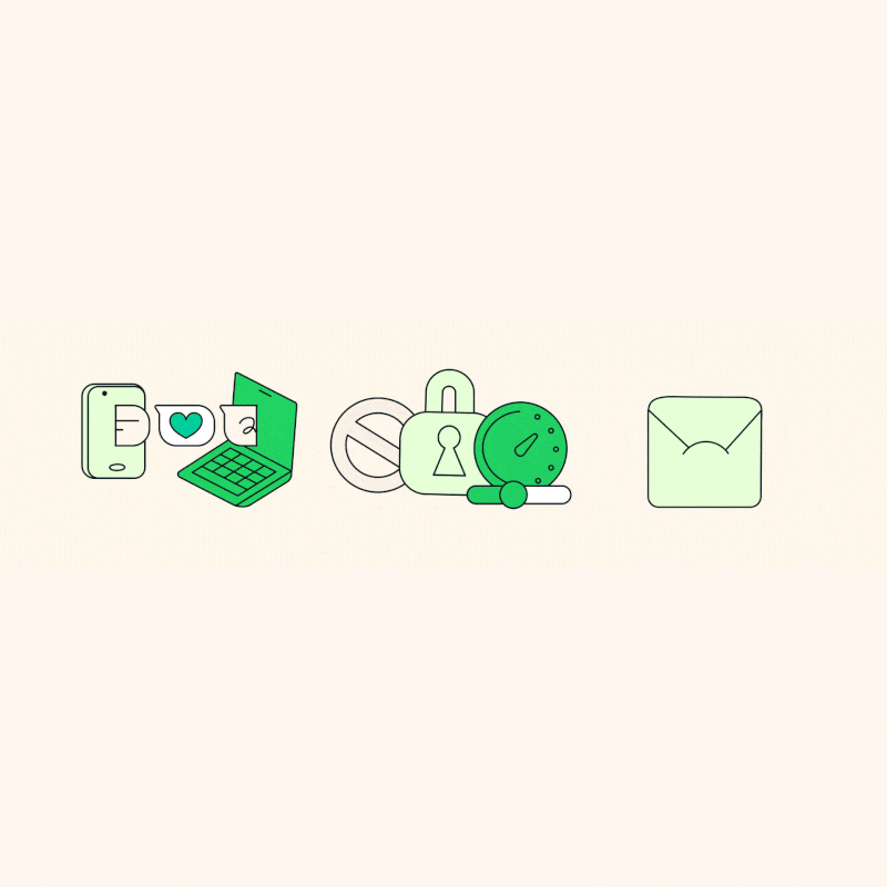
As for the visual appeals, the WhatsApp redesign introduces a bunch of new icons, redesigning them to a rounded, outlined style and, to match the new iconography.
WhatsApp also refreshed its illustrations and added animation for a more playful aesthetic.
WhatsApp also refreshed its original default background in chats.

A more significant change, is the introduction of a more modern, native bottom navigation bar on Android to help people find what they need faster.
The redesign places tabs closer to users' thumbs to offer more natural navigation and matches the current experience on Android devices.

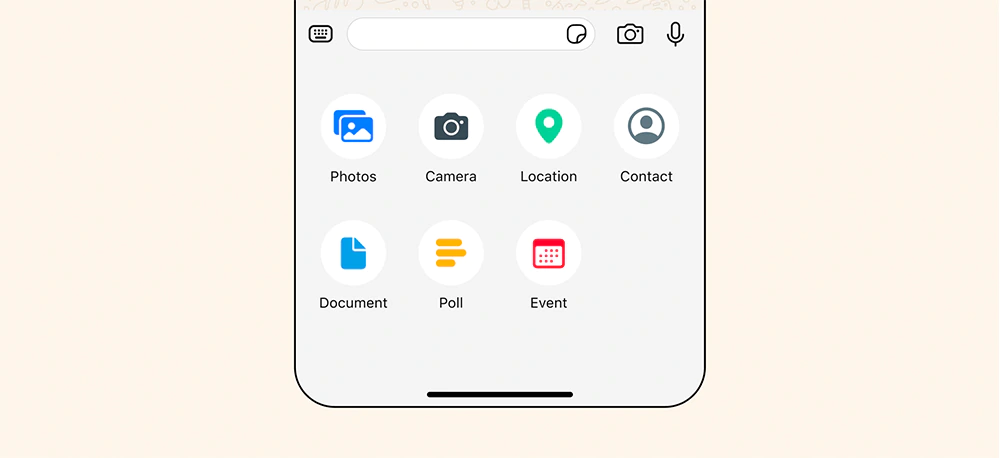
On iOS, the redesign introduces a way to ease the process of sending photos and videos with a new attachment layout.
Instead of a full screen menu, the redesign adds an expandable tray that allows users to see the features more clearly when sending media, polls, documents and more.
And lastly, the redesign introduces a better chat management.
WhatsApp is updating its mobile apps for a fresh and more streamlined look.
These changes have been under test with WhatsApp beta users for a while, before Meta finally giving them a go.